The Navigation menu of a website helps users easily access different sections and pages of a website, enhancing the overall user experience and improving site usability.
In this article
You can manage the Menu styling (for both desktop and mobile) from the Design (1) section.

Once you are inside the Design section, click on Menu (2) tab.

Alternatively, you can also use the studio’s search option.
- Enter Menu (1) in the Search Bar.
- From the related results, click on the Design- Website Menu option (2).

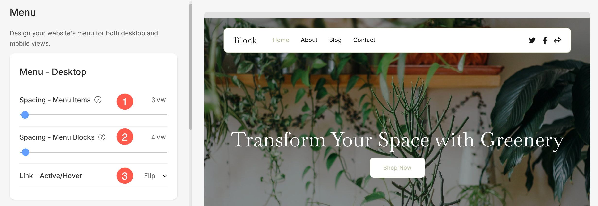
Menu for Desktop
- Menu Spacing – Specify the space between the menu links (specified in vw).
- Block Spacing – Specify the space between the menu links, social media icons, and search/cart icons (specified in vw).
- Link Active / Hover – Select the style for the active menu link and hover link. You can choose from the underline, overline, strikethrough, and no style.
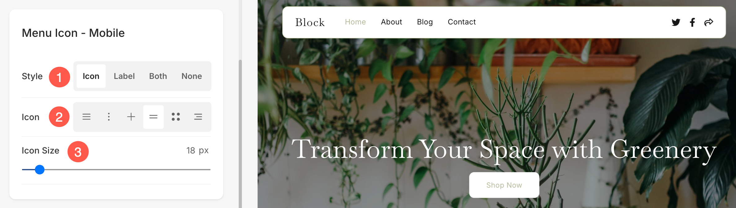
Menu Icon for Mobile
- Style – Specify if you want to display Icon, Label, Both or None on mobile devices.
- Icon – Select the menu icon style.
- Icon Size – Specify the size of menu icon (specified in pixels).
Menu Overlay for Mobile
- Layout: Choose a layout for how the menu screen will appear on mobile devices. A preview of the selected layout will be shown here.
- Menu Text Size: Specify the size of menu text on mobile.

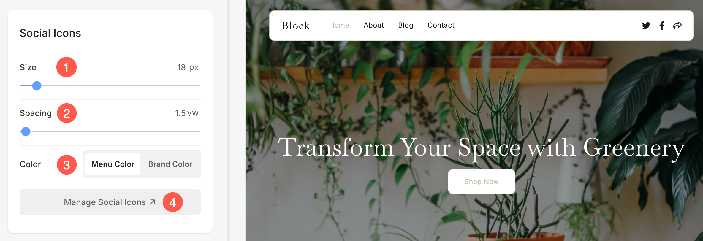
Social Icons
- Size – Specify the size of the icons (social media icons, search icon, and cart icon) in the header (specified in pixels).
- Spacing – Specify the space between the icons (social media icons, search icon, and cart icon) in the header (specified in vw).
- Color – Select the color for the social media icons. You can choose between the Menu Color and Brand Color.
The menu color will use the color set for the menu links in the main menu category, and the brand color will use the original brand color of the social media icons. - Manage Social Icons – Click this option to add, remove, or reorder the social media icons displayed in the header. This allows you to customize which platforms are shown and how they appear on your website.
Any changes in these options will reflect on your website’s social icons:
