You can add a Headline Section to your page directly so you can add a description for the page. When you want to display an image and the relevant text against it, you can use this section.
The image uploaded here does not support lightbox mode. It can be rescaled by dragging the image corners.
This section can be primarily used for an About Me/Us page. You can also link the image to any page you wish to.
In this article:
- Add a Headline Section
- Managing the Content
- Manage Elements
- Change Layout
- Autofit Text Layout
- Cover Section Layout
- The Style options
Add a Headline Section:
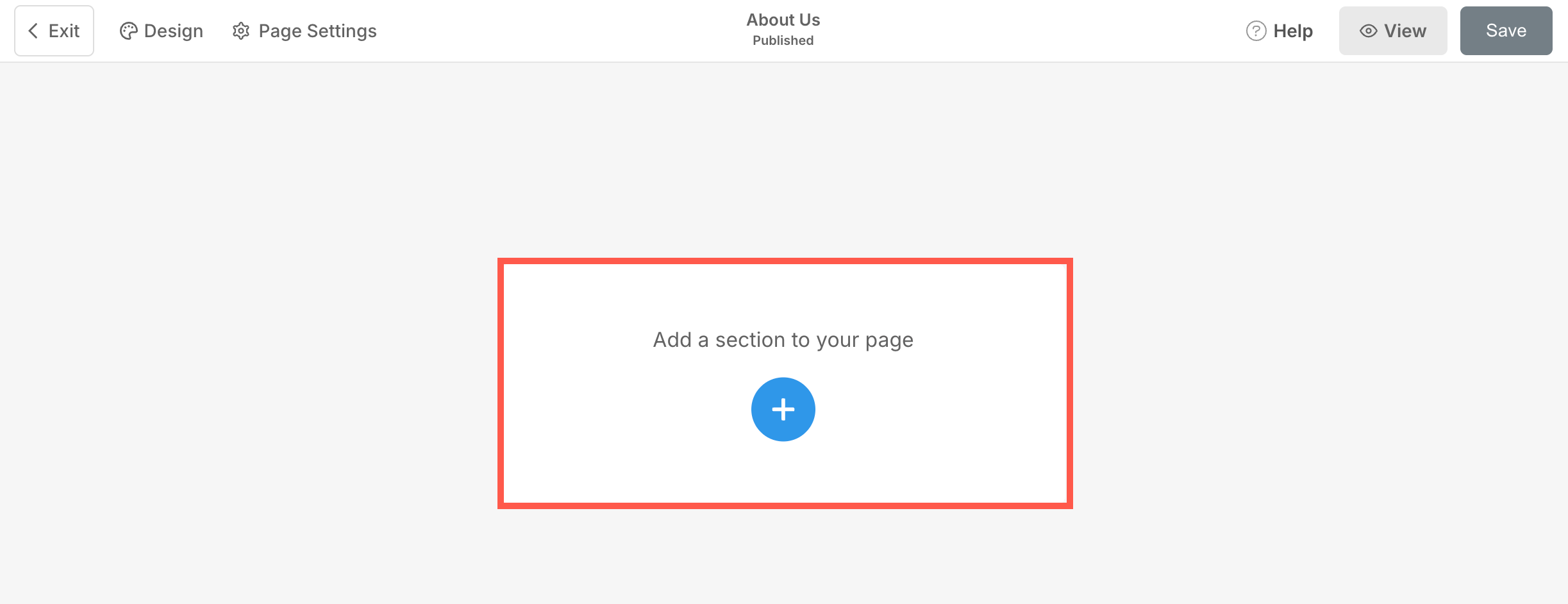
- A section can be added to a page. You can either add a section to an already existing page or create a new page within your website.
- On your page, click on the blue + icon to add a New Section to your page.
- You will now see the section categories on the left side.
- Choose the Hero Sections (1) option and select Headline (2) tab.
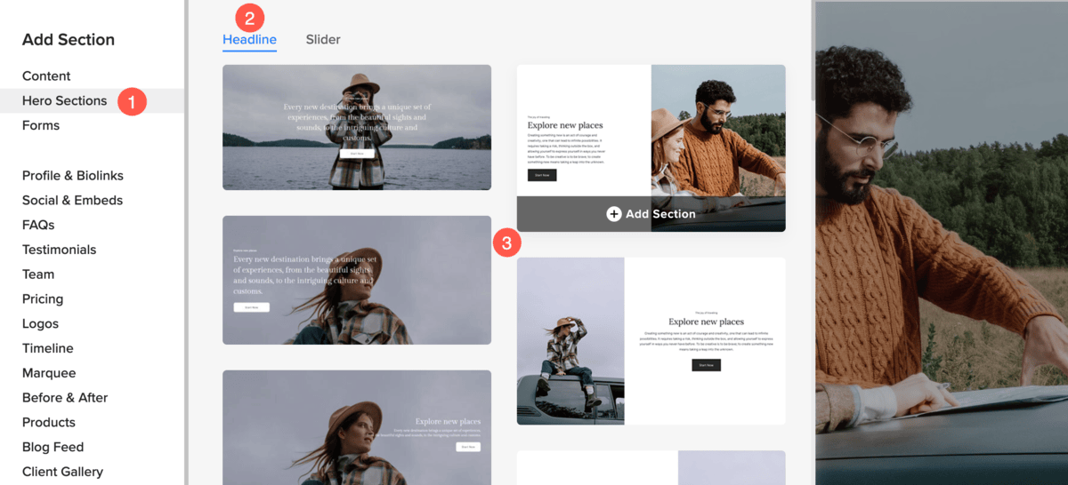
- Choose any section layout (3) and click on it to add it to your page.
- As the section is added, you can edit the text and upload any image.
Managing the Content
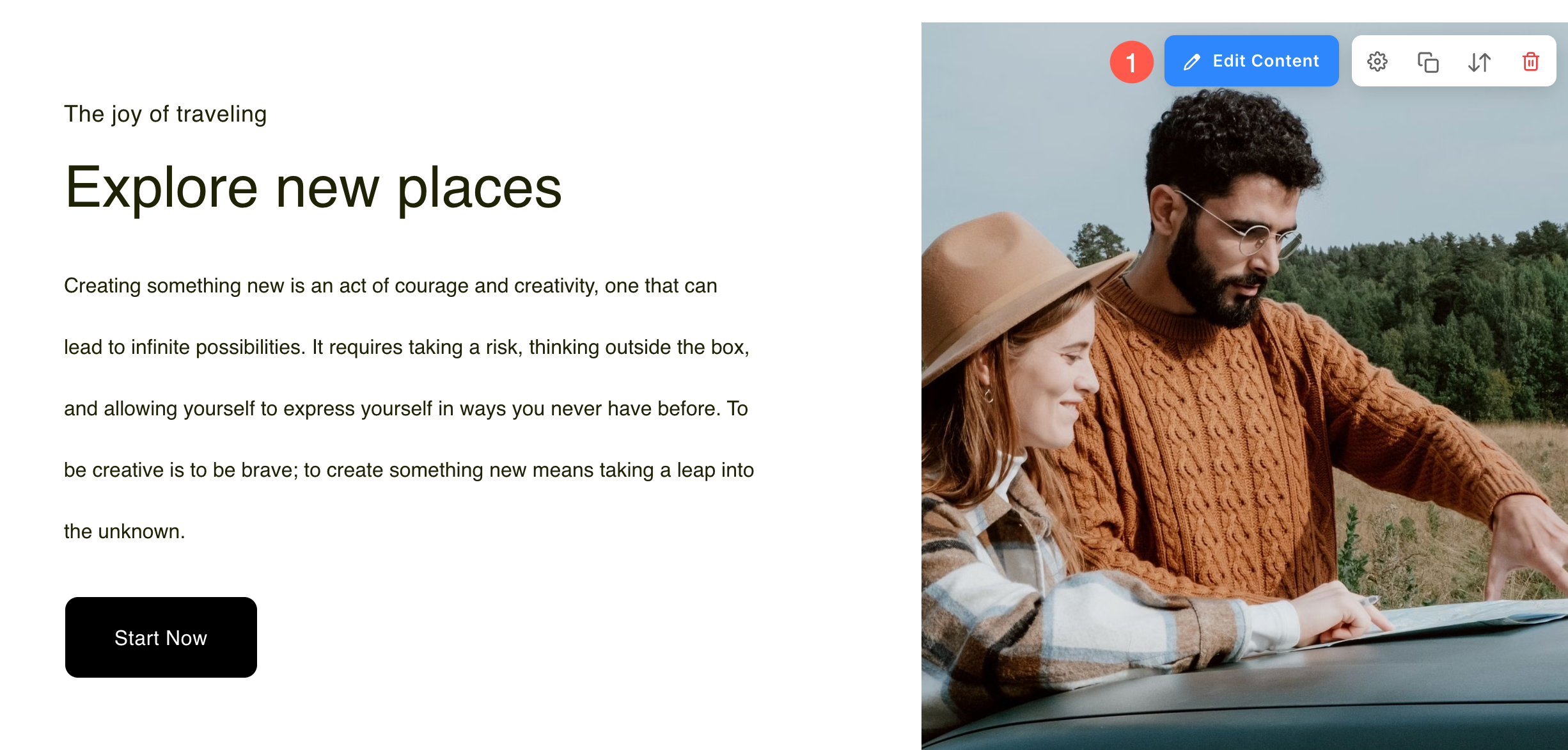
Once you have added the section:
- Click on the Edit Content (1) button.
- This will open the Headline Item Panel (2).
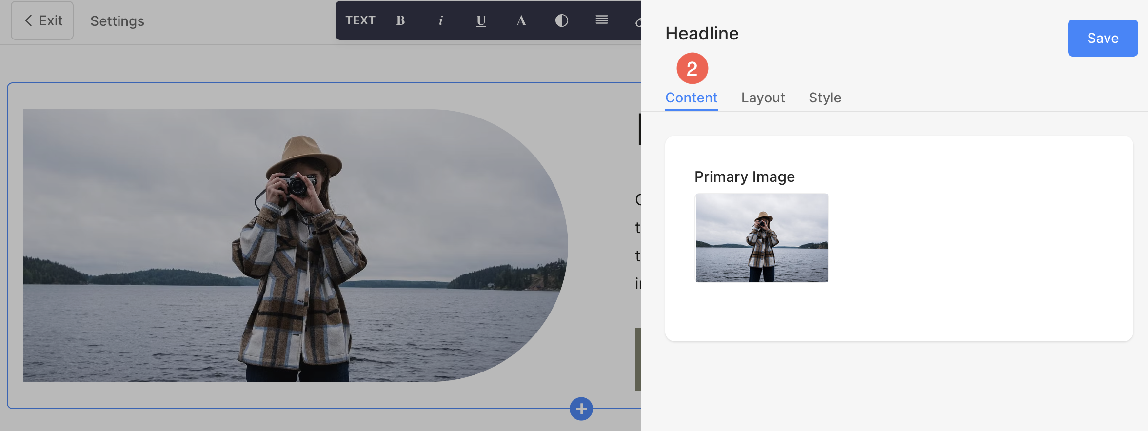
From here, you can:
- Upload a Primary Image (1) for the Headline block.
- Upload a Secondary Image (2) for the Headline block (only on selected layouts).
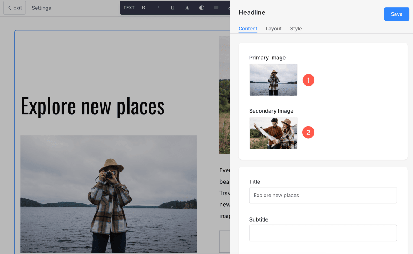
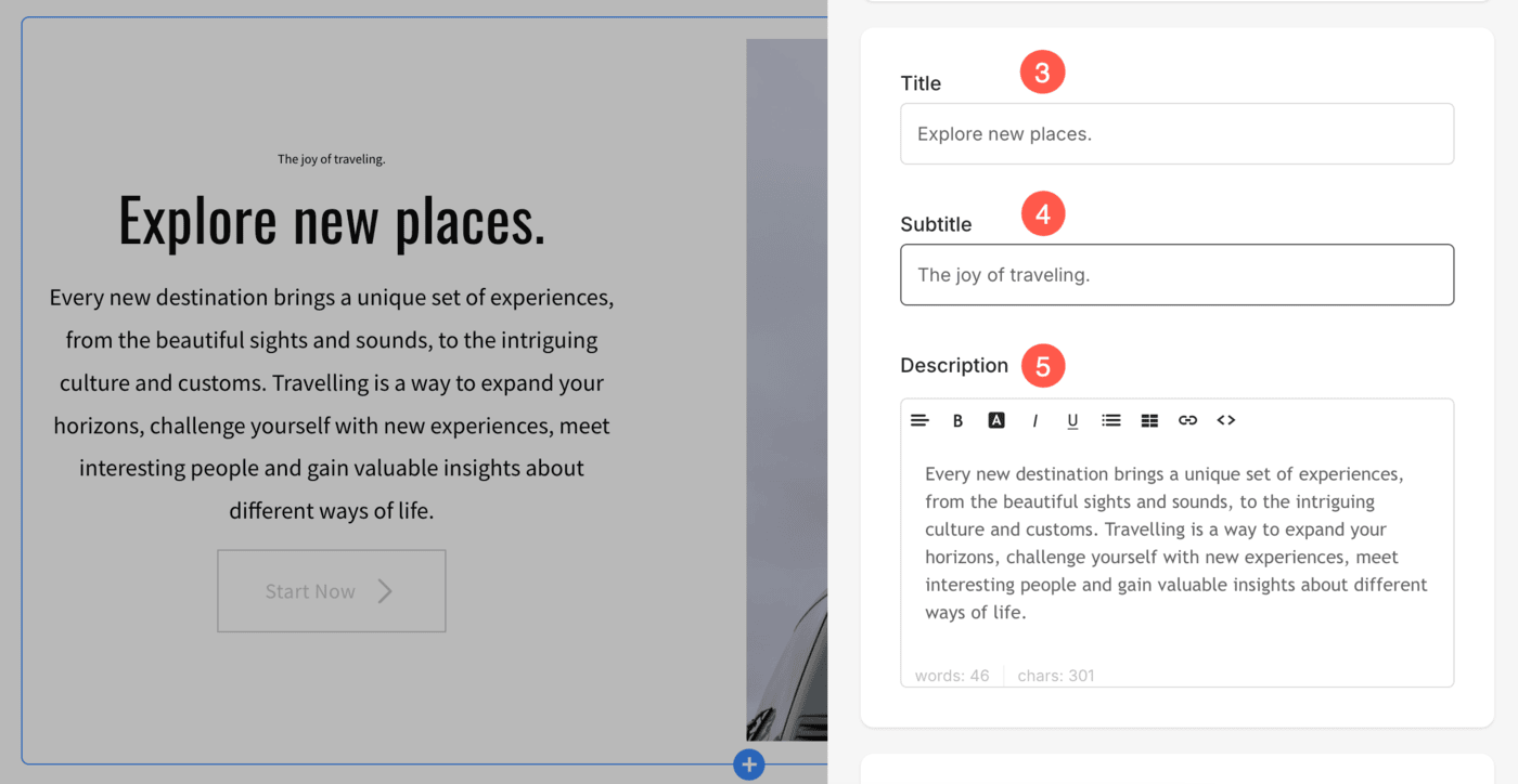
- Add a Title (3), Subtitle (4), and Description (5) of the Headline block. Before adding the description, check this article.
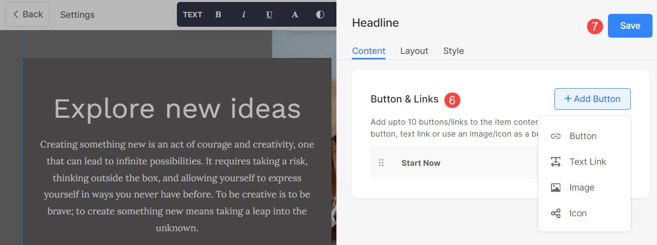
- Add any type of Link (6) to the headline section. You can add a Button/Image link/Social Icon/Text Link. Learn more.
- Save (7) your changes.
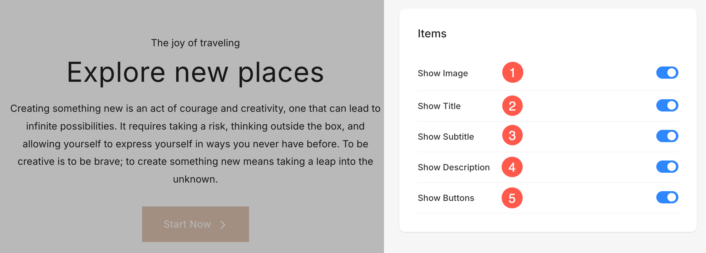
Manage Elements
Headline section includes an Elements tab that allows you to manage the visibility of various elements within the section with ease. Using simple toggle switches, you can enable or disable specific elements without having to delete or modify the elements themselves.
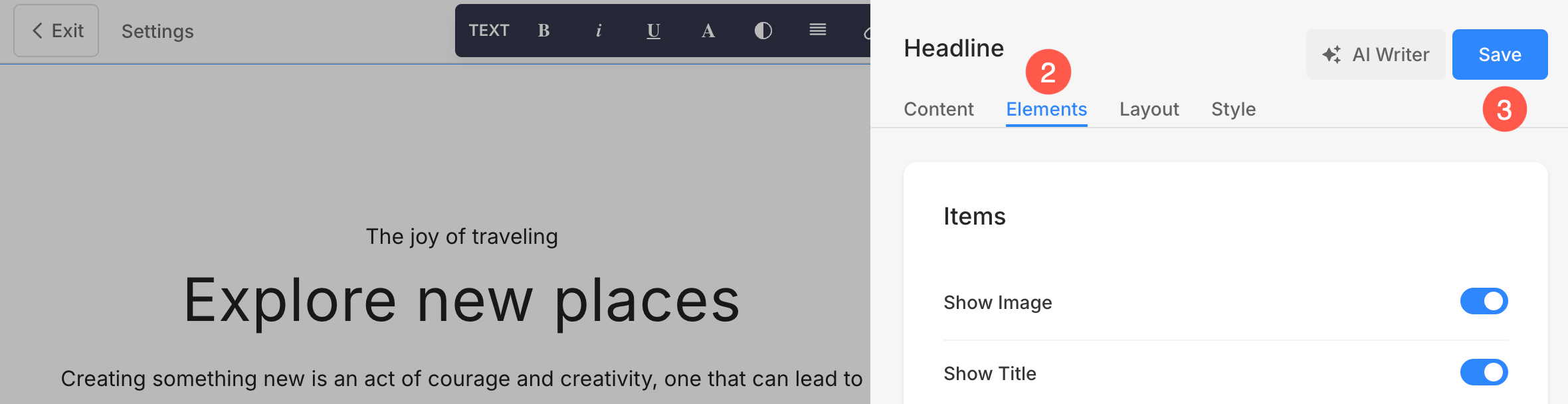
- Click on Edit Content (1) button.
- Choose the Elements (2) tab.
- After making the changes, hit the Save (3) button.
Items Options
- Show Image: Toggle the visibility of the images.
- Show Title: Control whether the title is displayed.
- Show Subtitle: Enable or disable subtitles.
- Show Description: Manage the visibility of item descriptions.
- Show Buttons: Decide if buttons for individual items should be shown.
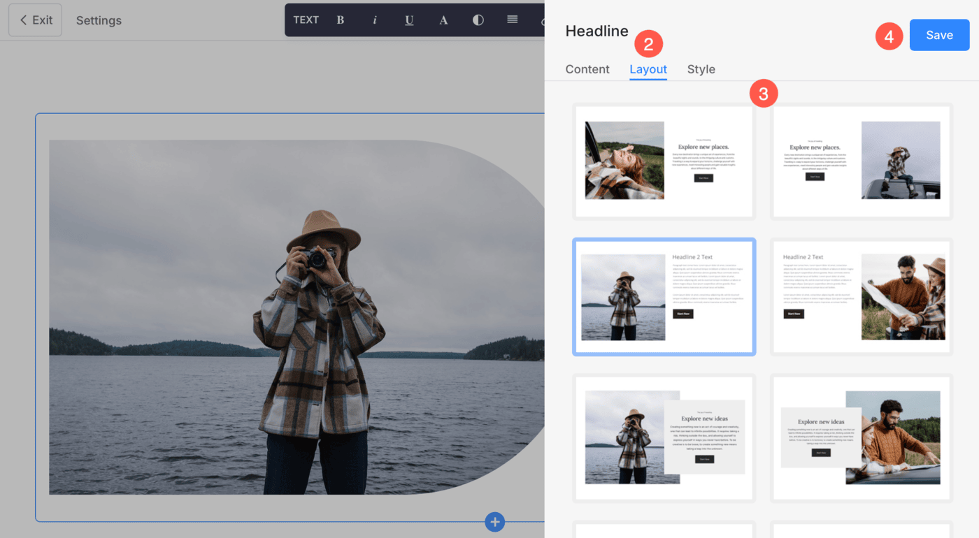
Change Layout
- Click on the Edit Content (1) button.
- Choose the Layout (2) tab.
- Select the Layout (3) for your section and Save (4) the changes.
Autofit Text Layout
The Autofit Text section is a powerful tool for creating dynamic and responsive text content on your Pixpa website.
This allows you to set a maximum font size, and the text will automatically resize according to the available screen size, space, and length of text ensuring optimal readability and aesthetic appeal.

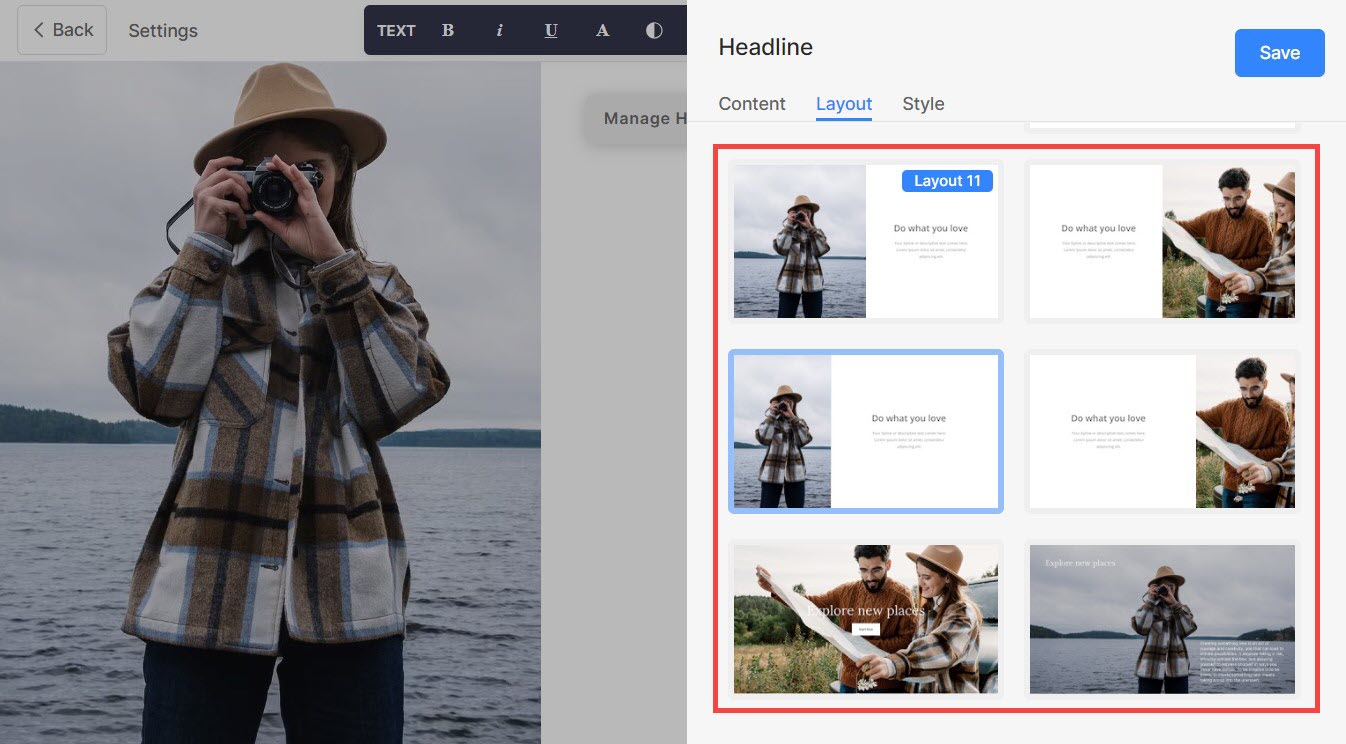
Add Autofit Section to the page
- Click on the blue + icon to add a New Section to your page.
- Choose the Hero Sections (1) category and click the Headline (2) tab.

- From the available layouts under the Headline section, scroll to the bottom and select any of the layout marked in the screenshot as per your preference.

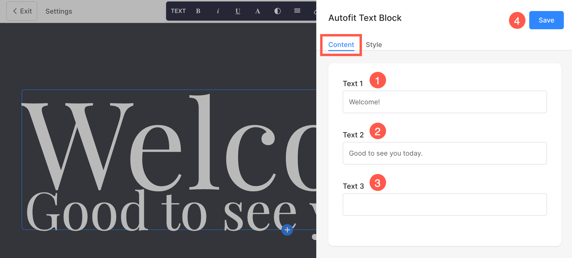
Edit Autofit Section
- Click on the Edit Autofit Text Block button on the top right corner of the section.
- Under the Content tab, you can specify the text content for the section using 1st, 2nd, and 3rd text fields.
- Font size of the text will automatically be adjusted according to the screen-size and length of the text. Finally, Save (4) the changes.
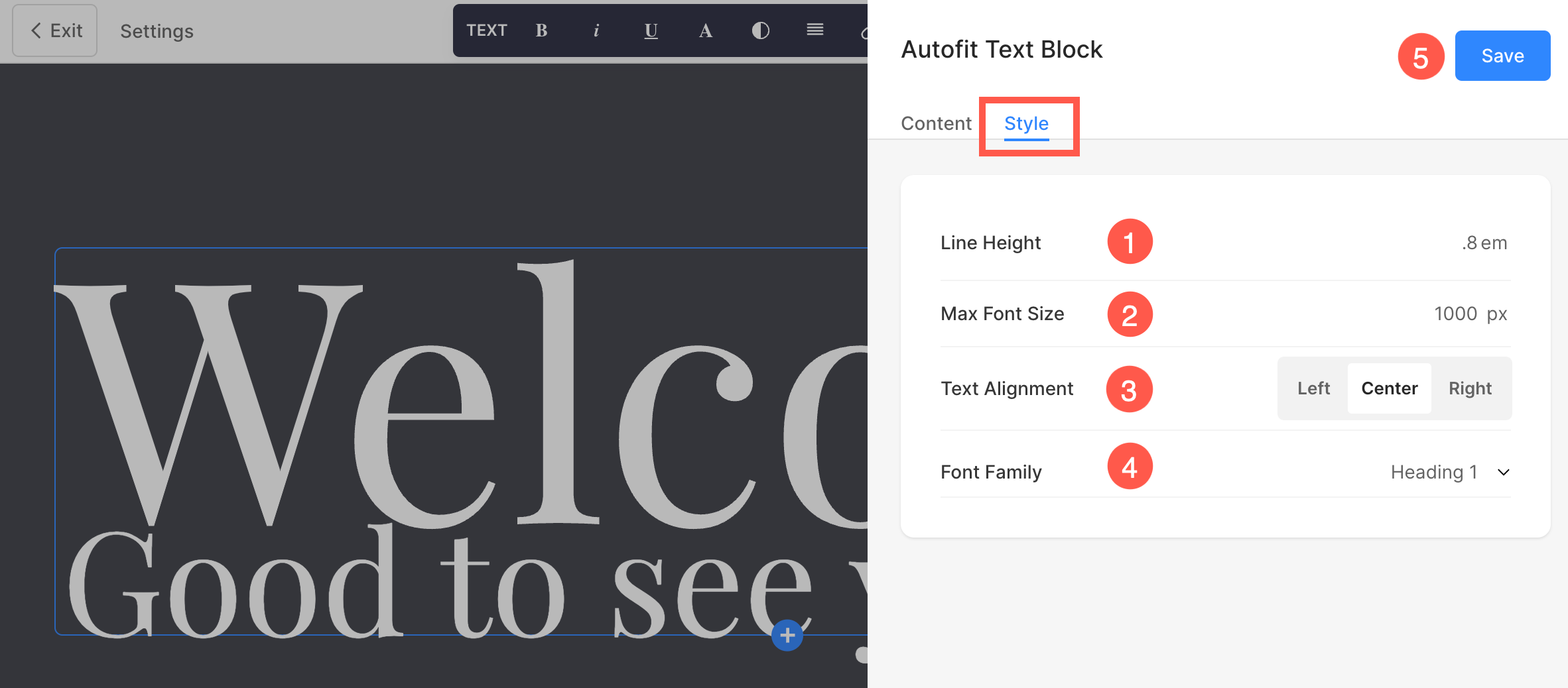
Style Autofit Section
Customize the styling of the section from the Style tab. You will find the following options here:
- Line Height: Specify the vertical space between lines of text.
- Max Font Size: Set the maximum font size that the text can reach.
- Text Alignment: Align the text horizontally within the section.
- Font Family: Choose the font family such as Heading 1, Heading 2, Paragraph, etc.
Cover Section Layout
The Cover section layout can be used when you want to add text, a button, and a background to your section. The Cover section is the simplest layout which can be customized very easily.
You can also embed custom codes within this layout using the custom code snippet option. Learn more.
Add Cover section layout to a page:
- On your page, click on the blue + icon to add a new section.
- You will now see the section categories on the left side.
- Choose the Hero Sections (1) category and click the Headline (2) tab.
- From the available layouts under the Headline section, scroll to the bottom and select the layout marked in the screenshot.

Learn more about adding and editing snippets in the Cover section layout.
The Style Options
- Click on the Edit Content (1) button.
- Choose the Style (2) tab.
- Change the Style for the section elements and Save (3) your changes.
You will have multiple style options for the section:
- Image Style Options
- Shape Mask
- Image Border Options
- Alignment & Color
- Spacing Options
- Text Size
- Buttons & Links
Images
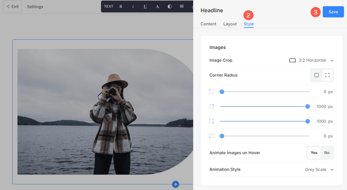
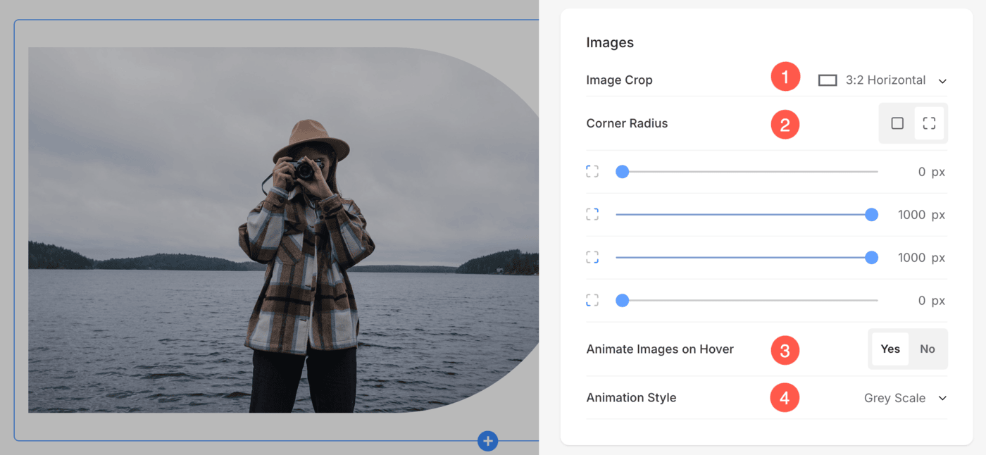
- Choose the Image Crop for the image. You can set the image as Square, Circle, Landscape, Portrait, and Dynamic.
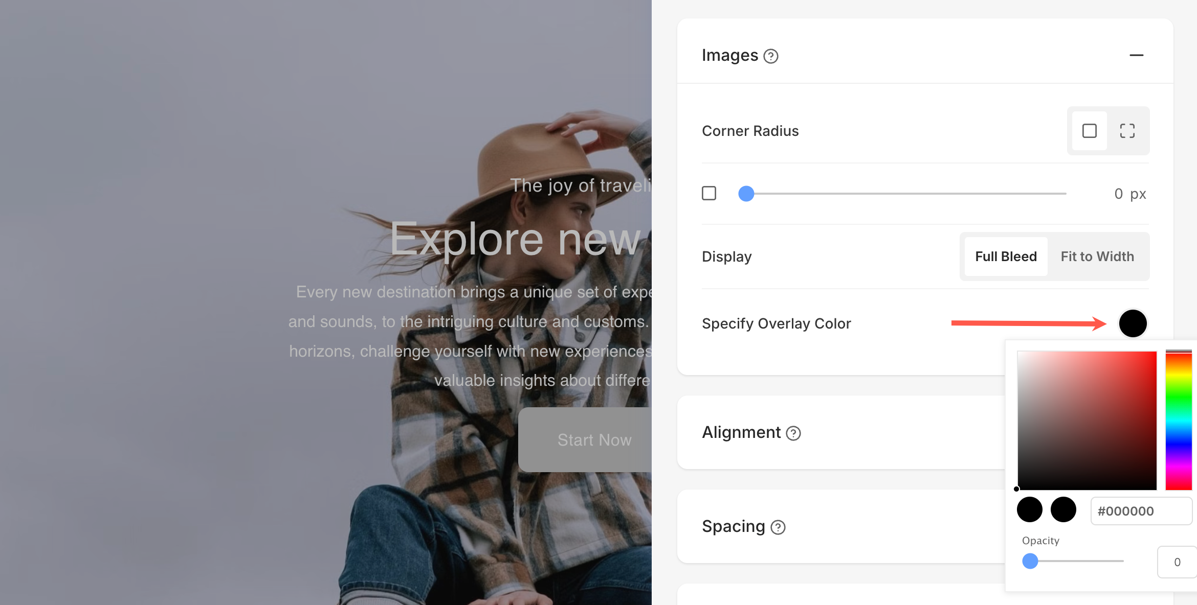
- Choose to have a common corner radius or different corner radius for each side of the list items and set a number (in px) for the Corner Radius of the list item images.
Using the corner radius field, you can create different shapes of image. In case you specify 500 px here, the image would display in a circle shape.
In case you have chosen split corners, you can set different corner radius for each corner. Know more. - Choose to Animate Images on Hover by clicking on Yes.
- Choose from the different Animation Style for images on hover.
When Full-Width Headline layout is applied, you will see this additional option:
- Specify Overlay Color: This lets you apply a color overlay across the entire headline section. You can choose any color using the color picker and control its transparency using the opacity slider, helping you enhance text visibility or create a specific visual mood.
Shape Mask
- Shape Mask: Enable this toggle to apply a shape mask to the image in the Headline section. Once enabled, the selected shape will visually clip the image into that form.
- Select Shape: Choose from various predefined shapes to apply to your image. This allows you to creatively stylize your content by displaying image in a unique form like rounded, diamond, drop, etc.
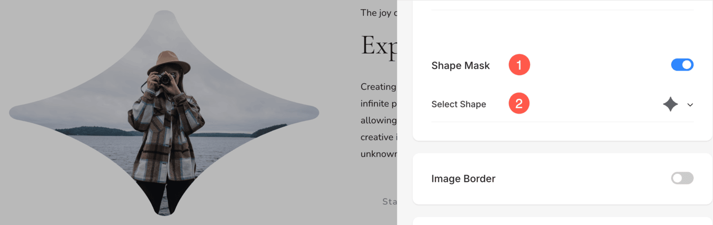
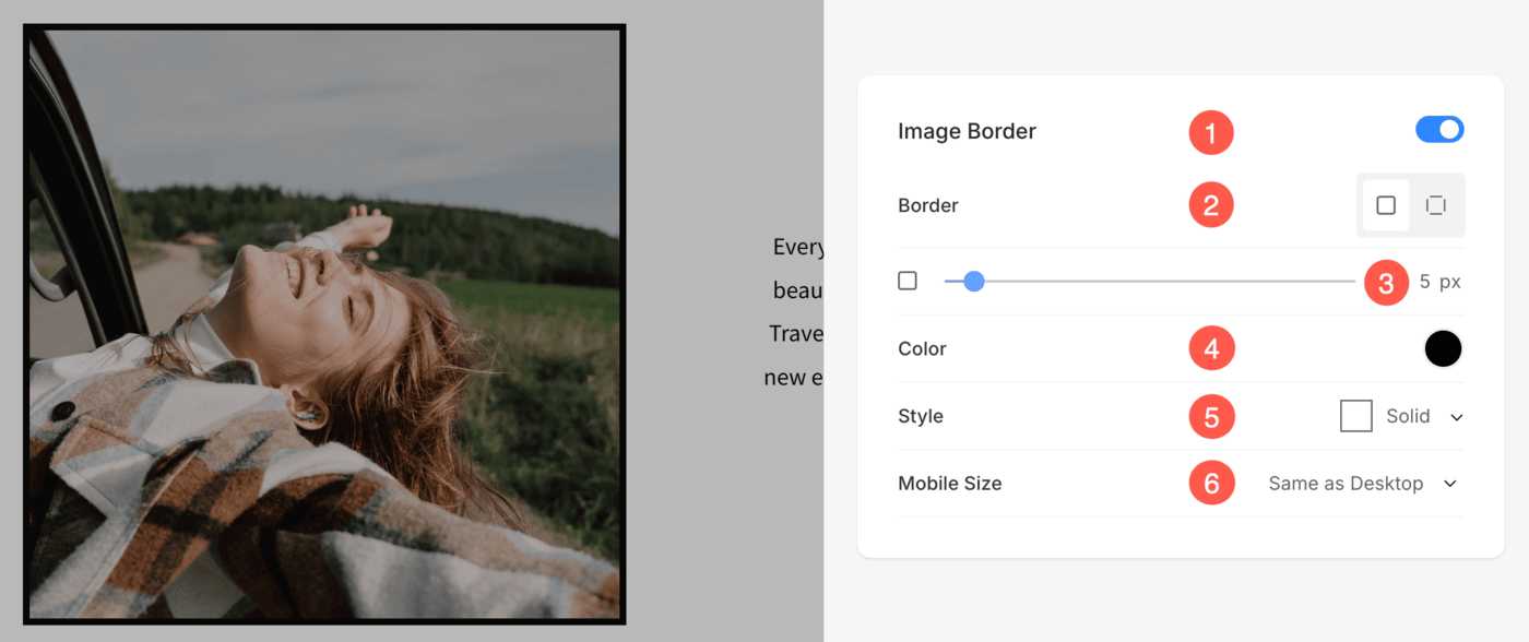
Image Border Options
- Enable / Disable border around the images by switching the toggle.
- Choose to have a common border on all sides of images or you can specify the borders separately for each side.
- Specify the width of the border. If it is set to 0, then the border will not appear. You also have the option to set the border width individually for each side of the image.
- Select the Border Color from color picker.
- Select a preferred Border Style from the dropdown.
- Determine the border width for mobile devices, aligning it with the width chosen for desktop.
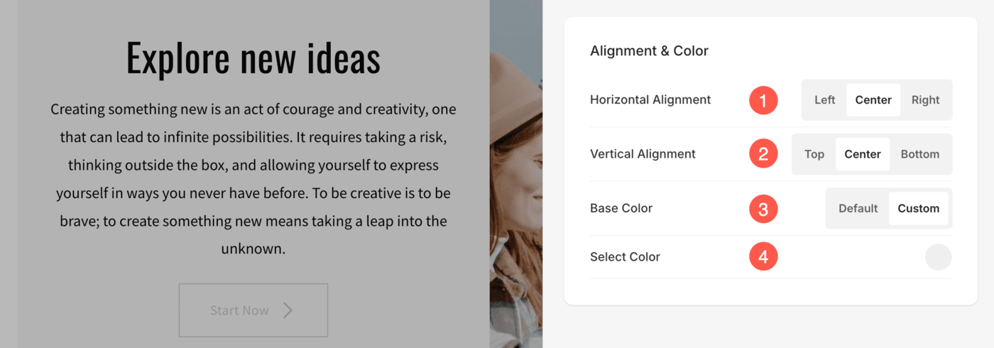
Alignment & Color
- Align the content in the Headline section horizontally. You can set it to be Left, Right or Center aligned.
- Align the content in the Headline section vertically. You can set it to be Top, Bottom, or Center aligned.
- Select if you want to keep the Base Color (background color of the textbox) to Default or Custom.
- If you have chosen Custom for the base color, you get the option to select the background color. You can also specify the opacity of the Base color.
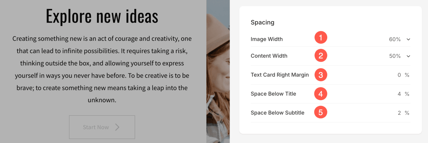
Size & Space
- Specify the Image Width for the Headline block image.
- Specify the Content Width for the Headline block text.
- Specify the Space or Overlap between Text Card and Image (in %).
- Specify the Space below the Title (in %).
- Specify the Space below the Subtitle (in %).
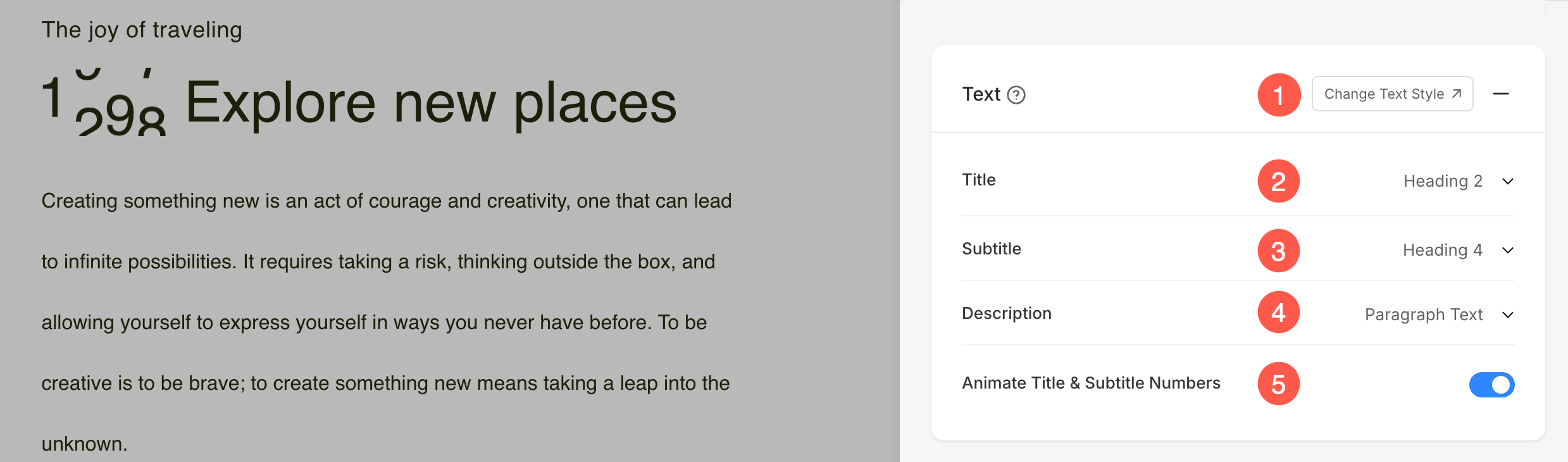
Text
- Click on the Change Text Style button to visit the Design section and manage your font sizes and styles.
- Set the Title font style for the Headline block section.
- Set the Subtitle font style for the Headline block section.
- Set the default Description font style for the Headline block section.
- Enable this option to animate any numbers present in the Title and Subtitle fields. When turned on, numeric values will appear with a dynamic counting animation, making them more visually engaging.
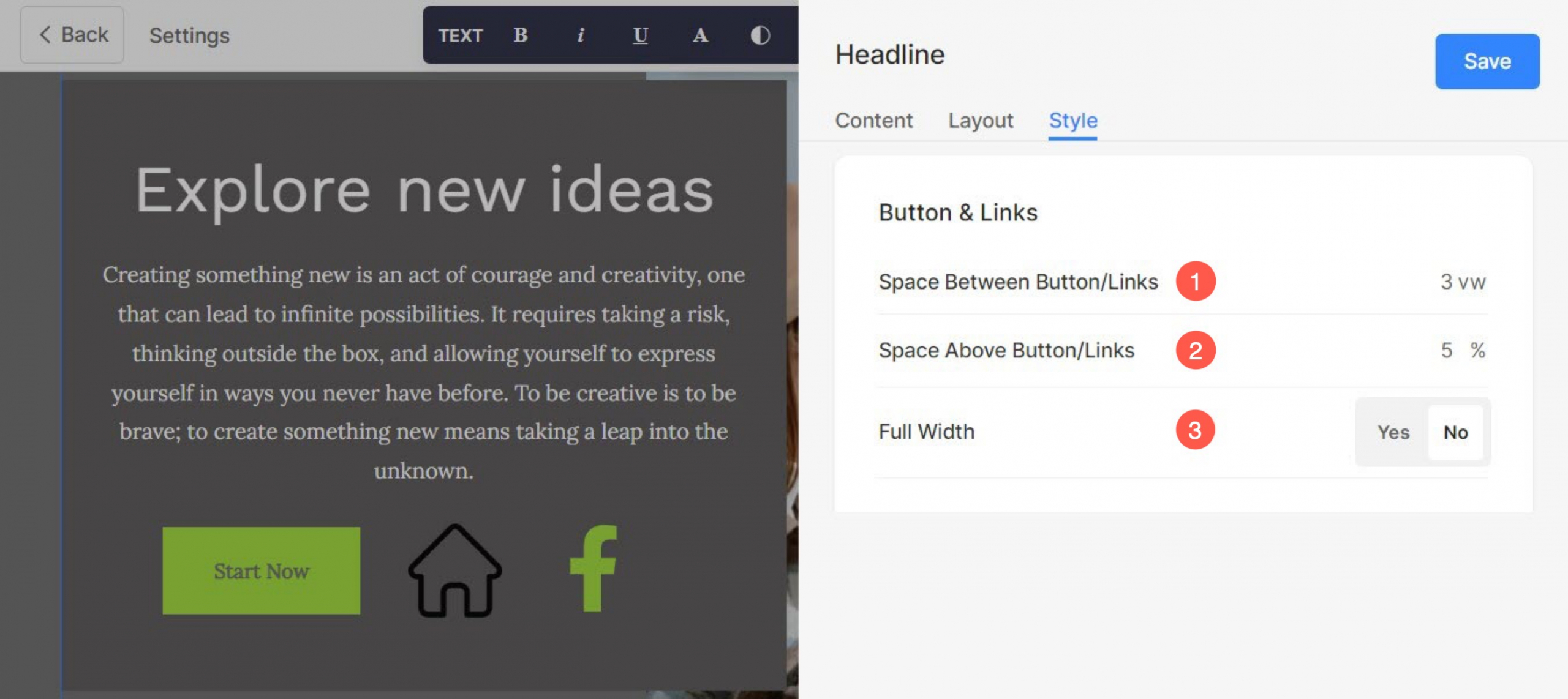
Buttons & Links
You can add different types of buttons to Headline section. They are as follows:
- Normal Button (1), Image Button (2), and Icon Button (3).

- Specify the Space Between different Buttons / Links.
- Specify the Space Above Button / Links inside the Text Card.
- Set the Width of Button inside Text Card.
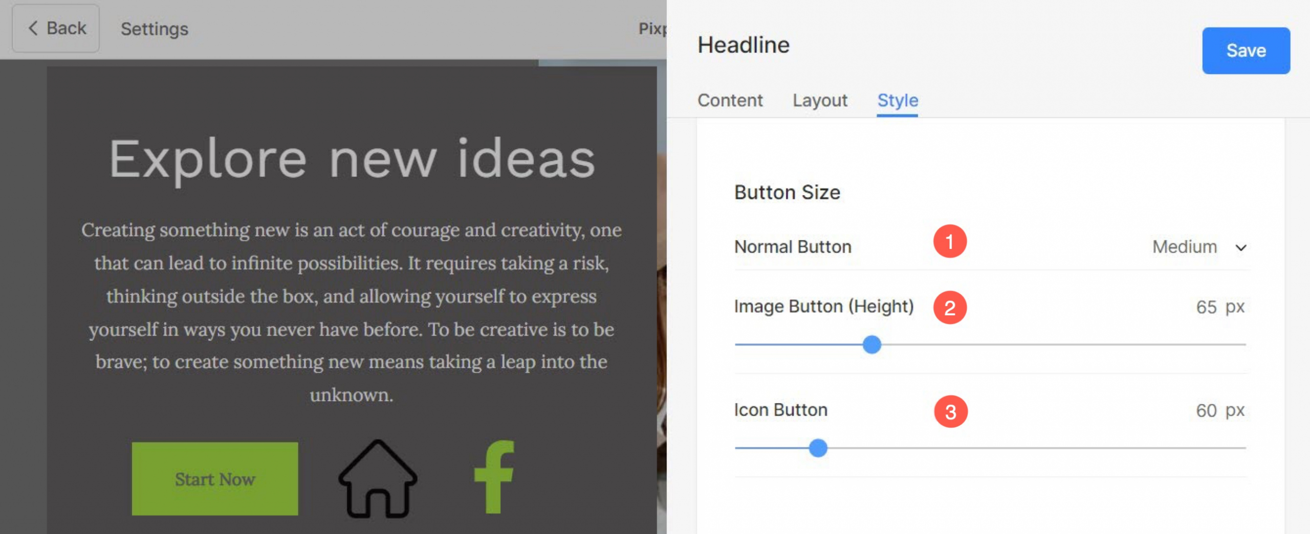
Button Size
- Set the Size of Normal Button. You can chose from three options : Small, Medium, and Large.
- Specify the Height of Image Button in pixels.
- Set the Size of Icon Button in pixels.
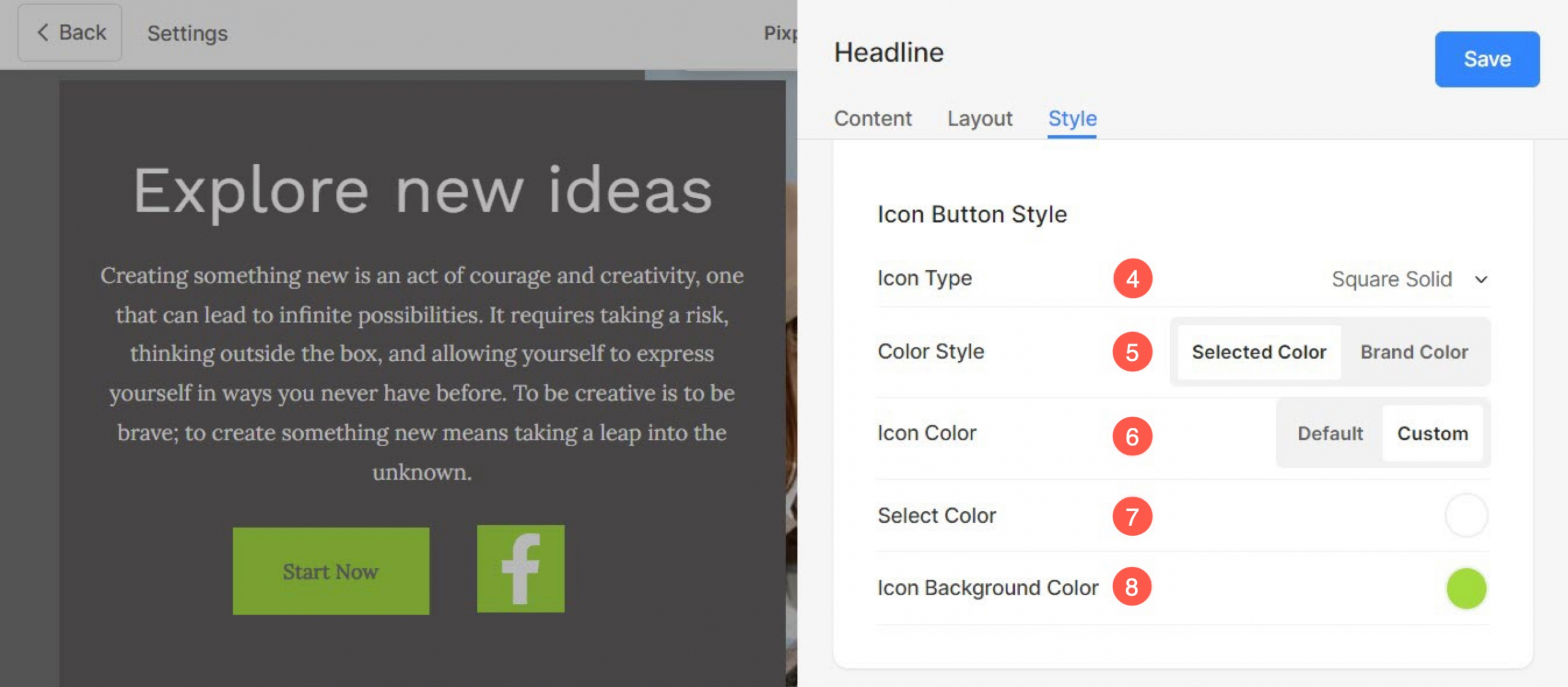
- Set the Icon Type for the Icon Button.
- Choose the Color Style for Icon inside button. You can select the icon’s brand color or specify any color of your choice.
- Set the Icon Color of Icon button. You will see this option only when you enable Selected Color (28) option.
- If you have selected Custom in previous step (29), you can set your preferred color for Icon inside the button.
- Select the Background Color for the Icon Button.
See how the Corner Radius works: