Pixpa gives you the option to add an image gallery to a page using the Galleries section. This section can be used if you want to display a set of images using some layout.
The fundamental way to display a set of images is through using the Gallery menu item. But in case you wish to add more content (other than images) to your Gallery, you can use this Galleries section.
The Galleries section offers fixed grid layouts, dynamic grid layouts, block pattern layouts, or full image layouts.
The mobile view of the galleries section is based on the settings that you have made in the Settings tab.
In this article:
- What is a Galleries section?
- Add Gallery section to a Page
- Delete Content from Gallery
- Add Content to Gallery
- Manage Gallery Content
- Manage Gallery Settings
- Change Gallery Layout
The Gallery section
- Add a gallery section to your page to showcase your galleries.
- You will be able to upload your images, add Youtube / Vimeo videos and text slides in the galleries section.
- Using other sections, you can also add a description to your gallery and add multiple galleries on the same page.
- This way you can easily create a portfolio page with multiple galleries on same page.
Add a Gallery Section
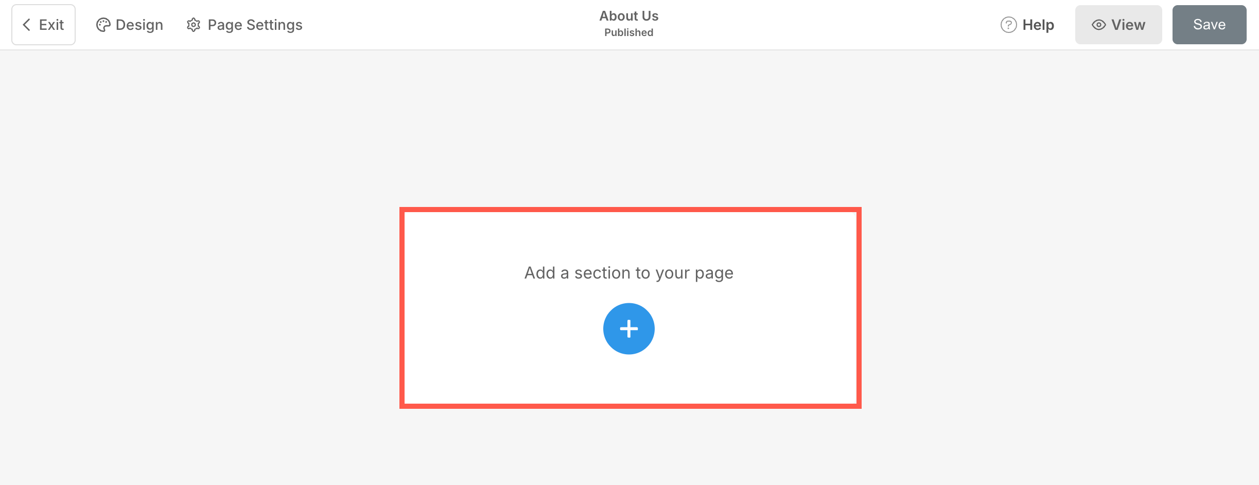
- A section can be added to a page. You can either add a section to an already existing page or create a new page within your website.
- On your page, click on the blue + icon to add a New Section to your page.
- You will now see the section categories on the left side.
- Choose the Content (1) category and click on the Gallery tab (2) where you can choose from different layouts of the Page Gallery section.
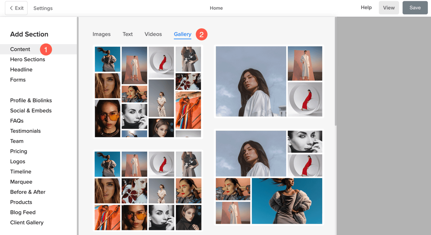
- Choose any section layout and click on it to add it to your page.
Delete content from Gallery
- Click on the Edit Gallery (1) button to open the gallery editing panel.

You’ll see some sample images added to the gallery. To remove the images:
- Click on Select All (2) option or manually select each image by clicking on it.
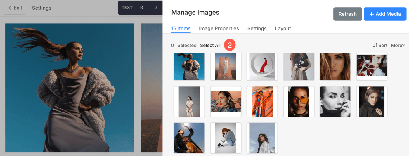
- Clicking on Delete (3) option will open a confirmation pop-up. Confirm the action by hitting the Delete button.

All the selected images will now be removed from the gallery.
Add Content to Gallery
- Click on the Add Media (1) button.
- You will have the option to add images, videos, and text slides to the gallery.

- Save your changes.
Manage Gallery Content
- Once you have added the content, you can easily manage it.
Check: Manage Items in a Gallery
Gallery Settings
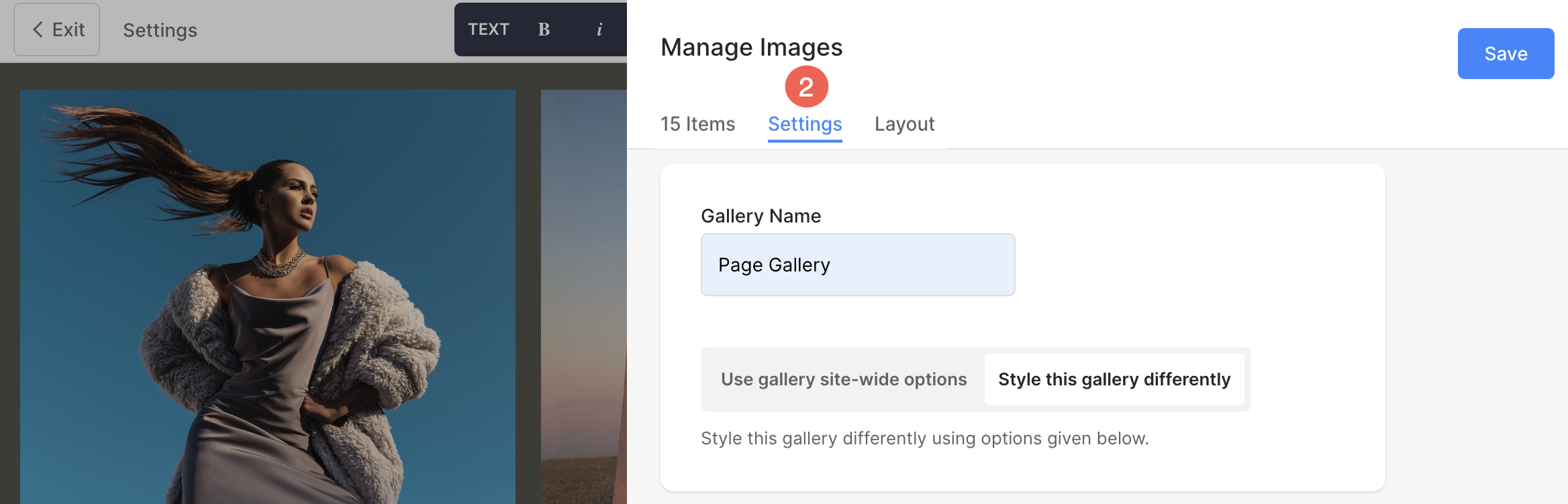
- To visit the gallery settings, click on the Edit Gallery (1) button.
- Then, click on the Settings (2) tab.
You will see the following options here:
- General Settings
- Grid Style Settings
- Image Title Settings
- Image Border Options
- Lightbox Options
- Mobile Display Settings
- Watermark Option
General Settings
- Specify the Gallery Name (1).
- Choose Gallery Style option (2) from here. You have two options:1. You can choose the Gallery Site-wide options in which all the settings will be picked up from Global Gallery Design section.2. If you want to customize the galleries individually, choose Style this Gallery Differently option.

Grid Style Settings
- Grid Spacing : Specify the gutter space between the images in grid layouts. (0 – 250 pixels)
- Corner Radius : Apply a border-radius to make the image corners rounded in the gallery grids.
- Base Color : The base color is used for grid formation and is visible only momentarily before the images are loaded. You have two options for the grid base color.
- Specific Color : Choose this option to set a specific color for the grid base. Specify any color and opacity for the grid base.
- Accent Color : Use image accent colors for the grid base. This will give a multi-colored grid using the accent colors of each image.
- Base Opacity: If you have selected the base type as the accent color, set the grid base opacity from here.
- Hover : This affects the grid when the cursor is hovered over the image.
- Pick Color : Set a specific color and its opacity if you have selected Hover Color for your grid images.
- Accent Color : Use image accent colors for the grid base. This affects the grid when the cursor is hovered over the image.
- Hover Opacity: If you have selected the hover type as the accent color, set the grid base opacity from here
- Hover Effect: The hover effect will be used only in the grid layout. You can choose from different hover effect options on hover in grid mode.
- Hover Icon: Hover icons are also used in grid layouts of galleries. You can choose to show an icon to your images in grid mode.

Image Title Settings
- Font: Choose a font style to display the image titles.
- Color: Set a preferred color for image titles.
- Font Size: Specify the image title font size (in pixels).
- Letter Spacing: Specify the space between letters of image titles (in em).

Image Border Options
- Enable / Disable border around the images by switching the toggle.
- Choose to have a common border on all sides of images or you can specify the borders separately for each side.
- Specify the width of the border. If it is set to 0, then the border will not appear. You also have the option to set the border width individually for each side of the image.
- Select the Border Color from color picker.
- Select a preferred Border Style from the dropdown.
- Determine the border width for mobile devices, aligning it with the width chosen for desktop.

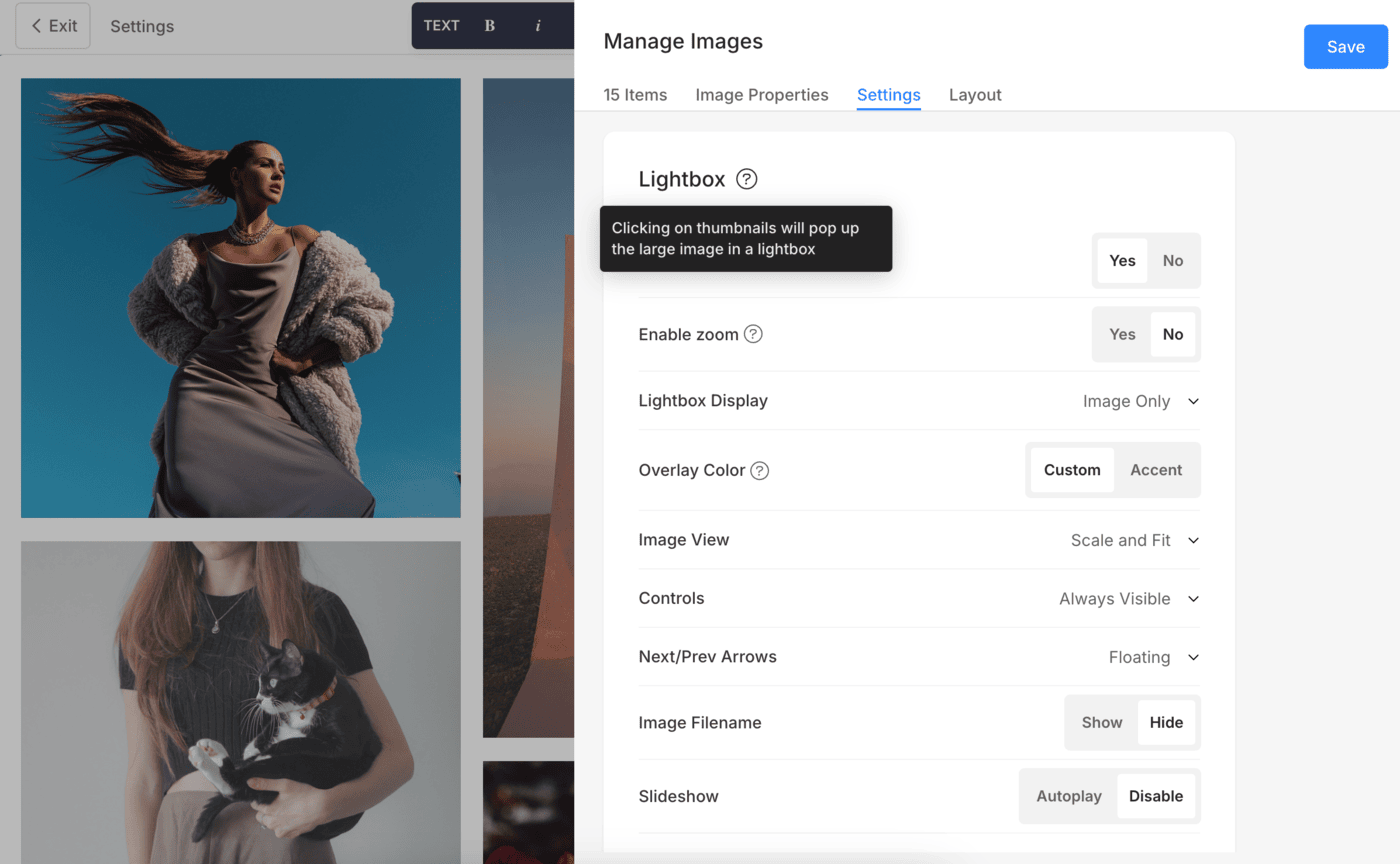
Lightbox Display Settings
By enabling lightbox mode, you can open the image in a large image viewer that allows a more detailed view.
To learn more about Lightbox Settings, click here.
Mobile Display Settings
- Show as: Choose to show the gallery as an Image Slider or in grid mode in the mobile view.
- Grid Columns: Choose from 1 column or 2 column view for grid display in mobile view.
- Grid Gutter: Set the spacing between images in the mobile view.

Finally, Save (4) the changes.
Watermark Option
You can easily add watermarks to your images in order to safeguard your creative work and maintain your brand identity.
- Click on the Select List (1) option.
- A dropdown will appear allowing you to choose from the list of watermarks (2) that you have created.
- Select a watermark and Save (3) the changes.

Learn more about Watermarking images.
Change Gallery Layout
To change the gallery layout:
- Click on the Edit Gallery (1) button.
- Choose the Layout (2) tab, and select the layout (3) for the desktop view.
- Save (4) your changes.
