Using a Banner adds visual flair to your website and adds character to your content whether it’s a gallery, page, folder, client album, or blog. You can add the image alt text to the banner images, this helps in SEO.
Banners can be placed either on top or bottom of your content (under the website header) and are typically used to show a full-width banner image/image slideshow/video.
Here’s what a Banner looks like:

The Banner settings are categorized as:
1. Content
The options under the content category are:
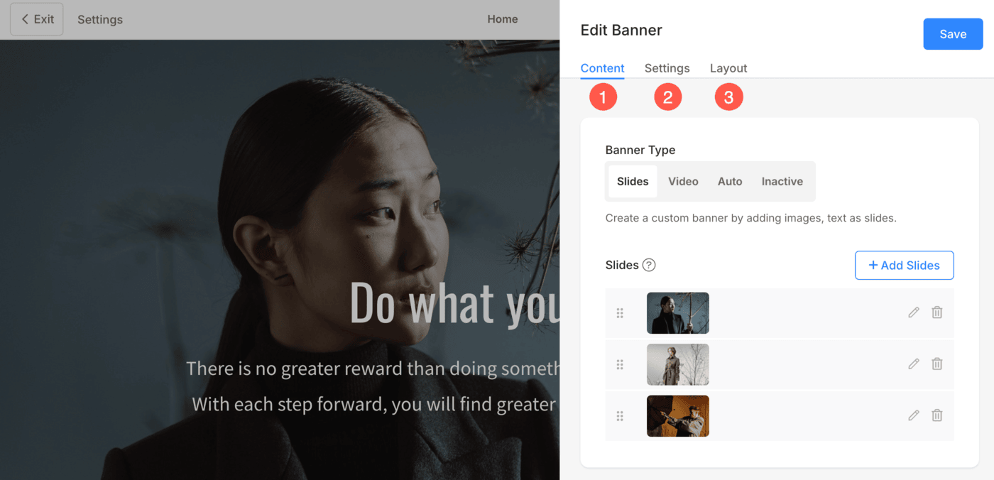
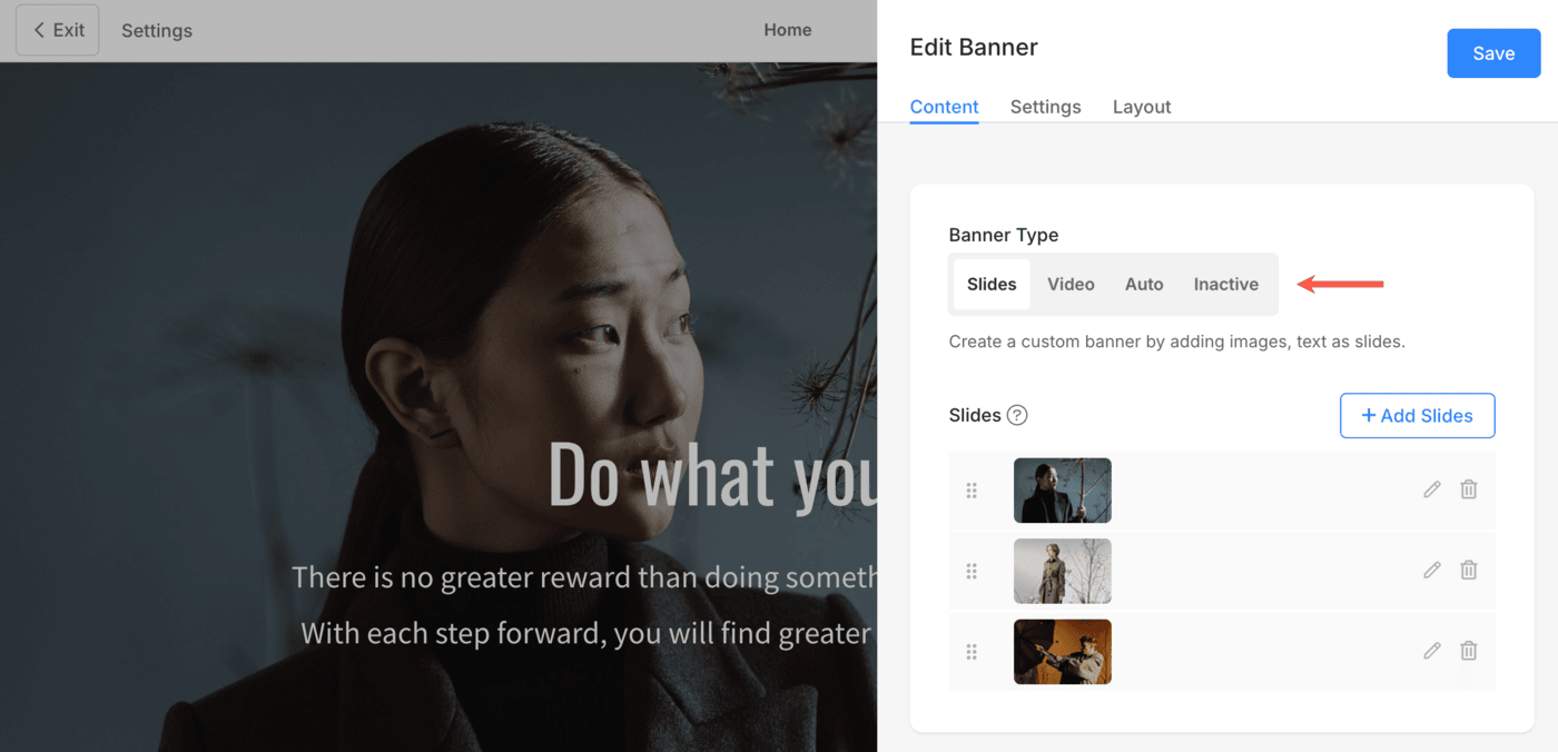
Banner Type
Select the type of banner. You can choose any of the following options:
- Slides – Select Slides option if you want to display images in the banner. You can add multiple image slides under one banner.
- Video – If you want to display videos as banner slides, then select this option. Under each banner, you can add multiple video slides.
- Auto – The gallery’s featured image, headline, and description will be used for the banner. It will be automatically created by the system.
- Inactive – The banner will not be visible on the website.
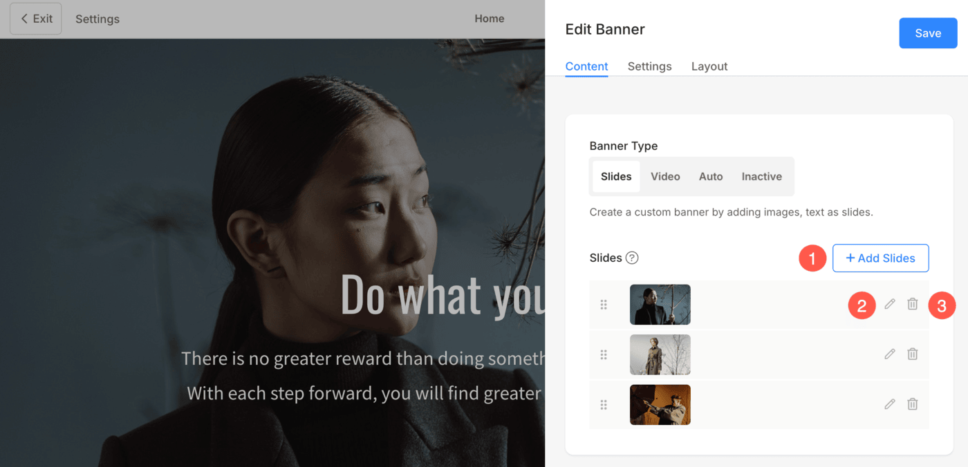
Slides
- Click on the +Add Slides (1) button in order to add the custom slides to the banner.
- Once you have uploaded the slides, you can edit (2) or delete (3) the slide.
Edit Image/Text Slide
- Once you have clicked on the edit icon, you will see the Image/Text Slide drawer.
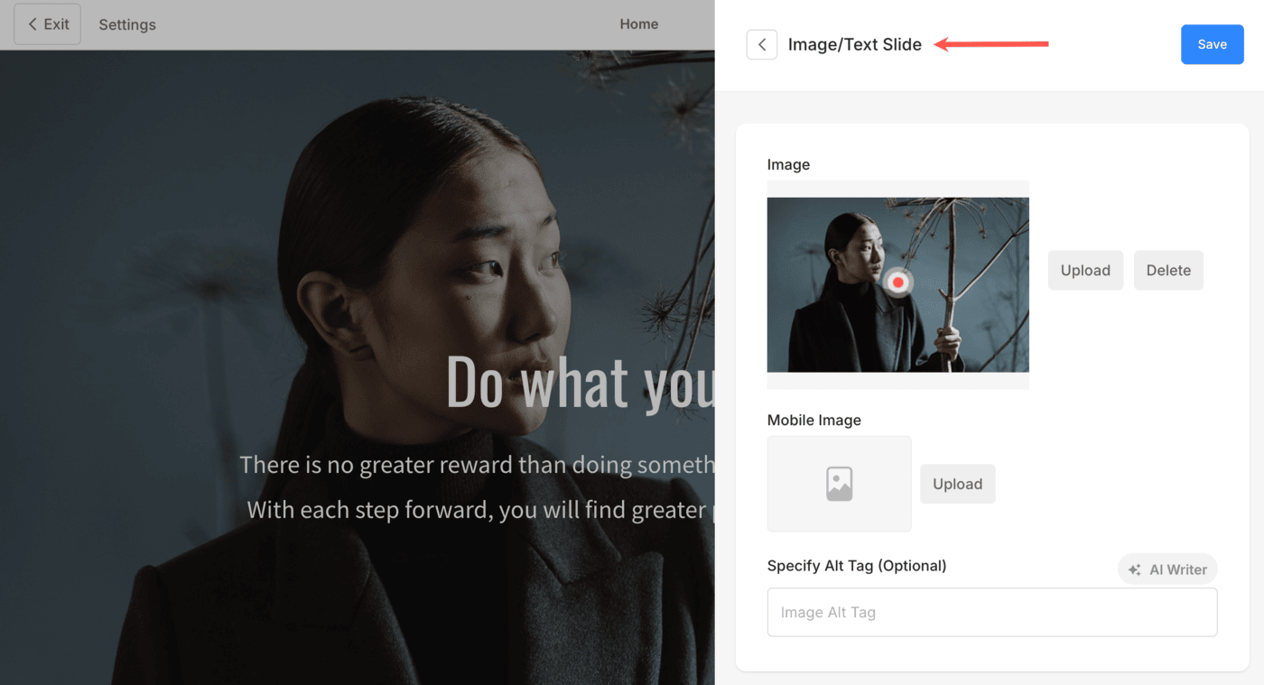
The options available here are:
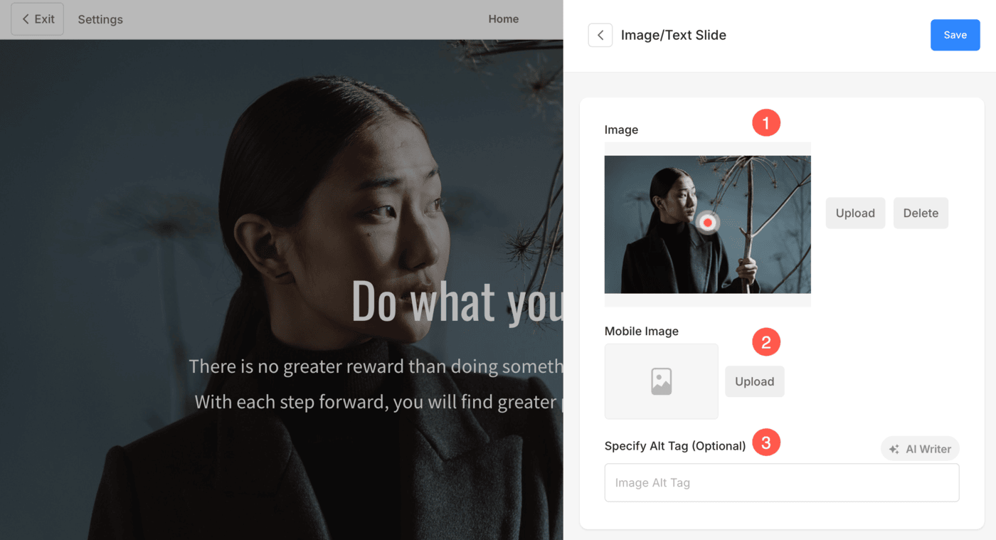
- Image
- Click on the Upload button to change the image/slide. Click on the Delete button to delete the slide.
- Change the focal point of the image just by clicking on the image anywhere.
- Mobile Image – Upload a mobile banner image. We recommend adding portrait images here.
- Specify the Alt Text for the image slide. This helps for SEO purposes.
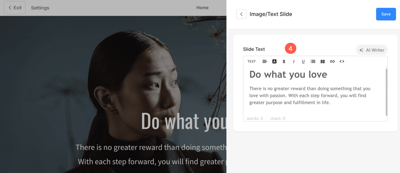
- Slide Text – Enter the slide text which will appear over the slide. You can make the text bold, italic, underlined, link it, and do much more.
Also See: The Pixpa text editor.
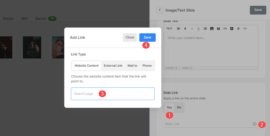
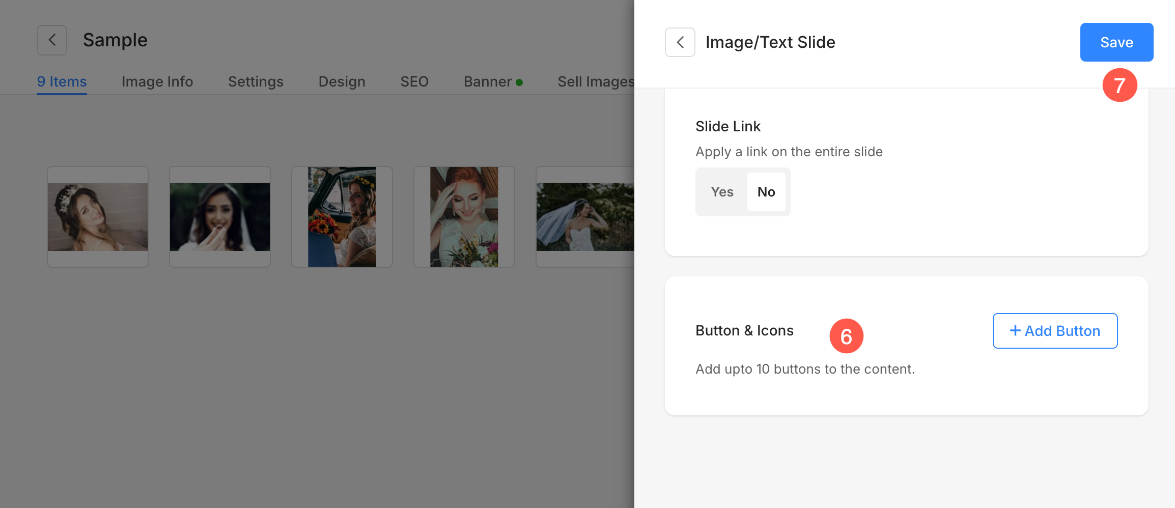
- Slide Link
-
- Click on the settings icon and enter the overlay link for the slide.
- You can specify any page inside/outside your website, your email, or a contact number.
Also Check: Linking text/button.
- Button & Icons
-
- Add up to 10 buttons/links to the slide content.
- You can add a normal button, text link or use an image/icon as a button.
Also Check: Button & Links.
- Hit the Save button to save your changes.
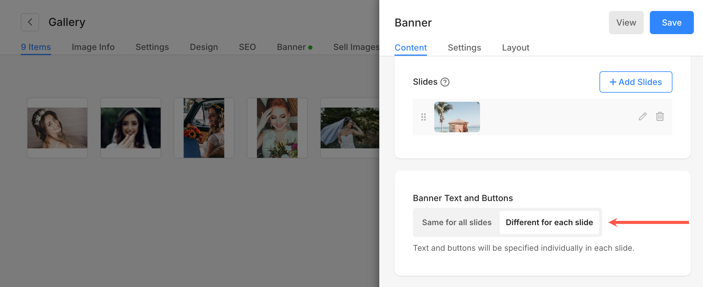
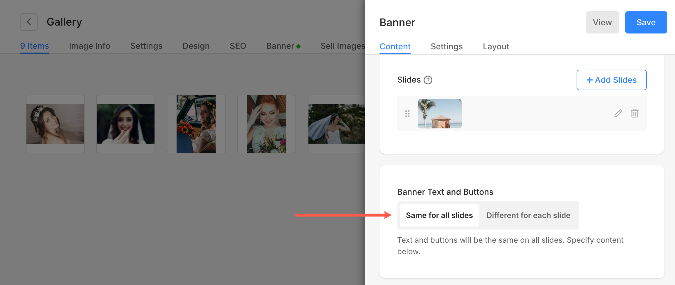
Banner Text and Buttons
- Specify whether the text and the buttons will be the same for all the slides or different for each slide. When you select the Same for all slides option, the banner text and Button 1 & 2 will be used.
- When you have selected the Different for each slide option, the text and buttons specified for a particular slide will be used.
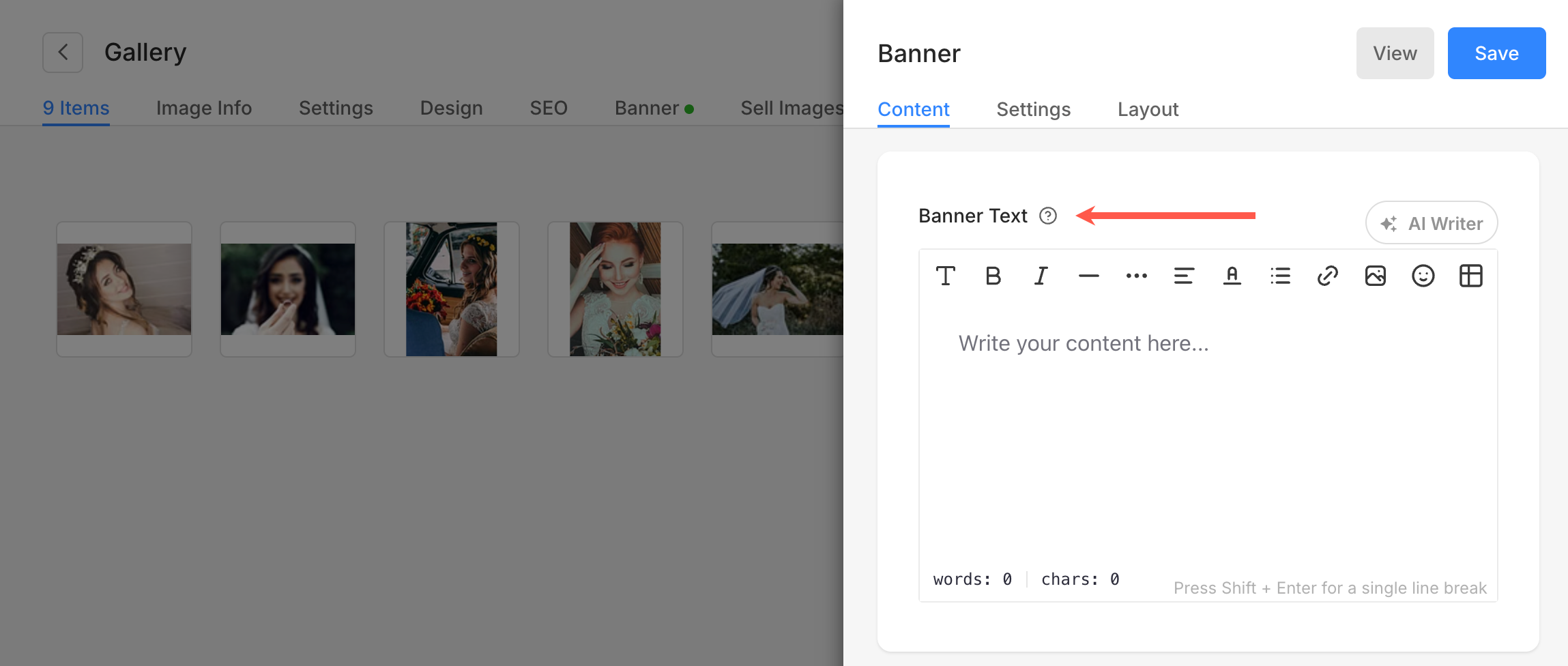
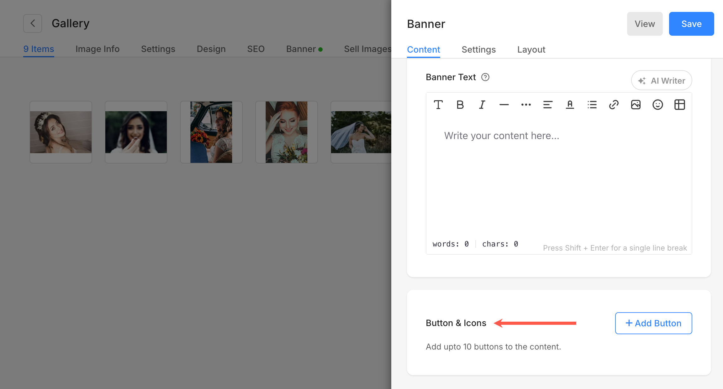
Banner Text
- Enter the banner text which will be common for all the slides.
Also See: The Pixpa text editor.
Button & Icons
- These buttons/links appear over your banner slides (common for all slides).
Also Check: Button & Links.
2. Settings
Under the Banner Settings tab, you get the following options:
- Banner Display Options
- Site Header Behaviour
- Banner Visibility
- Styling Options
- Banner Slideshow
- Buttons & Links
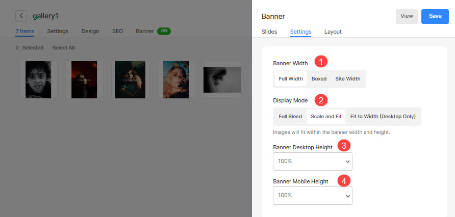
Banner Display Options
- Banner Width – Specify the width of the banner.
- ‘Full width‘ will display the banner while covering the entire width without leaving any margin.
- ‘Boxed‘ will display the banner while leaving some amount of padding on right and left of the screen.
- ‘Site width‘ can be specified in the Design section. You can specify a fixed width there.
It will display the banner by adhering to the fixed width specified.
-
- Scale and Fit – Images will fit within the banner width and height.
- Fit to Width (Desktop Only) – Images will be scaled to banner width. Banner height will inherit the image height.
- Banner Desktop Height – Specify the desktop banner height if you have chosen the full bleed or scale and fit option in the Display Mode field.
- Banner Mobile Height – Specify the mobile banner height.
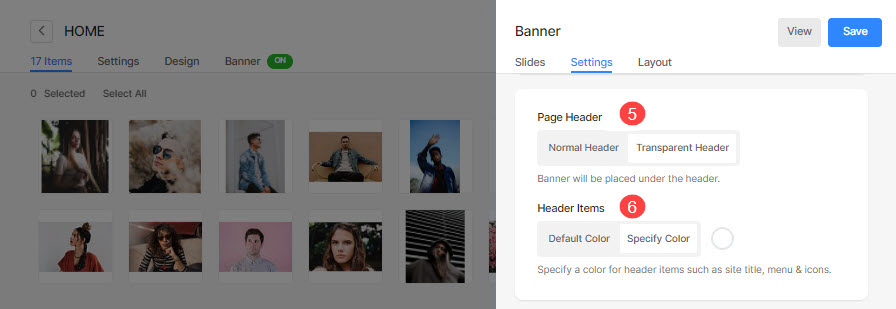
Site Header Behaviour
- Page Header – Select the header style that will be applied over the banner.
- In case, you have selected Default, the header will use the default website header style and the banner will be placed after the header. Check out a live example.
- In case, you have selected Transparent, the header background will be set as transparent and the header elements will be white. The banner will be placed under the header. Check out a live example.
- Header Items – If you have set the header to be transparent, you can choose the header items/menu items color:
- In case Default Color is selected, the header items color is inherited from the Design section.
- In case Specify Color is selected, you can click and choose the header items color.
Also Check: Styling the Header items of any page.
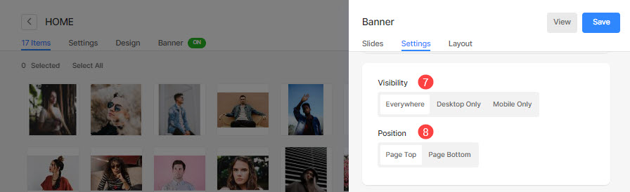
Banner Visibility
- Visibility – Set the visibility of the banner.
- Position – Specify the position of the banner.
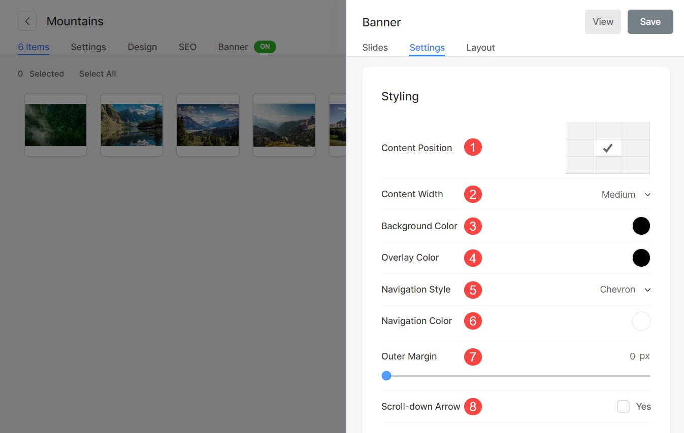
Styling
- Content Position – Specify the content position over the banner.
- Content Width – Specify the width for the banner content.
- Background Color – Set the background color for the banner.
- Overlay Color – Set the overlay color for the banner.
- Navigation Style – Specify the navigation style of the banner. You can select from Chevron, Long Arrows, and Short Arrows. Select None if you want to disable the navigation controls.
- Navigation Color – Specify the color of navigation controls on the banner.
- Outer Margin – Apply the outer margin for the banner. When the outer margin is applied, free space occurs at the bottom of the banner.
- Scroll-down Arrow – Select this option to show a scroll-down arrow over the banner.
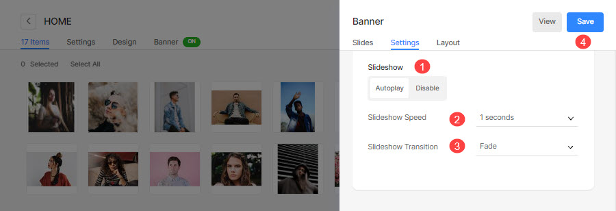
Slideshow
- Slideshow – Choose the Autoplay option to enable slideshow for the banner.
- Slideshow Speed – Specify the slideshow speed (in seconds).
- Slideshow Transition – Specify the image transition style for the banner.
- Finally, hit the Save button.
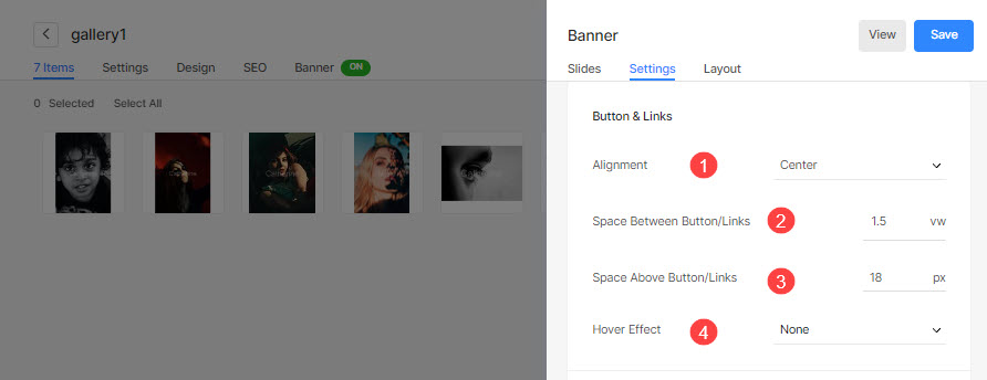
Button & Links
- Align the button/links to be left, right, or center aligned.
- Specify the Space Between the Button/Links that have been added.
- Specify the Space Above the Button/Links.
- Choose the Hover Effect for the button/links.
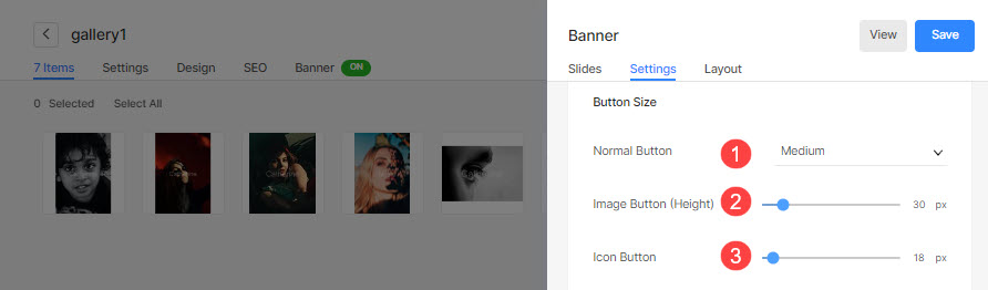
- Choose the size of the Normal Button that you have added in the Button/Links.
- Specify the height of the Image Button if you have added an image link in the Button/Links.
- Specify the size of the Icon Button if you have added a social icon in the Button/Links.
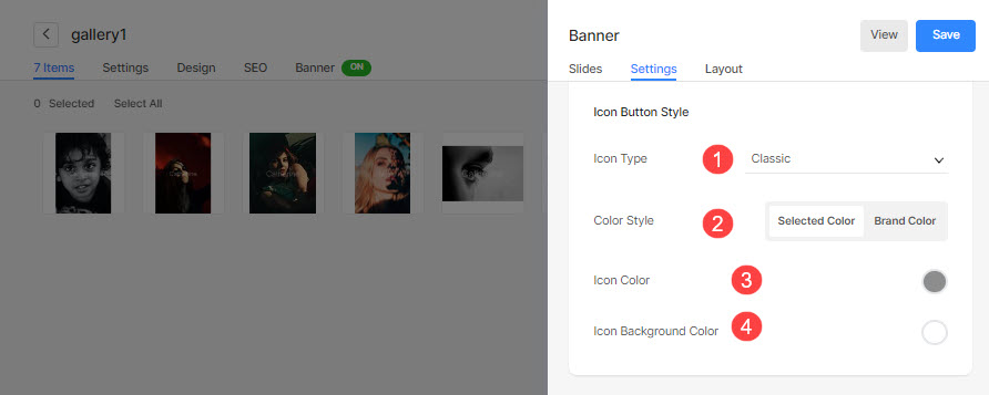
If you have added a social icon in the Button/Links, then:
- Choose the Social Icon Type/Shape.
- Choose the Social Icon Color Style.
If you have chosen the Selected Color option above then:- Specify the Social Icon Color.
- Specify the Social Icon Background Color.
3. Layout
You can easily change the layout of a Banner. Know more about the banner layouts.