The Before & After Images section describes a pair of images showing the differences. Two images are to be uploaded into the section, one for the before stage and the other for the after stage.
You can customize the slider to be horizontal or vertical. For suppose, you can add images of a cat before and after trimming.
In this article:
Add a Before & After Block:
- A section can be added to a page. You can either add a section to an already existing page or create a new page within your website.
- On your page, click on the blue + icon to add a New Section to your page.
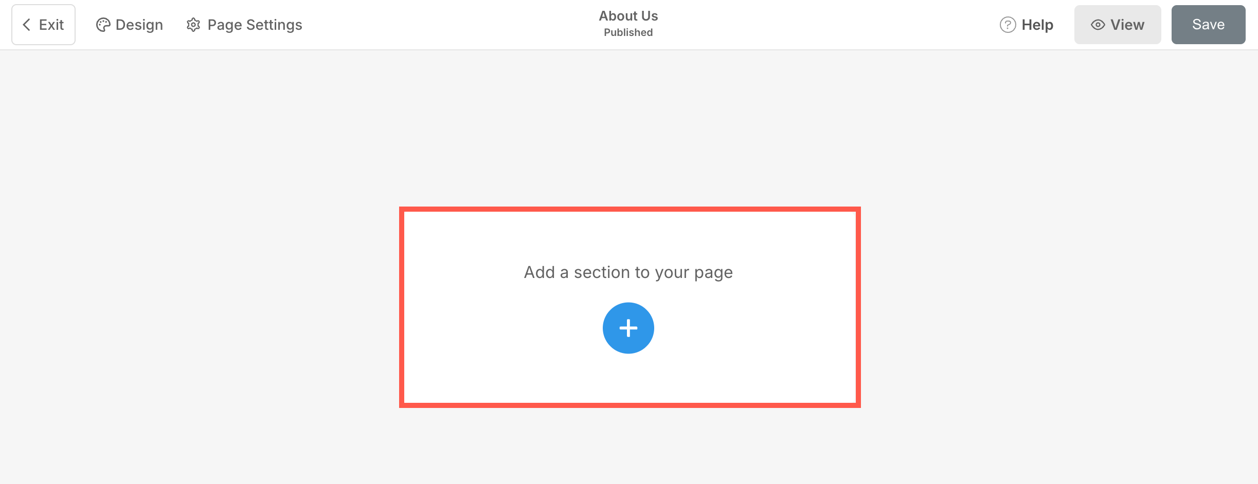
- You will now see the section categories on the left side.
- Choose the Before & After (1) option where you can choose from the different layouts (2).

- Choose any section layout and click on it to add it to your page.
- As the section is added, you can edit the text and upload images.
Managing the content
Once you have added the section:
- Click on the Manage Before & After (1) button to open the right drawer (2).
 From here, you can:
- Upload a Primary Image (1) for the before-view.
- Upload a Secondary Image (1) for the after-view.

- Add a Title (3), Subtitle (4), and Description (5) for the section. Before adding the description, check this article.

- Add any type of Link (6) to the section. You can add a Button/Image link/Social Icon/Text Link. Learn more.
- You can duplicate (7), edit (8), or delete (9) the existing button.
- Save (10) your changes.

Button & Links
- Add any type of link to the section. Click on the + Add Link button to add the link.
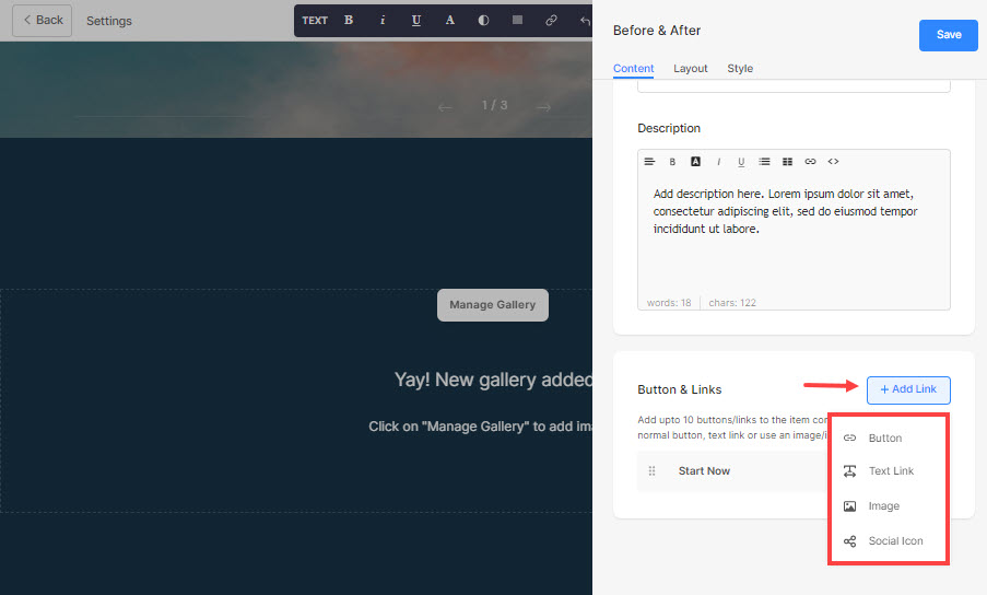
- The + Add Link option provides four ways to add a link:
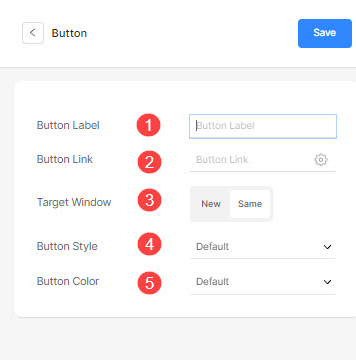
Button
Add a button to the list item. You will be able to update:
- Button Label – Set the button label.
- Button Link – Specify the link.
- Target Window – Choose to open the page in the same or a new window.
- Button Style – Choose the button style to be the default (set in the Buttons and Links tab of the Design section), Solid, Outline, or a Text Link.
- Choose the button color to be default or invert the color.
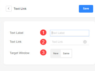
Text Link
Add a text link to the list item.

You will be able to update:
- Set the text label.
- Specify the text link.
- Target Window – Choose to open the page in the same or a new window.
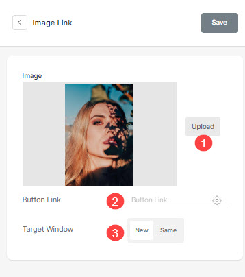
Image
Add an image and link it to any page.

- Once you have uploaded the image, it shows up this way. Click on the link to edit it.

- From here, you can:
- Upload/Change the image.
- Button Link – Specify the link.
- Target Window – Choose to open the page in the same or a new window.
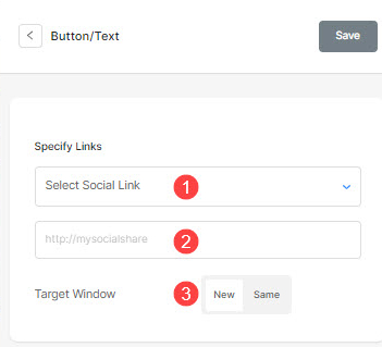
Social Icon
- Add a social icon to the list item.

- You can manage:
- The social icon to be linked.
- Specify your relevant social profile path.
- Target Window – Choose to open the page in the same or a new window.
Managing the layout
- Click on the Manage Before & After button (1).
- Choose the Layout tab (2).
- Select the layout for your section (3) and save the changes (4).

The Style Options
- Click on the Manage Before & After (1) button.
- Choose the Style (2) tab.
- Change the Style for the section elements and Save (3) your changes.

You will have multiple style options for the section:
Images
- Choose to have a common corner radius or a different corner radius for each slide and set a number (in px) for the corner radius.
Using the corner radius field, you can create different shapes of images. In case you specify 500 px here, the image would display in a circle shape.
In case you have chosen split corners, you can set different corner radius for each corner. Know more. - Choose the Slider Direction to be horizontal or vertical.
- Specify the Slider Start Position in percentage. The slider can be moved to the left/right to view a particular slide.

- Align the content of the section horizontally to be left, right, or center aligned.
- Align the content of the section vertically to be top, bottom, or center aligned.
-
Specify the Arrow and Handle Bar (slider) Color.

Size & Space
- Specify the Image Width for the before and after images.
- Specify the Space between image and text (in %).
- Specify the Space below the title (in %).
- Specify the Space below the Subtitle (in %).

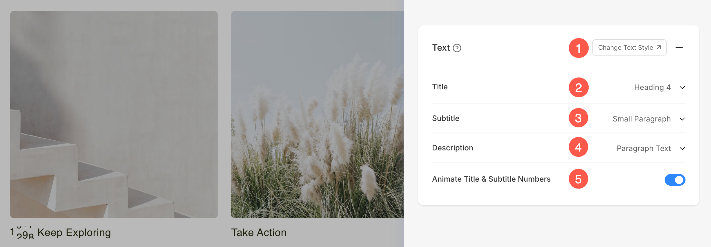
Text
- Click on the Change Text Style button to visit the Design section and manage your font sizes and styles.
- Set the Title font style for this section.
- Set the Subtitle font style for this section.
- Set the default Description font style for this section.
- Enable this option to animate any numbers present in the Title and Subtitle fields. When turned on, numeric values will appear with a dynamic counting animation, making them more visually engaging.
Button & Links
- See how to manage the styling of buttons & links.

For suppose, you have added an Amazon social link in the Button/Links, and specified the icon color as Red and the icon background color as Green, then the icon will show up as below:
