Pixpa gives you a lot of control over how to display images in your galleries.
Using the gallery style options, you can fully control your images’ display in the gallery in conjunction with the gallery layout.
In this article:
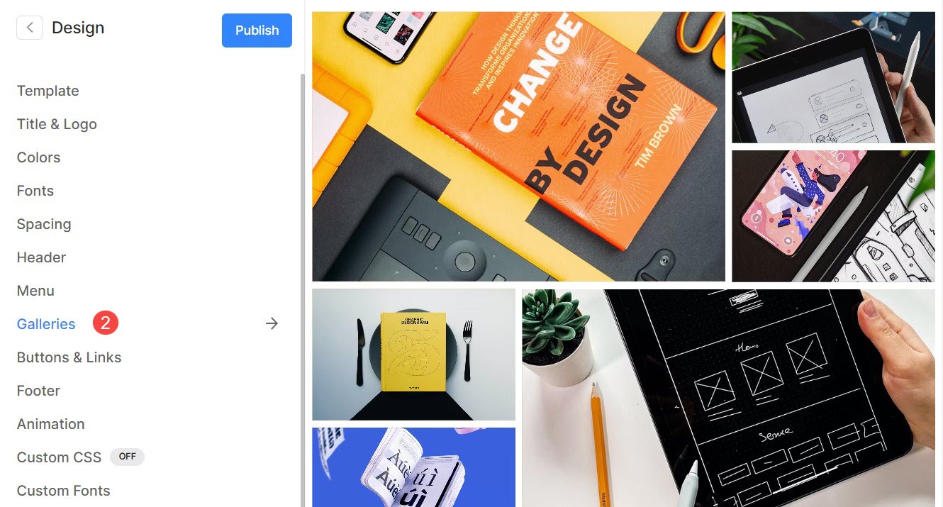
You can customize the sitewide gallery options from the Design (1) section.

Once you are inside the Design section, click on Galleries (2) tab.
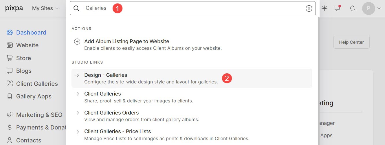
Alternatively, you can also use the studio’s search option.
- Enter Galleries (1) in the Search Bar.
- From the related results, click on the Design – Galleries option (2).
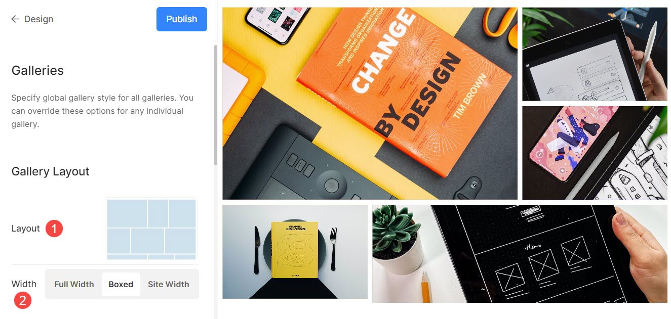
Gallery Layout
- Layout : Choose a layout that will be applied to the gallery.
Learn how to change the gallery layout. - Width : Choose the gallery width.
- ‘Full width‘ will display the gallery while covering the entire width without leaving any margin.
- ‘Boxed‘ will display the gallery while leaving some amount of padding on right and left of the screen.
- ‘Site width‘ can be specified in the design section. You can specify a fixed width here.
It will display the gallery by adhering to the fixed-width specified.
Grid Style
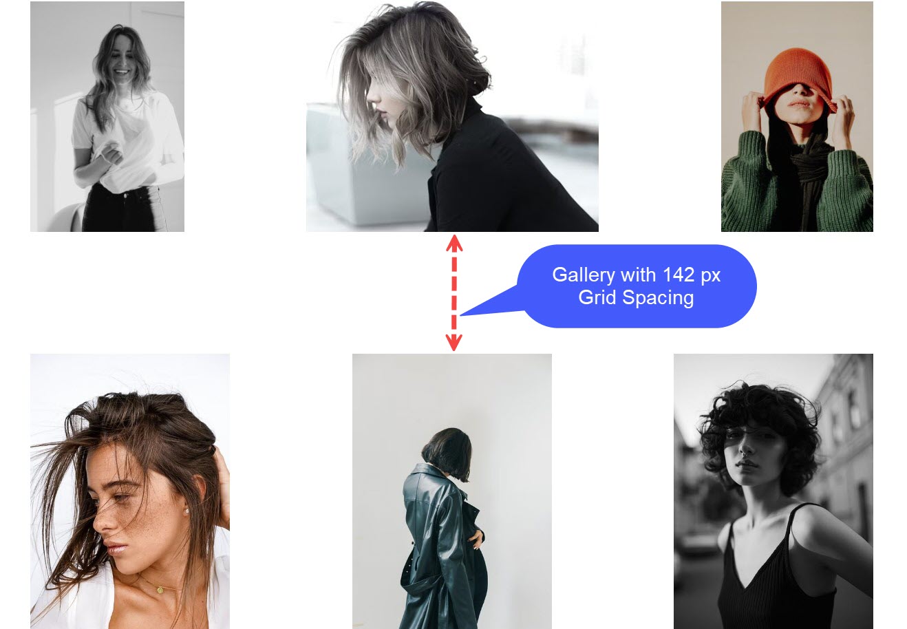
- Grid Spacing : Specify the gutter space between the images in grid layouts. (0 – 250 pixels)
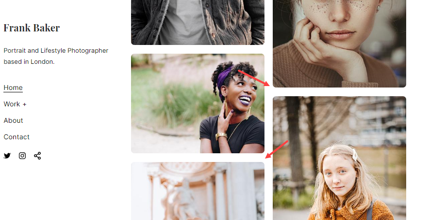
- Image Corner Radius : Apply a border-radius to make the image corners rounded in the gallery grids.
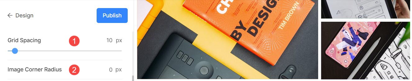
For example, the Lantern theme’s home gallery has 142px grid spacing.
After applying Image Corner Radius, you would see rounded edges to the images as in the Beyond template.
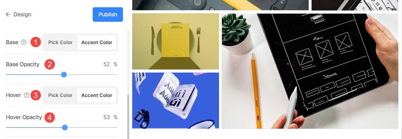
Grid Colors
Base Opacity: If you have selected the hover type as the image accent color, set the grid base opacity from here.
- Base : The base color is used for grid formation and is visible only momentarily before the images are loaded. You have two options for the grid base color.
- Pick Color : Choose this option to set a specific color for the grid base. Specify any color and opacity for the grid base.
- Accent Color : Use image accent colors for the grid base. This will give a multi-colored grid using the accent colors of each image.
- Base Opacity: If you have selected the base type as the accent color, set the grid base opacity from here.
- Hover : This affects the grid when the cursor is hovered over the image.
- Pick Color : Set the default hover color and its opacity if you have selected Pick Color for your grid images.
- Accent Color : Use image accent colors for the grid base. This will give a multi-colored grid using the accent colors of each image.
- Hover Opacity: If you have selected the hover type as the accent color, set the grid base opacity from here.
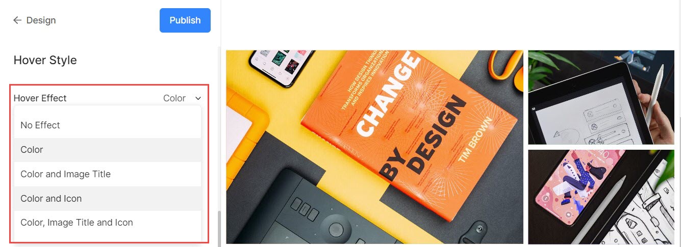
Grid Hover Effect
The hover effect will be used only in the grid layout. You can show the following options on hover in grid mode.
- No Effect – For no effect on images in grid mode.
- Color – For only hover color on your images in grid mode.
- Color and Image Title – For the image hover color with the image title. You can set the hover color and image title text color/font/size/weight in the next option.
- Color and Icon – For the image hover color with an icon.
- Color, Image Title, and Icon – For image hover color, image title, and icon. You can also add icons on your images like plus, arrow, cross, and eye.
Hover Icon
- Hover icons are only used in grid layouts of galleries. You can choose to show an icon to your images in grid mode.
- Options are – plus, arrow, cross, and eye. This is only applicable when the icon is selected in the hover effect dropdown.
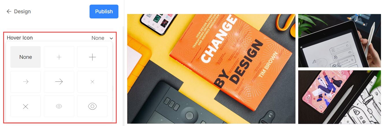
Image Title
- This is applied when you choose to show image titles on hover.
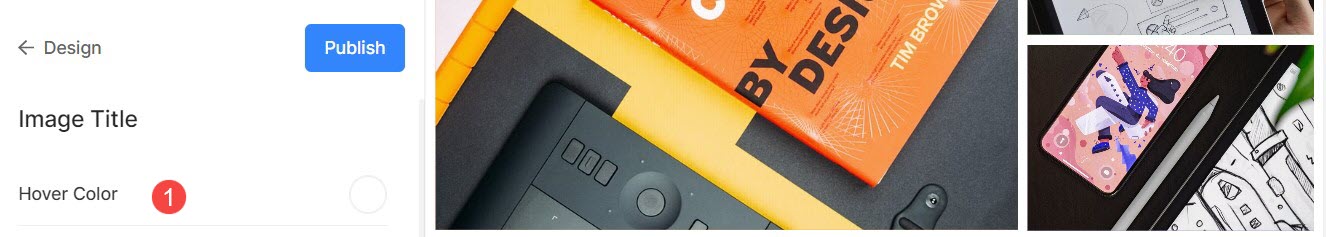
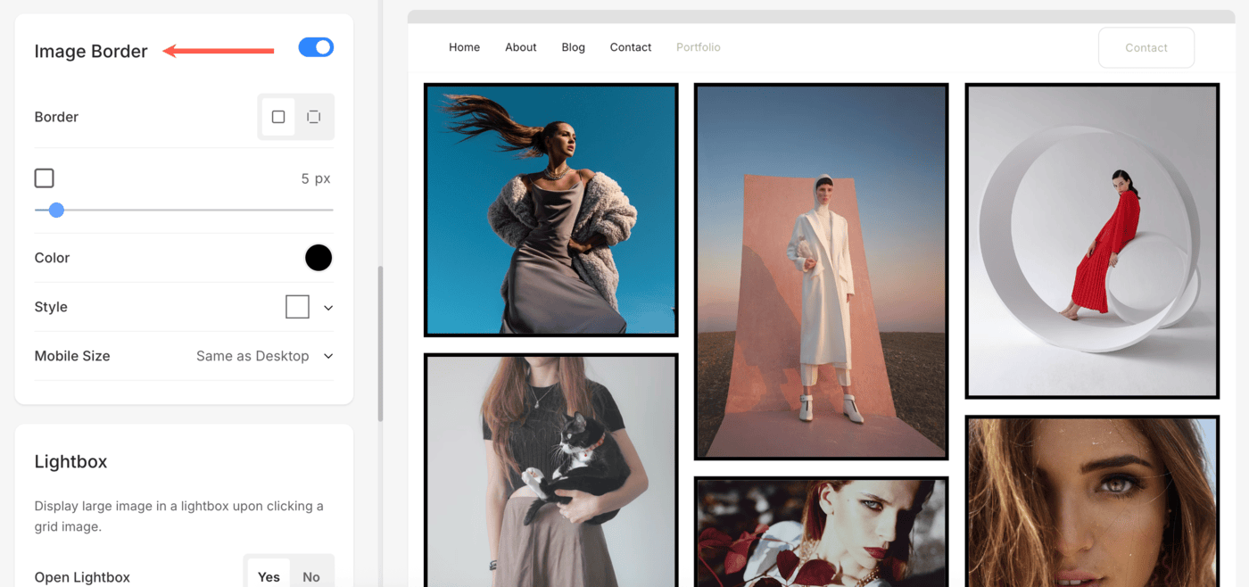
Image Border
Pixpa offers a versatile image border feature that allows you to enhance your website’s visual appeal by adding borders around images. Click here to learn more about Image Border
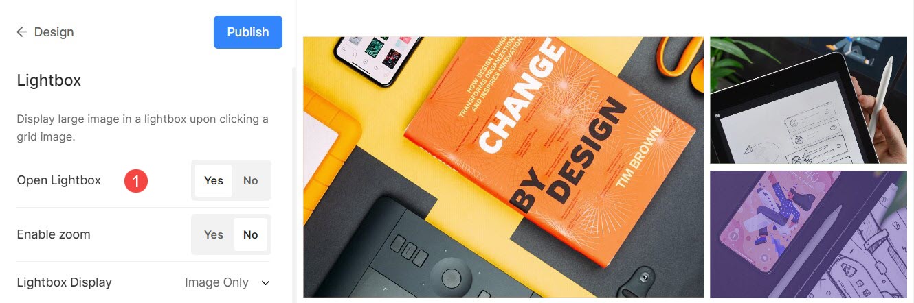
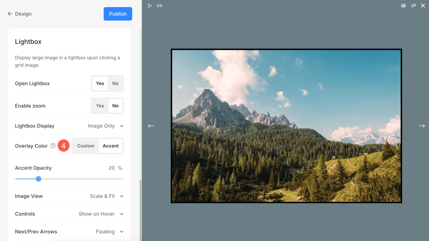
Lightbox Display
1. Open Lightbox
- When images are displayed in a grid, clicking on an image opens it in Lightbox mode (full-image display).
- You can enable or disable this from here.
Check Lightbox mode in action:
2. Enable Zoom
- Enable/Disable zoom over images in Lightbox mode.
- The zoom feature will work on desktop as well as mobile websites too.
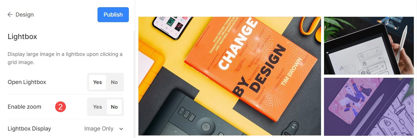
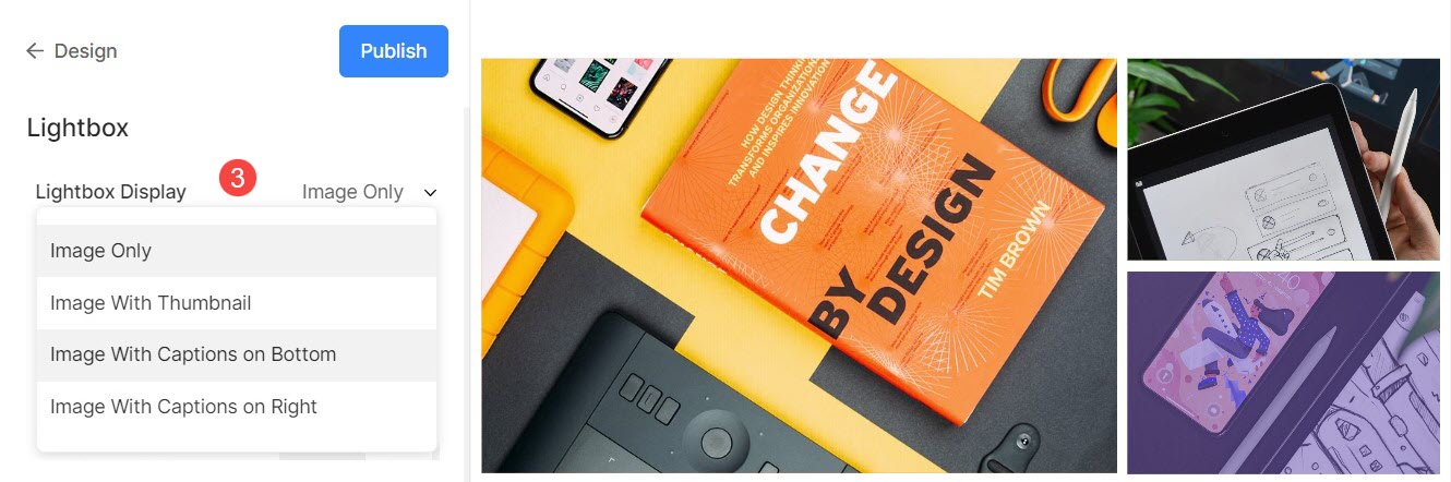
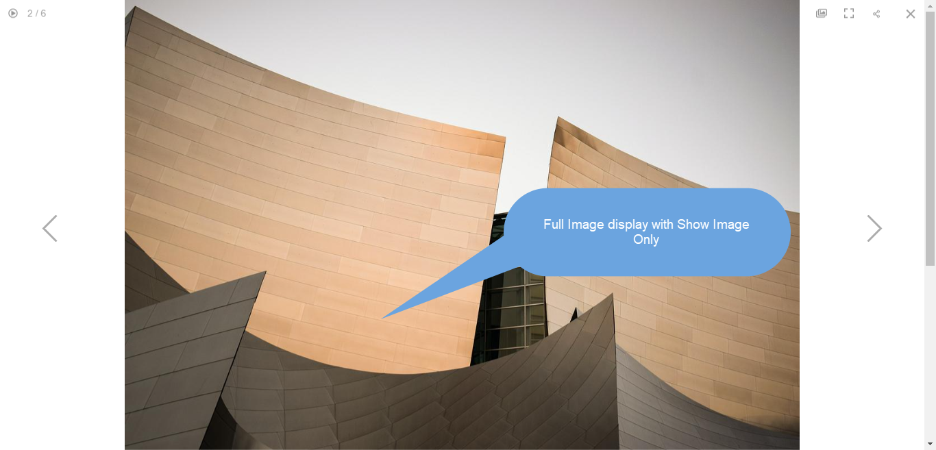
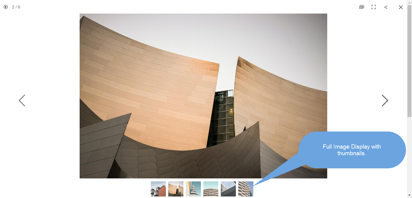
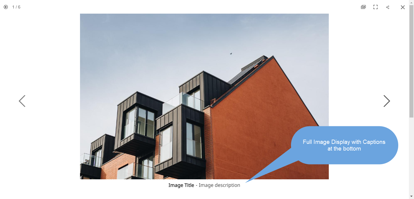
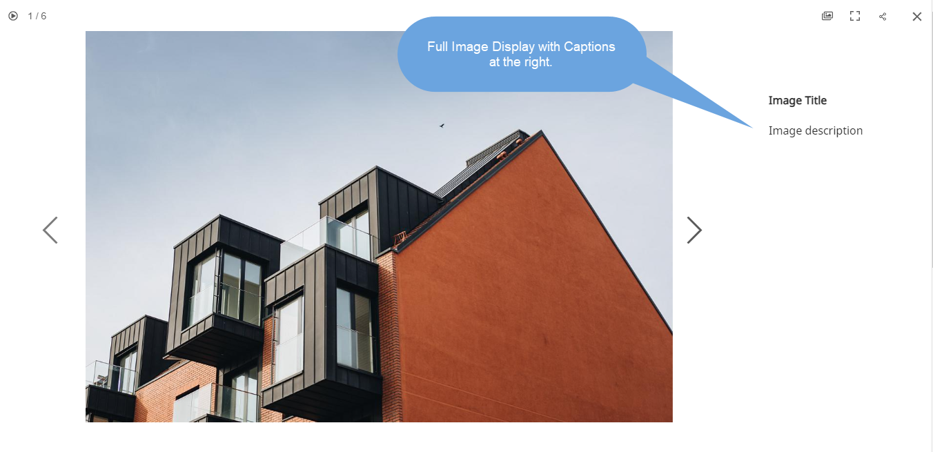
3. Display Options
- Choose how you want to display your images in full image display.
- You can select from show only images, image with thumbnails, image with captions on bottom, and image with captions on right.
For example, a gallery with show image only.
For example, a gallery with show image with thumbnails.
For example, a gallery with show image with caption on the bottom.
For example, a gallery with show image with caption on right.
4. Overlay Color Options
The Overlay Color is the background color that appears when images are viewed in lightbox mode. Adjusting the overlay color can help match the look and feel of your website’s design and provide a cohesive, polished presentation for your images in lightbox view.
- Choose the Custom Color option to set a specific background color for all images viewed in lightbox mode. You can define your preferred color in the Overlay Color setting. Learn more.
- Choose Accent Color to apply a unique color from each image’s accent tones. You can customize this individually for each image as desired. Learn more.
- If you select the Accent color option, you can adjust the Opacity (transparency) of the background color.
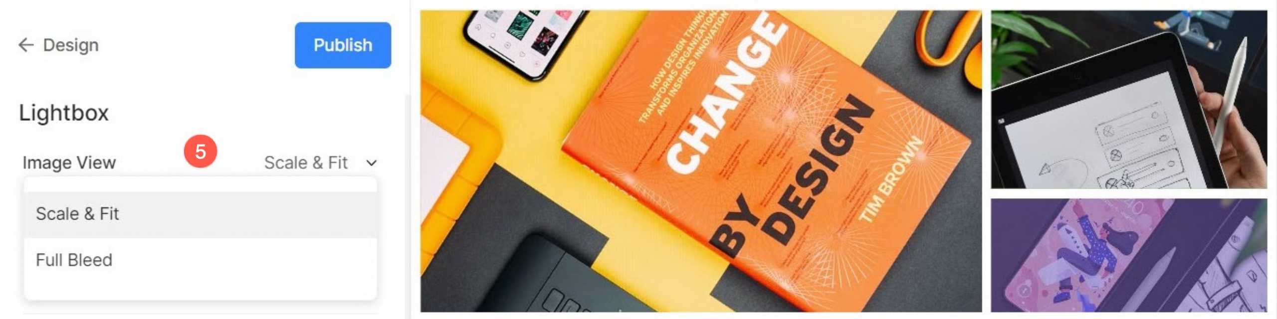
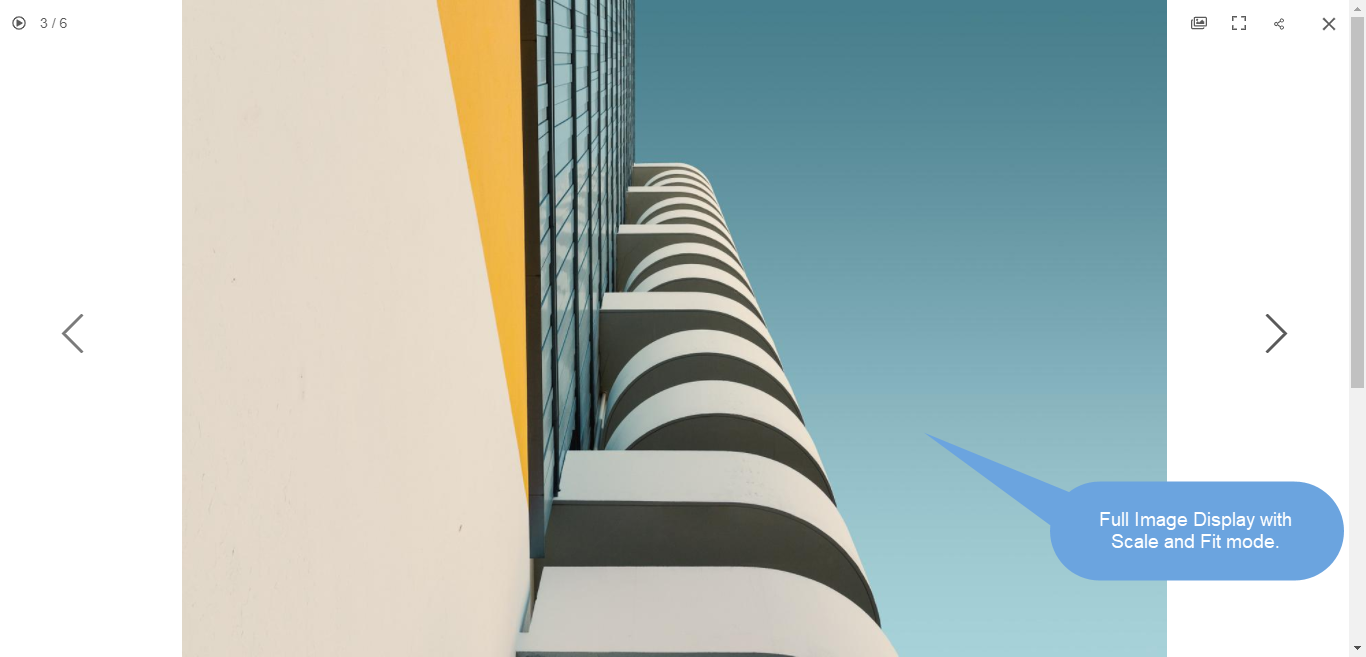
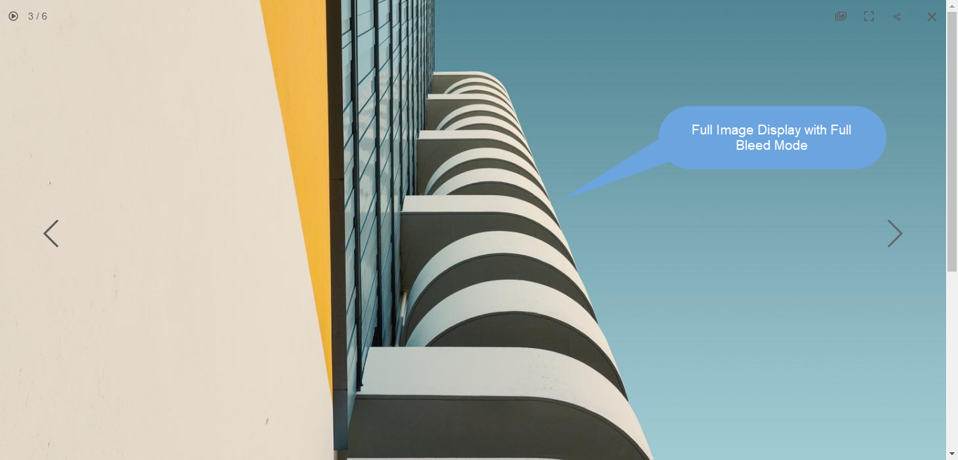
5. Image View
Specify the display mode for the Lightbox –
- Scale and fit – Images would be scaled to fit into the available browser area so that the full image is visible.
- Full-bleed – Images would be sized to fill the entire available browser area – some portions of the image may get cut off in achieving this full-screen display.
For example, a gallery with scale and fit mode where images would fit into the available browser height.
For example, a gallery with a full bleed mode where images would be stretched to fill the available browser width.
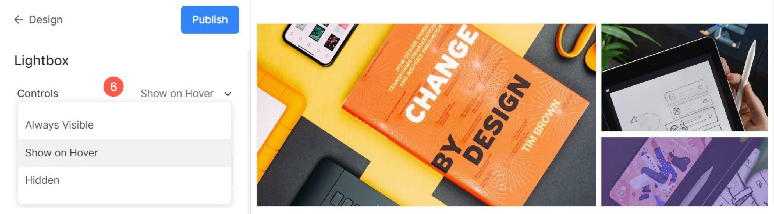
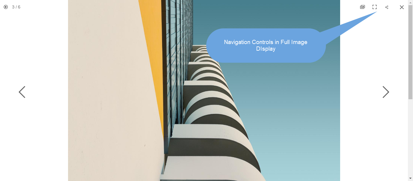
6. Controls
In the Lightbox view, choose how you want to show navigation controls like image info icon, gallery info icon, cross icon, browser fit icon, etc. options are:
- Always Visible (always show navigation controls on top of images)
- Show On hover (navigations controls will only show when you move your cursor on the screen)
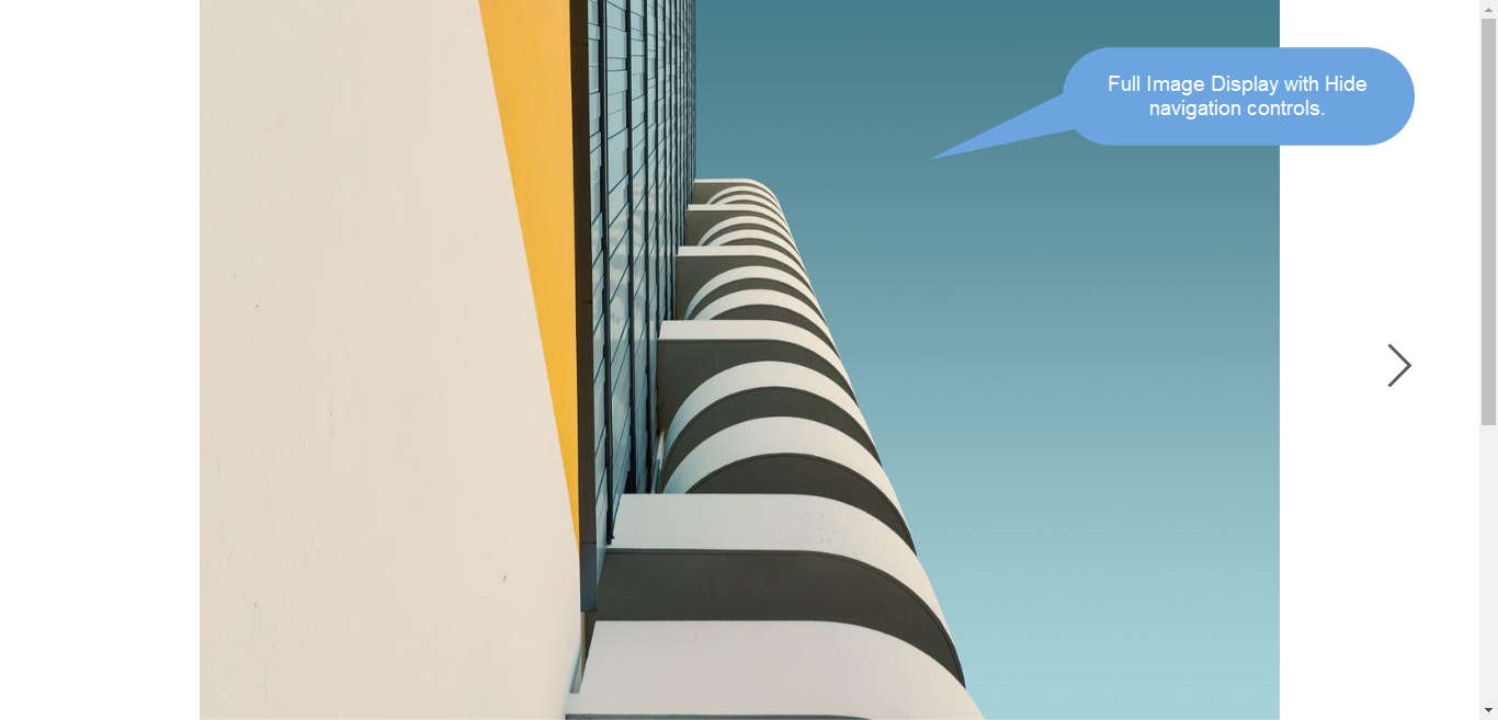
- Hidden (navigation controls will never be shown).
For example, a gallery with Always Visible navigation controls.
For example, a gallery with show on hover navigation controls.

For example, a gallery with hidden navigation controls.
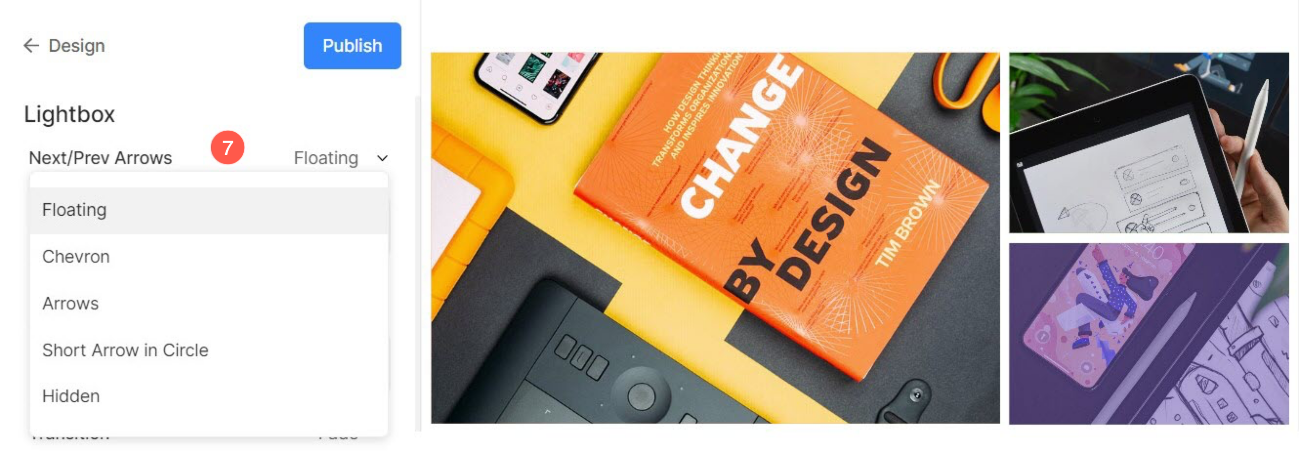
7. Next/Prev Style
In the full image display, choose how you want to show your navigation arrows.
- Floating : The navigation arrows will be floating. Move your cursor over the image, and click on the screen once the arrow appears to navigate through the images.
- Chevron
- Arrows
- Show Arrow in Circle
- Hidden : Disable the navigation arrows completely.
8. Image Filename
- Choose to show the filename when the image is viewed in lightbox mode.
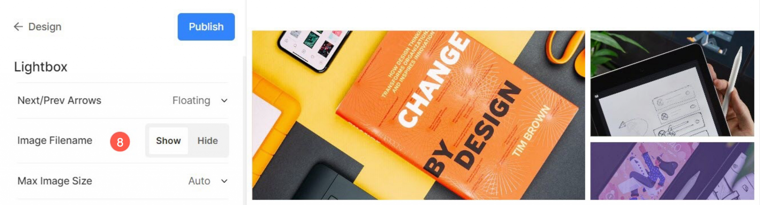
See in action:
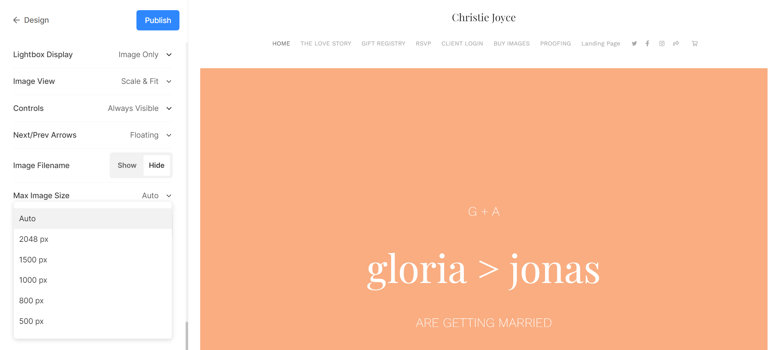
9. Max Image Size
This setting controls the maximum resolution at which your gallery images appear in lightbox mode. You can choose from the following options:
- Auto – Automatically adapts the image size based on the viewer’s screen and device resolution. The system intelligently selects the most suitable version of the image to ensure optimal clarity and performance.
- Fixed Sizes – 2048px, 1500px, 1000px, 800px or 500px. Choosing a fixed size means all lightbox images will be served up to that maximum resolution depending on the user’s device or screen size.
Slideshow Settings
- Slideshow : Click on autoplay to start the slideshow automatically in full image viewer. You can also disable the slideshow.
- Speed : Select the speed of transition. You can choose from 1 to 10 seconds.
- Transition : Choose the transition style of the slideshow.
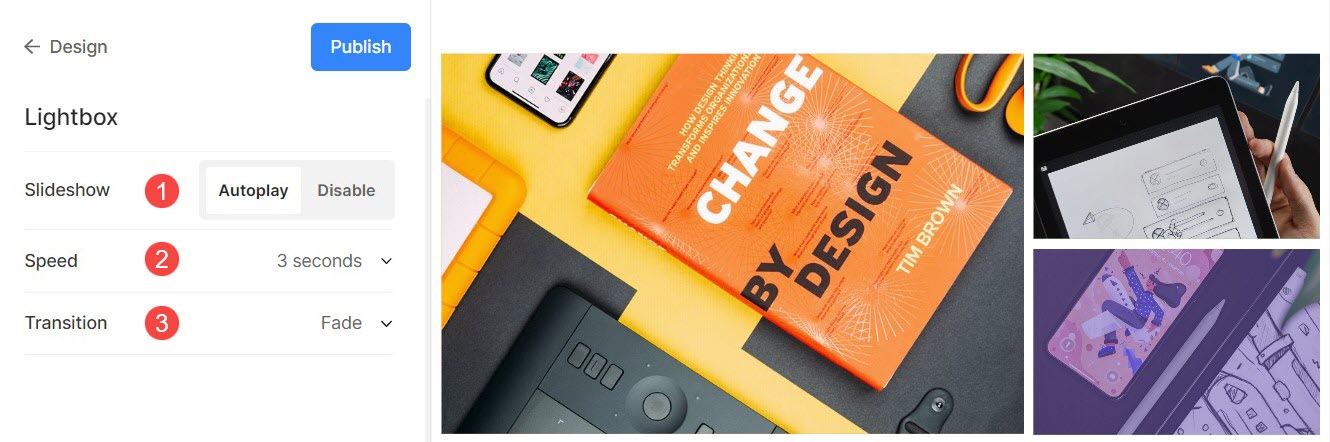
See slideshow in action:
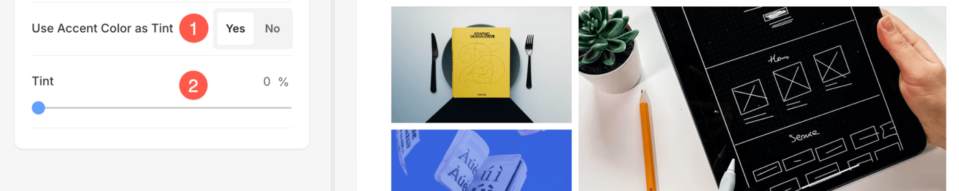
Tint Options
This feature allows the Accent Color of images to be used as the background when images are viewed in Lightbox Mode. This enhances the visual experience by aligning the background with the image’s accent color.
- Use Accent Color as Tint:
- By default, the Lightbox background color will be applied when viewing images in Lightbox Mode.
- When you enable this option, the Accent Color associated with the images will be used as the Lightbox background color, offering a more dynamic and visually cohesive look.
- Tint Opacity:
- You can manage the opacity of the Accent Color Tint using the Tint slider.
- Adjusting the opacity blends the Accent Color with the Lightbox background color, allowing you to achieve a seamless and professional aesthetic.
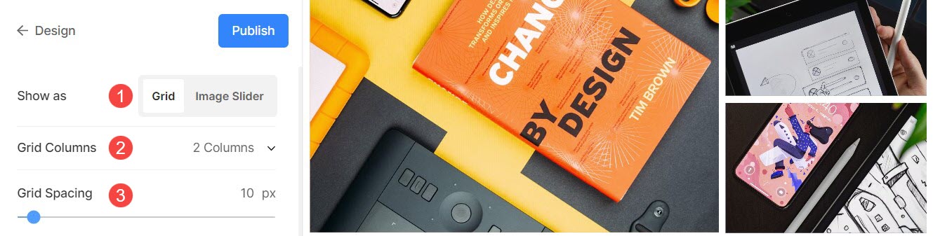
Mobile Display
- Show as : Choose to show the gallery as an Image Slider or in grid mode in the mobile view.
- Grid Columns: Choose from 1 column or 2 column view for grid display in mobile view.
- Grid Spacing : Set the gutter between images in mobile view.
Related Articles:
- Create a gallery
- Upload items to your gallery
- Best practices for image file naming
- Add image captions