Buttons and hyperlinked text are a must for any website. They make your site visitors engage with the content and let them visit the linked pages. We suggest you keep the button or hyperlinked text small and crisp.
In this article:
Add a button to a page
Pixpa enables you to add a button to any page.
- Visit the page you wish to add a button to.
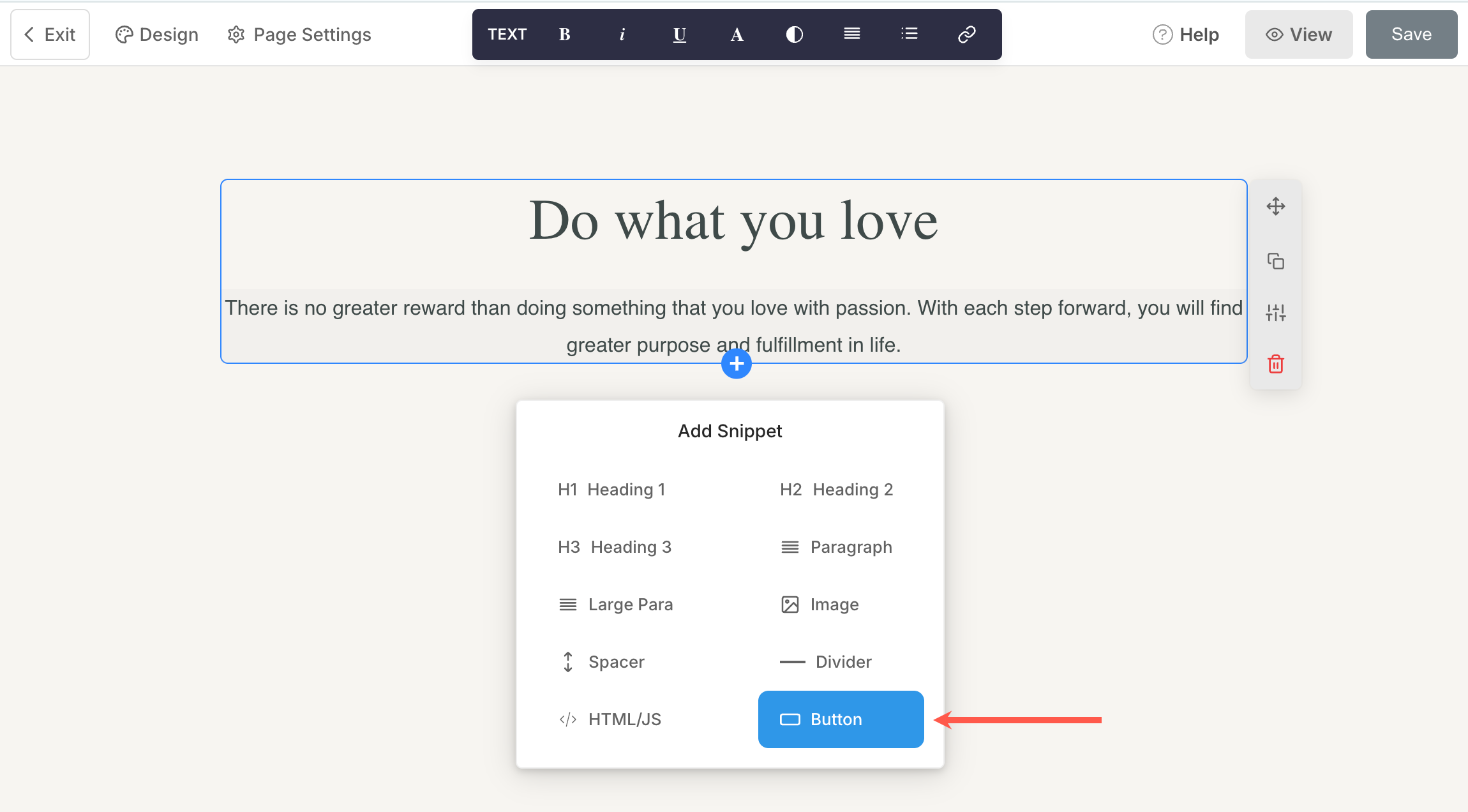
- Click on any pre-existing section to find the blue + icon.
- Click on it and select the button snippet from the available options.
Also See: Add a Snippet to a section. - You will now see a button on your page editor.
- Or you can add a button section from the Basic category.
- Once a button is added, click on it to view the button menu.
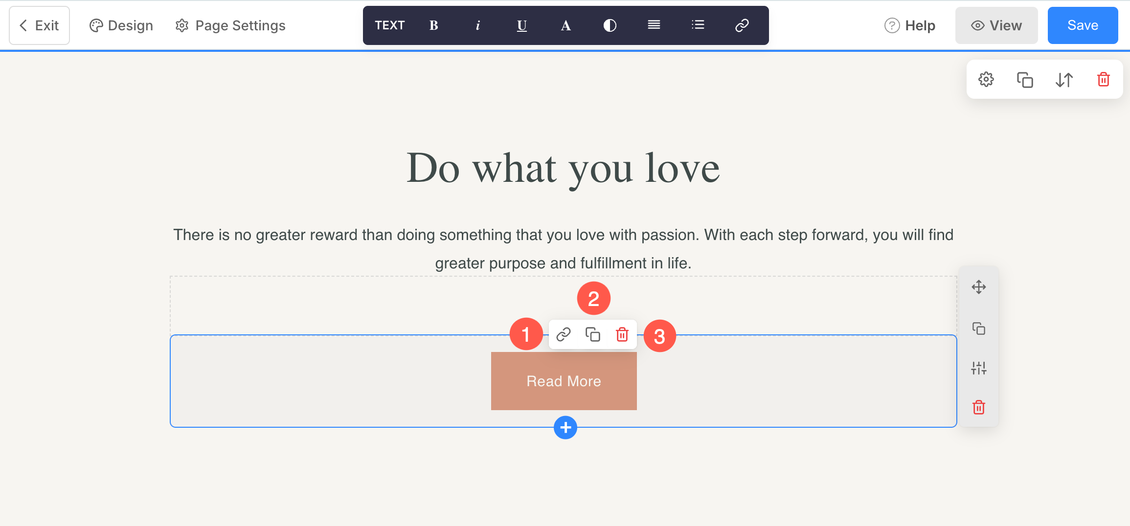
- The button menu will have three options/icons.
-
- The link icon – Used to link the button to an internal/external page, or contact number, or email.
- The duplicate icon – Used to duplicate the button.
- The delete icon – Used to delete the button.
Linking the button
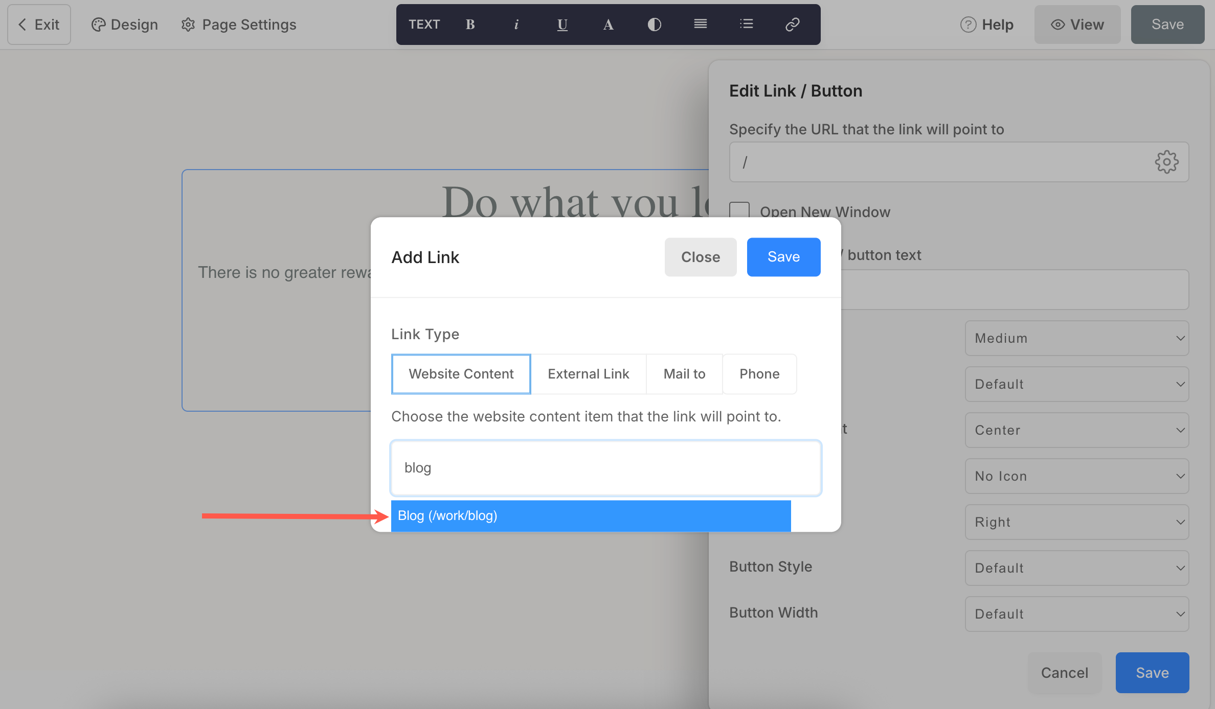
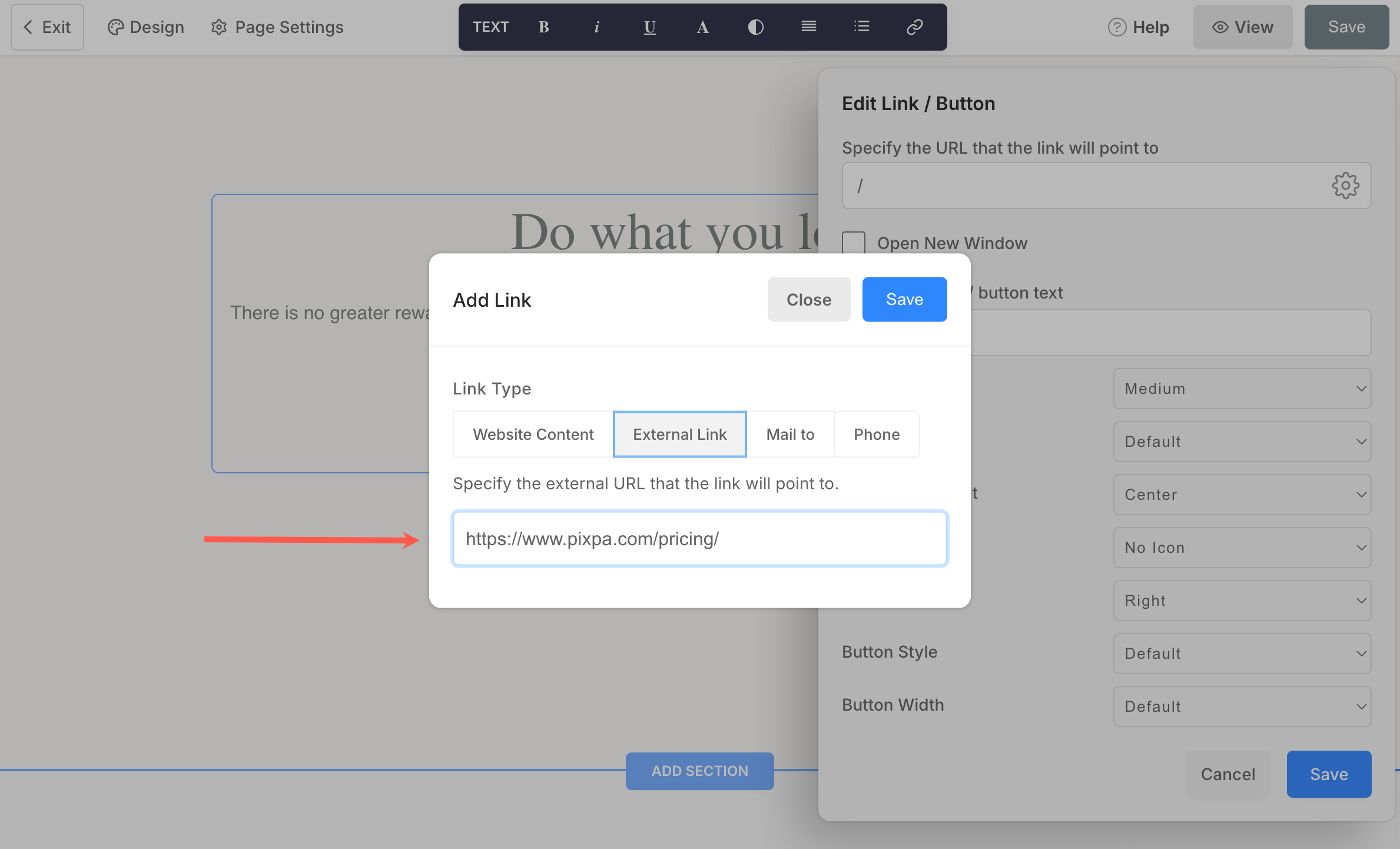
Link the button using the link icon specified above. Click on the link icon to view the Edit link/button pop-up where you can manage all the button options.
- Specify the URL – Click on the settings (⚙️) icon to link the button. Once you have clicked on the settings icon, you would see an Add Link pop-up as shown below. Link Type – Specify the link type first.
- Website Content – Used to specify a page inside your website.
Here, you just need to type in your page name and wait for a few seconds. Then the page name would appear in a dropdown. Click on it to link to the internal page.
- Website Content – Used to specify a page inside your website.
-
- External Link – Used to specify a page outside your website.
Here, you can directly put in the external page URL. You can enter the link URL along with the section ID to direct website visitors to a particular section of the page.
- External Link – Used to specify a page outside your website.
-
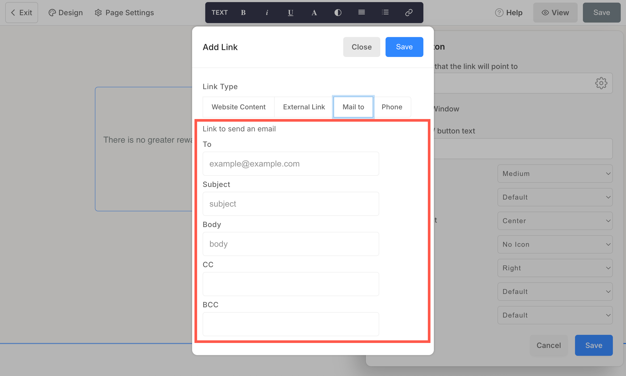
- Mail to – Used to specify your email address.
Here, you can set the default email address, subject, body, CC, and BCC. Once a user clicks on the button (that is linked to an email address this way), these defaults are copied to a new compose email.
- Mail to – Used to specify your email address.
-
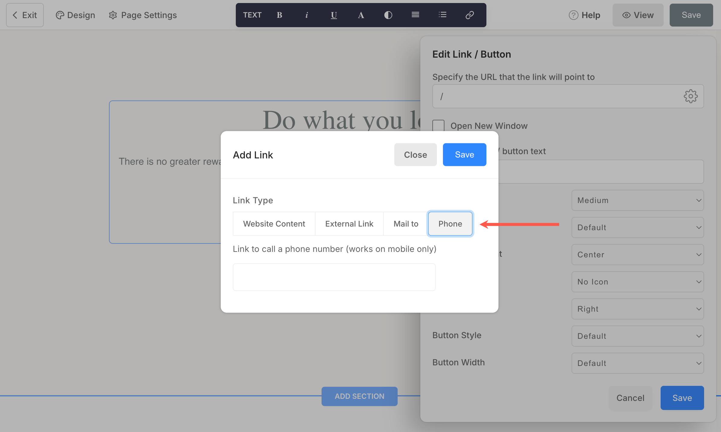
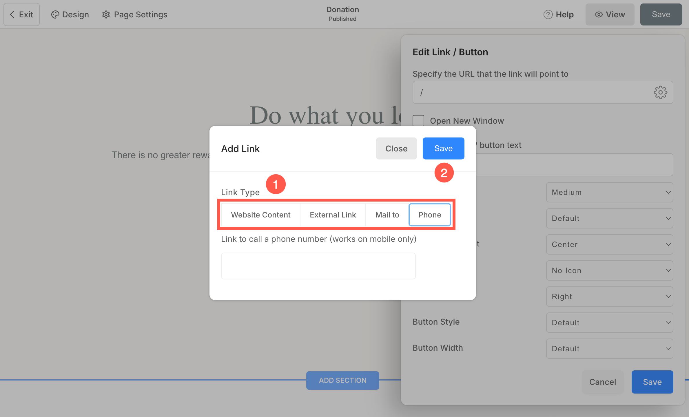
- Phone – Used to specify your contact number.
-
- Link – Specify the internal/external link, email, or contact number.
- Save – Finally, hit the save button.
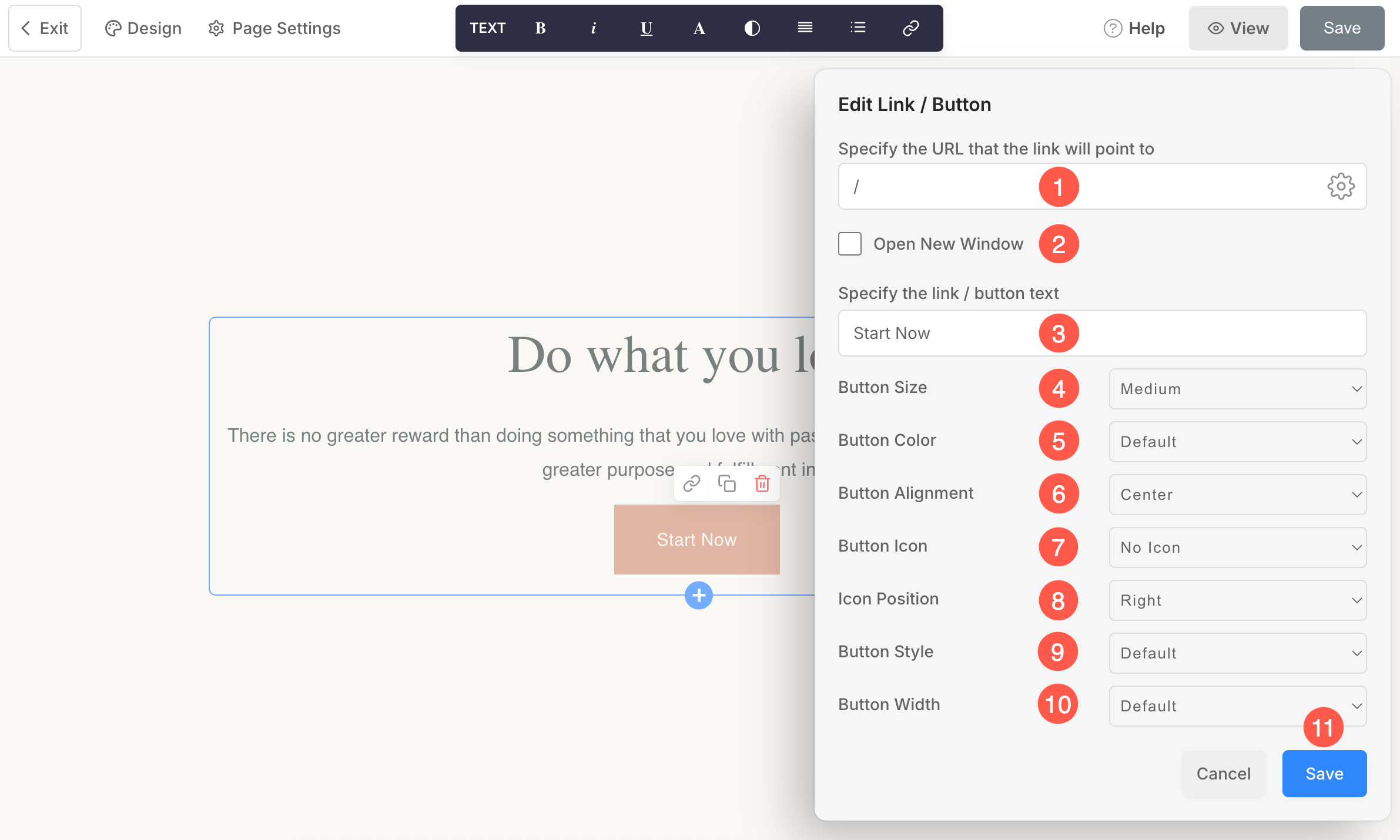
- Specify URL – Enter the URL that the link or button will redirect to as explained above.
- Open New Window – Check in this option to open the link in a new tab.
- Specify the link/button text – Set the button label from here.
- Button Size – Set the button size to be small, medium, or large.
- Button Color – Specify the button color from here. If you have chosen to invert the button color, the button text color will be applied to the button background, and vice versa.
- Button Alignment – Set the button alignment as left, center, or right.
- Button Icon – Set the icon that will appear on the button.
- Icon Position – Choose whether the icon should appear on the left or right side of the button text.
- Button Style – You can set the style for the buttons to be solid or outline or a text link.
- Button Width – Set the button width as Default, Large, X Large, or Full Width.
- Save – Click on the Save button to apply and save the button settings.
Other buttons on your website
1. Add hyperlinked text on a page
The hyperlinking of text works similar to button linking. Know more about hyperlinking text on a page.
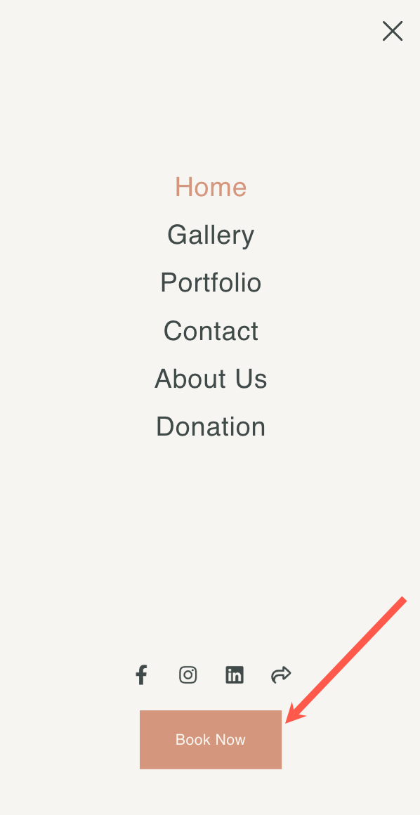
2. Header button
- Add a call-to-action menu button to your header and engage your customers upfront.
Check: Add a Menu Button to the site menu. - The menu button position on the site header (desktop) depends on the header layout that you have chosen. But the same resides at the bottom of the menu on the mobile view.
3. Banner button
Add up to two buttons and unlimited hyperlinked text over your banner and direct visitors to different pages.
Check: The Banner.
4. The Contact form button
- Once you add a contact form to any page in order to encourage site visitors to contact you, you will see a Submit button by default (in the form).
- You can customize its label, size, color, and alignment too.
Check: Contact section.

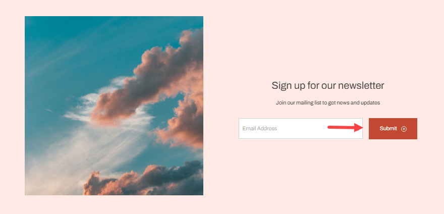
5. The Newsletter button
- Once you add a newsletter sign-up section to any page in order to build your subscriber base, you will see a Submit button by default.
- You can customize its label, size, and color.
Check: Newsletter Section.
6. The Add to Cart button
You can view this button on the product detail page of your store. See how to manage its label.