This timeline section enables users to display project milestones and tasks in a chronological sequence.
This is particularly beneficial for highlighting project progress, illustrating application processes, showcasing achievements such as awards, and offering other customizable options.
It provides a structured and visually appealing way to present information in a timeline format, enhancing user experience and engagement.
In this article:
- Add Section to your Page
- Add / Edit List Items
- Sequence List Items
- Manage Elements
- Change Section Layout
- Style Options
Add Section to your Page
- A section can be added to a page. You can either add a section to an already existing page or create a new page within your website.
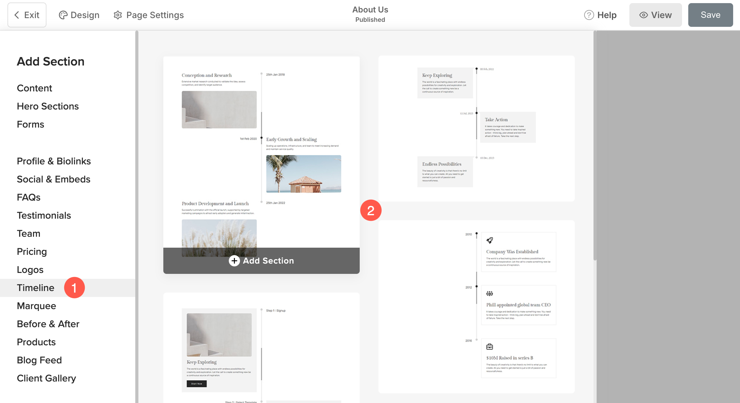
- On your page, click on the blue + icon to add a New Section to your page.
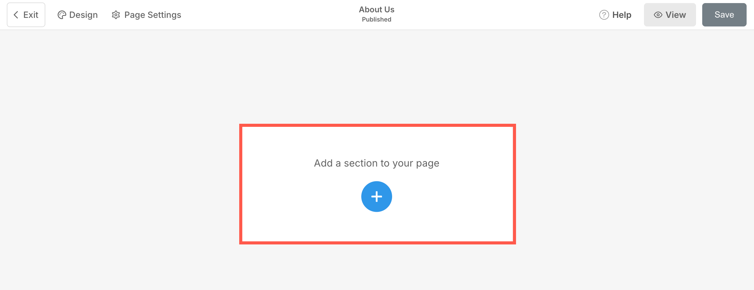
- You will now see the section categories on the left side.
- Click on the Timeline tab (1) where you can choose from different layouts of the timeline (2) section.
- The section will now be added to the page. Click on Save (3) button to keep the changes.
Add and Edit List Items
Add list item
Once you have added the section:
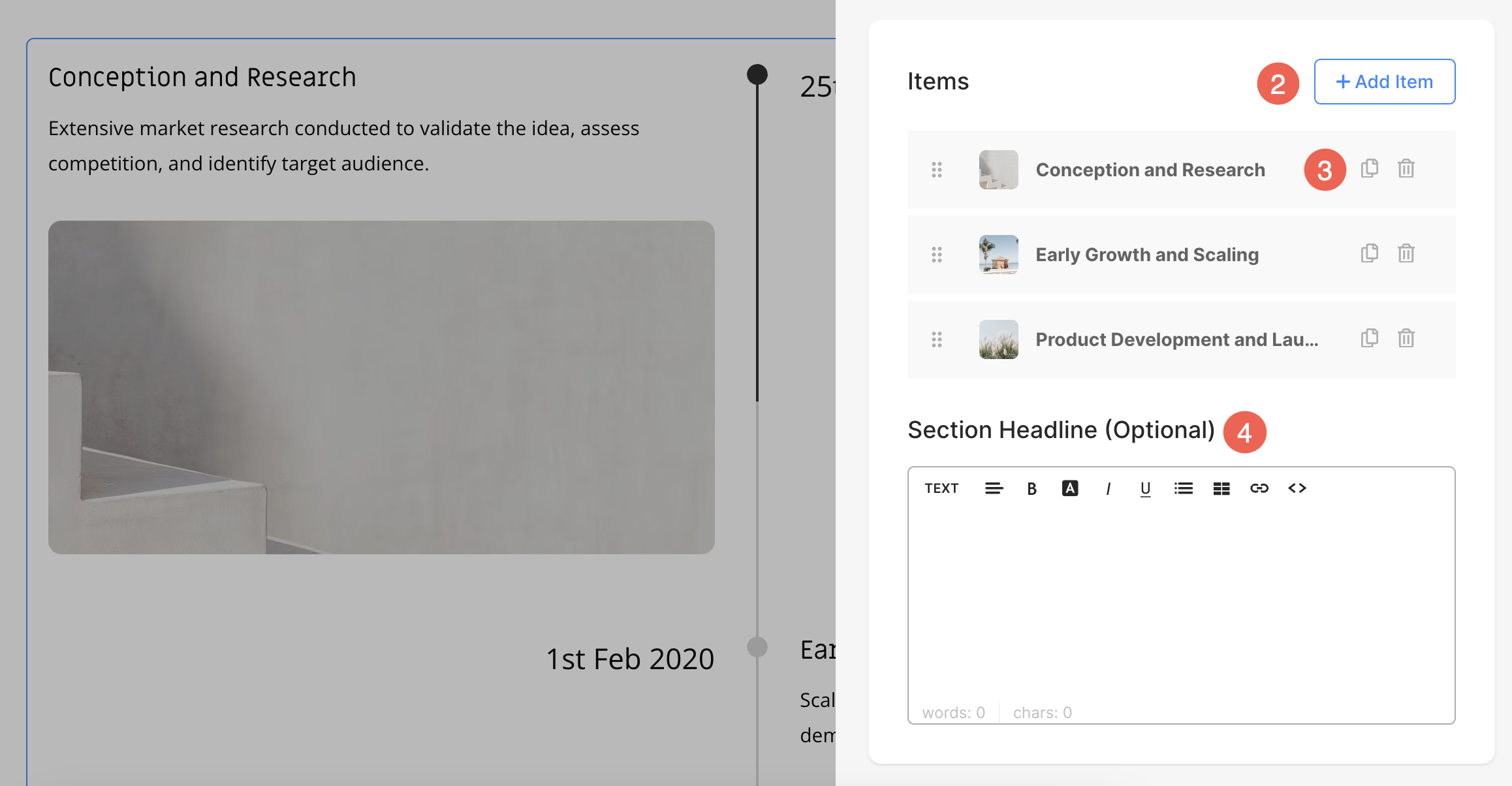
- Click on the Edit Timeline (1) button to open the List Item Panel.
- Click on the Add Item (2) button to add a new list item.
- You can choose to Duplicate or Delete (3) the list items.
- Specify a Headline (4) for the timeline section.
Edit List Item
Click on the list item that you want to edit. It will open that particular List item’s editing options.
From here you can:
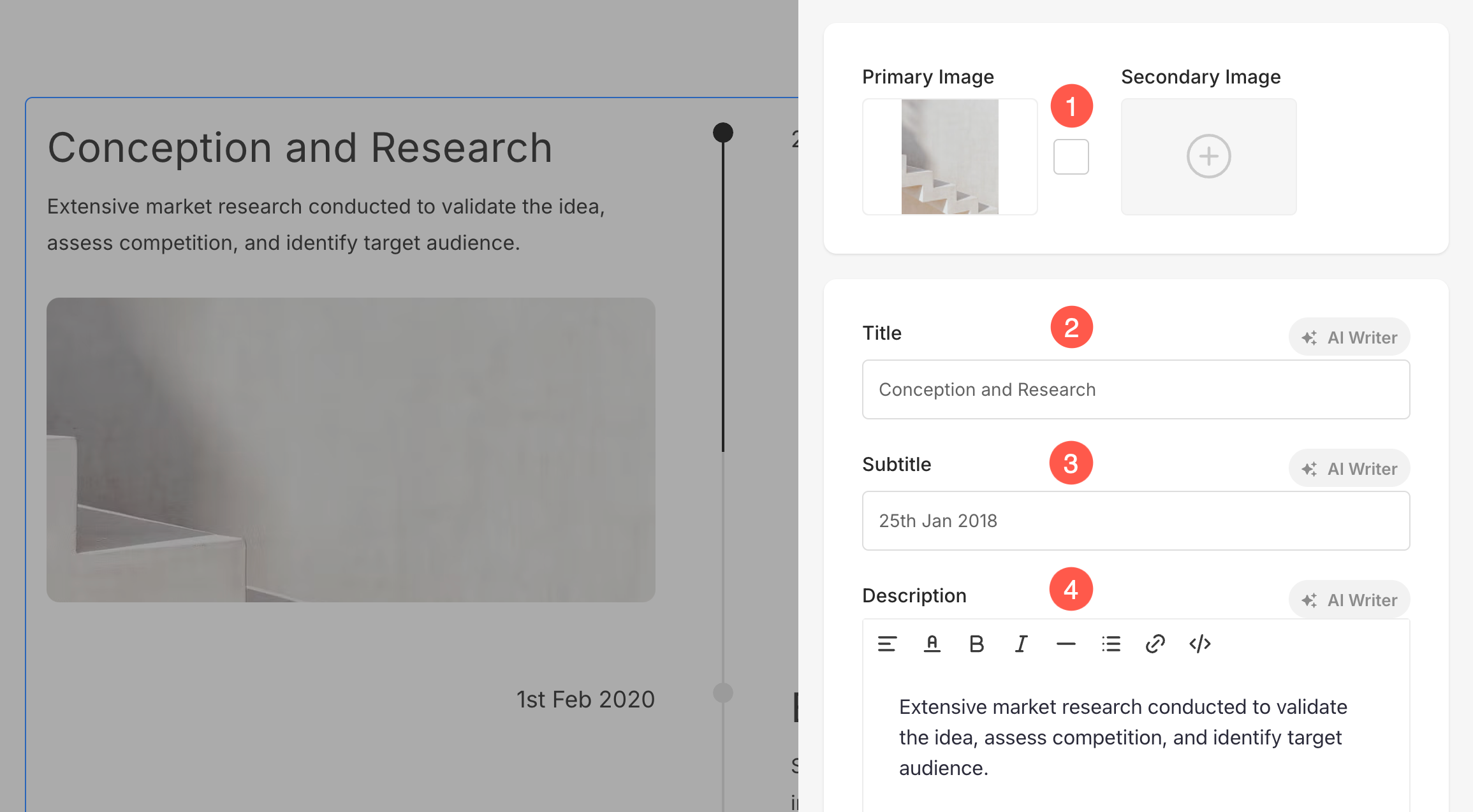
- Upload / Remove Primary and Secondary Image (1)
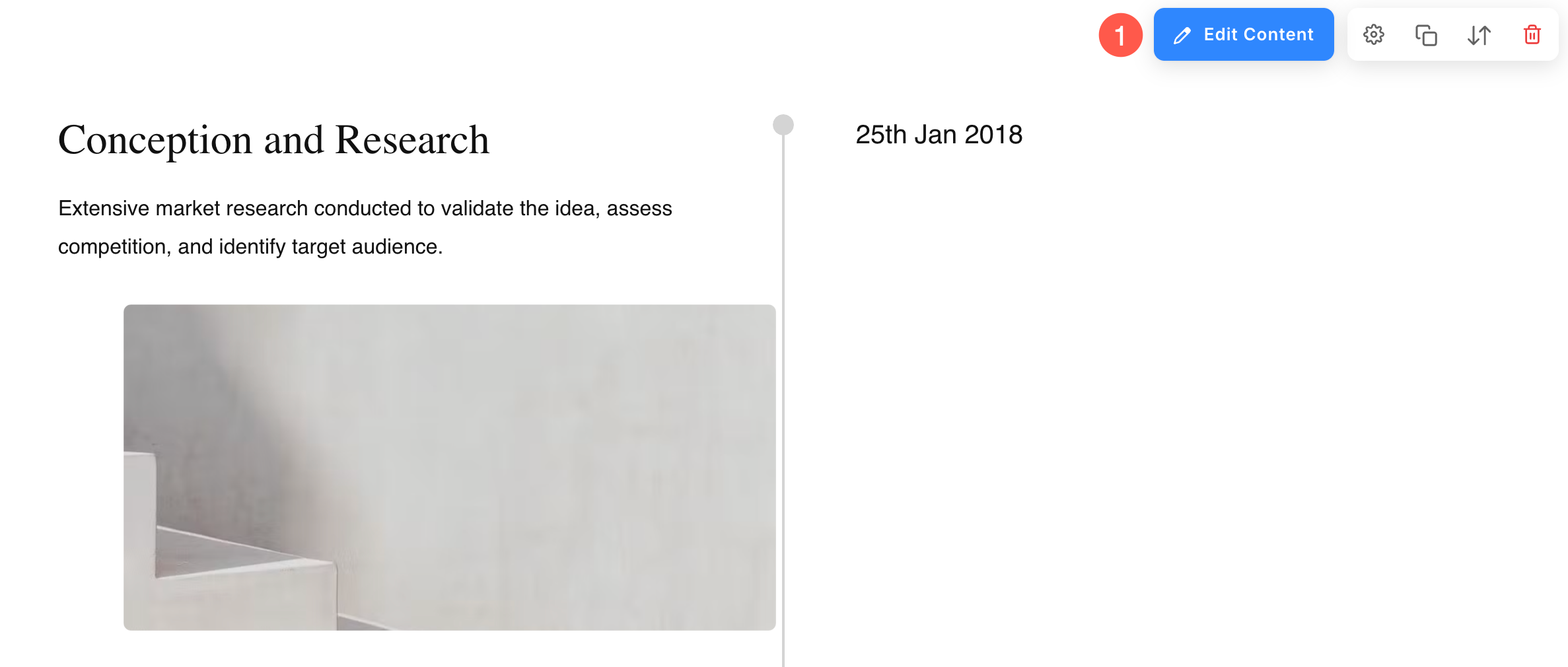
You can upload a Secondary Image along with the Primary Image for each list item. When a user hovers over the item, the secondary image will be displayed, replacing the primary image. Additionally, you can set the Image Accent Color, which will be displayed on image hover. - Add a Title (2), Subtitle (3), and Description (4) of the list item.
- You may not find the option of subtitle and description in particular list items depending on the layout you choose.
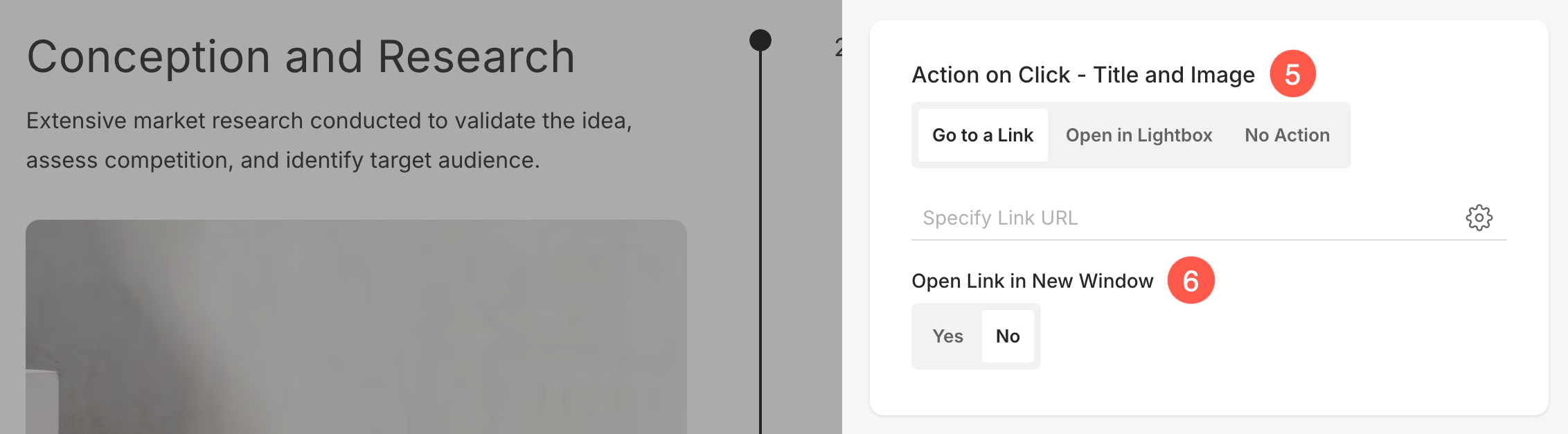
5. Action on Click – Title and Image
You can customize the click behavior of individual items in the Timeline section. Below are the available options:
- Go to a Link
Selecting this option opens the Link Builder, allowing you to add a hyperlink to this item. The link can direct users to another page within your website or an external URL. Know more about Link Builder. - Open in Lightbox
This option displays the item in an enlarged Lightbox view when clicked. In this mode, the Subtitle and Description associated with the item will not appear in the grid view but will be visible in Lightbox mode. - No Action
Choose this option to make the item unclickable. When selected, clicking on the item will not trigger any action.
6. Open Link in New Window: Set the Link to open in a new tab or in the same tab. This will only be visible when Go to a Link option is selected under the Action on Click menu.
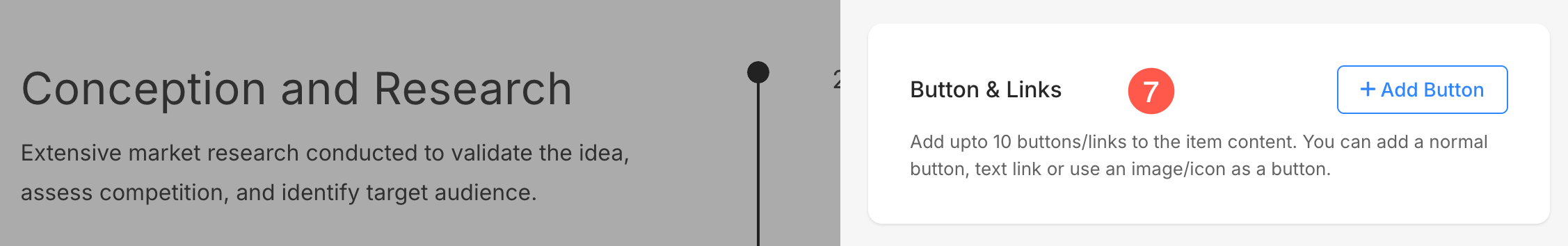
7. Buttons & Links: Add any type of Link to the list item. You can add a Button/Image link/Social Icon/Text Link. Learn more.
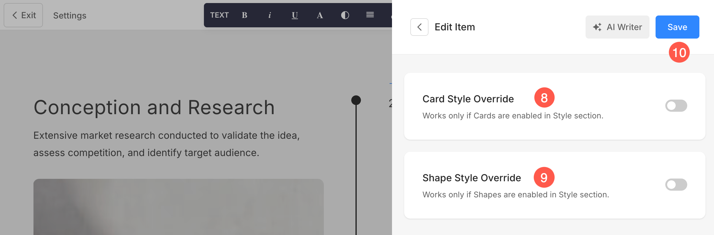
8. Card Style Override
You can override the global card style settings from the section’s Style Settings and customize each item’s card individually in the Timeline section. This allows you to apply unique styles to different list items for better customization.
Learn more about Cards option in dynamic section.
9. Shape Style Override
Use the Override option to assign a different shape to each image individually within the Timeline section, giving you greater control over the visual style of every item. Learn more about Shape Mask.
10. Save: After making the customizations, save the changes.
Sequence List Items
Manage Elements of Timeline Section
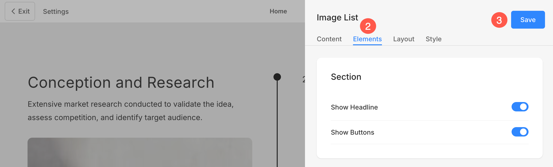
Timeline section includes an Elements tab that allows you to manage the visibility of various elements within the section with ease. Using simple toggle switches, you can enable or disable specific elements without having to delete or modify the elements themselves.
- Click on the Edit Timeline (1) button.
- Choose the Elements (2) tab.
- After making the changes, hit the Save (3) button.
Section Options
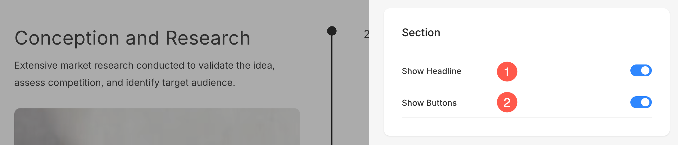
- Show Headline: Enable or disable the visibility of the headline for the Timeline section.
- Show Buttons: Control whether buttons are displayed at the section level.
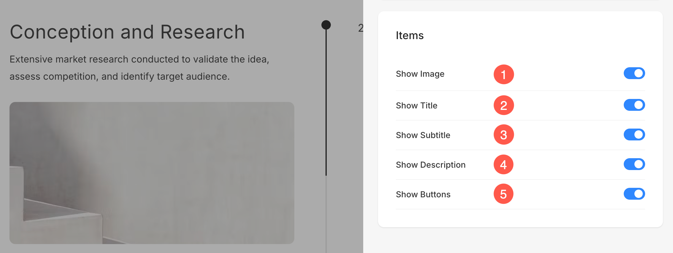
Items Options
- Show Image: Toggle the visibility of the images.
- Show Title: Control whether the title is displayed.
- Show Subtitle: Enable or disable subtitles.
- Show Description: Manage the visibility of item descriptions.
- Show Buttons: Decide if buttons for individual items should be shown.
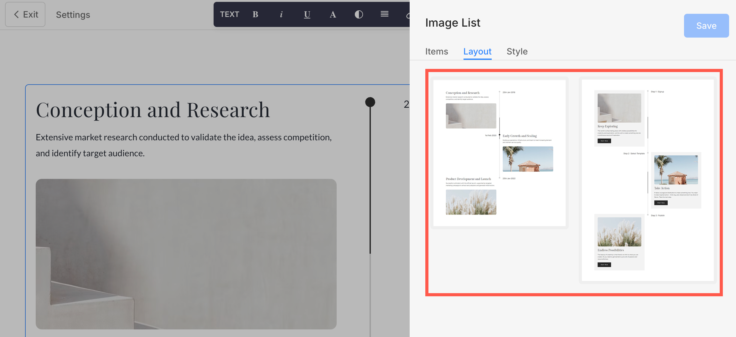
Change Section Layout
- Click on the Edit Timeline button to open the section editing panel.
- Choose the Layout tab.
- From here, you can easily change the layout of the section even after adding it to the page.
While changing the layout, you will see the section-related layouts on the top.
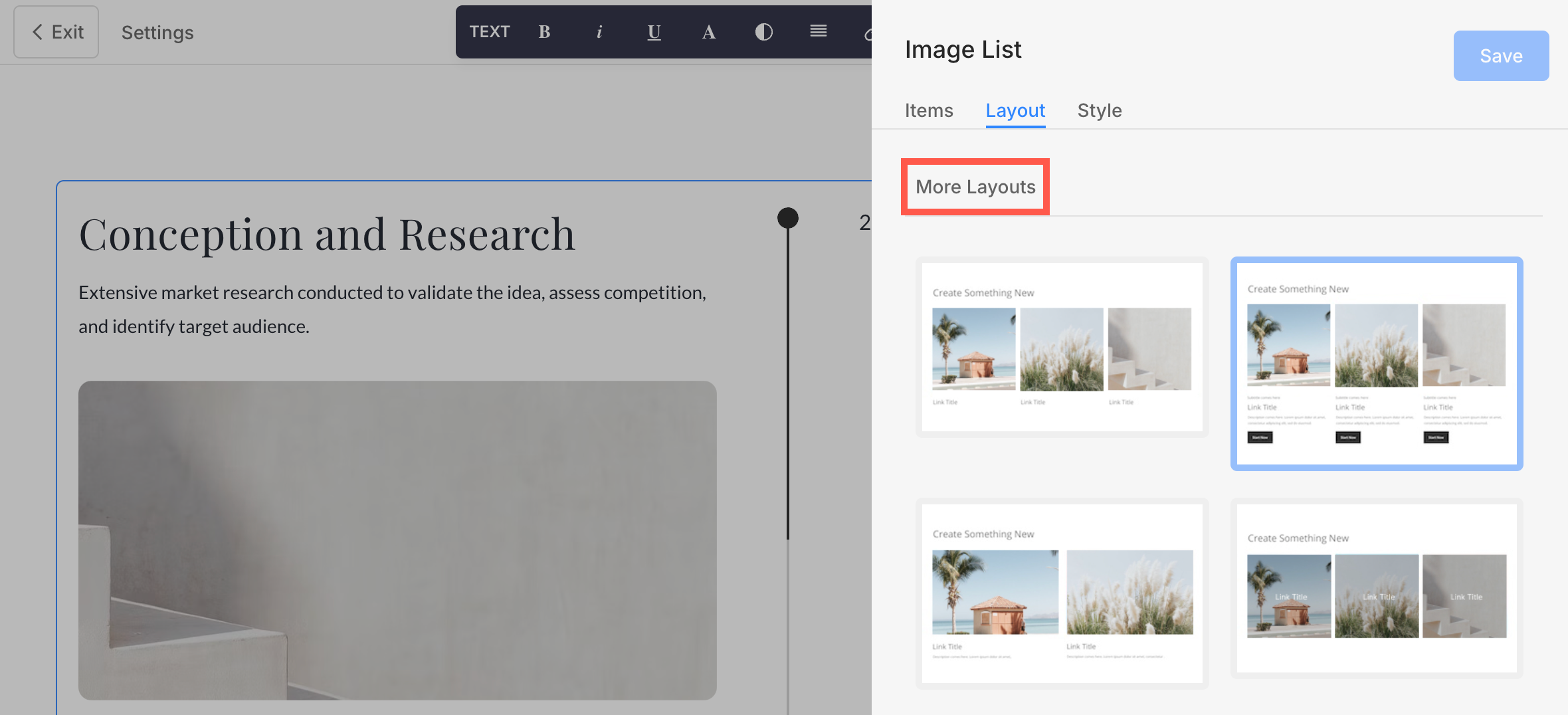
Apart from these, you also have the option to choose a layout from other sections under the More Layouts heading.
Style Options
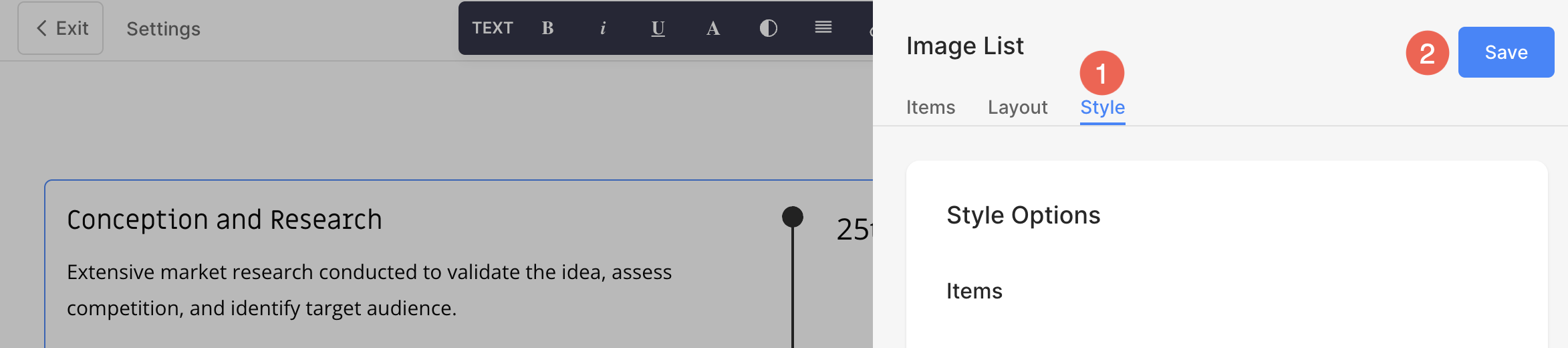
- Click on Edit Image List button.
- Choose the Style (1) tab.
- Change the Style for the section elements and Save (2) your changes.
You will have multiple style options for the section:
- Display Options
- Alignment
- Text Size
- Spacing
- Section Headline
- Timeline Style Options
- Images Options
- Shape Mask
- Image Hover Options
- Image Border
- Card Options
- Shadow Options
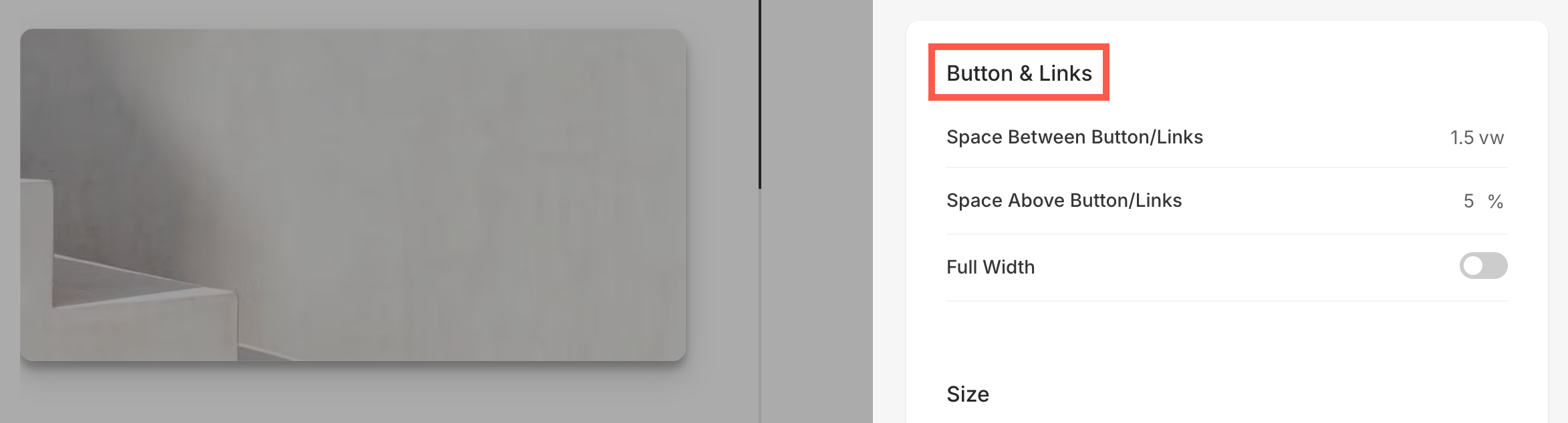
- Buttons & Links
Display Option
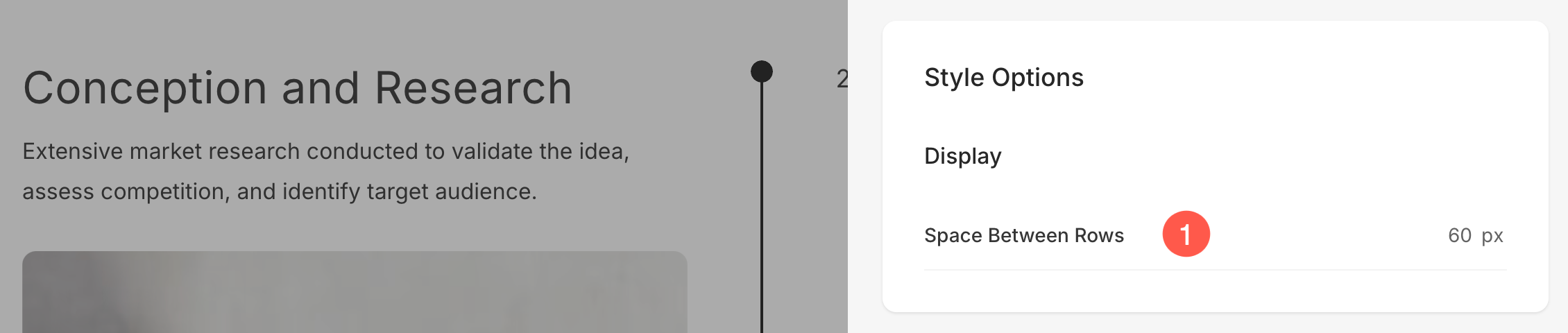
- Specify the Space Between Rows of the list items.
Alignment
- Align the Text Horizontally in the section. You can set them to be left, right or center aligned.
- Align the Content Vertically in the section. You can set them to be top, center and bottom aligned.
- Choose the Content Order i.e., the images of the list items to be displayed first or the associated text.

Text Size
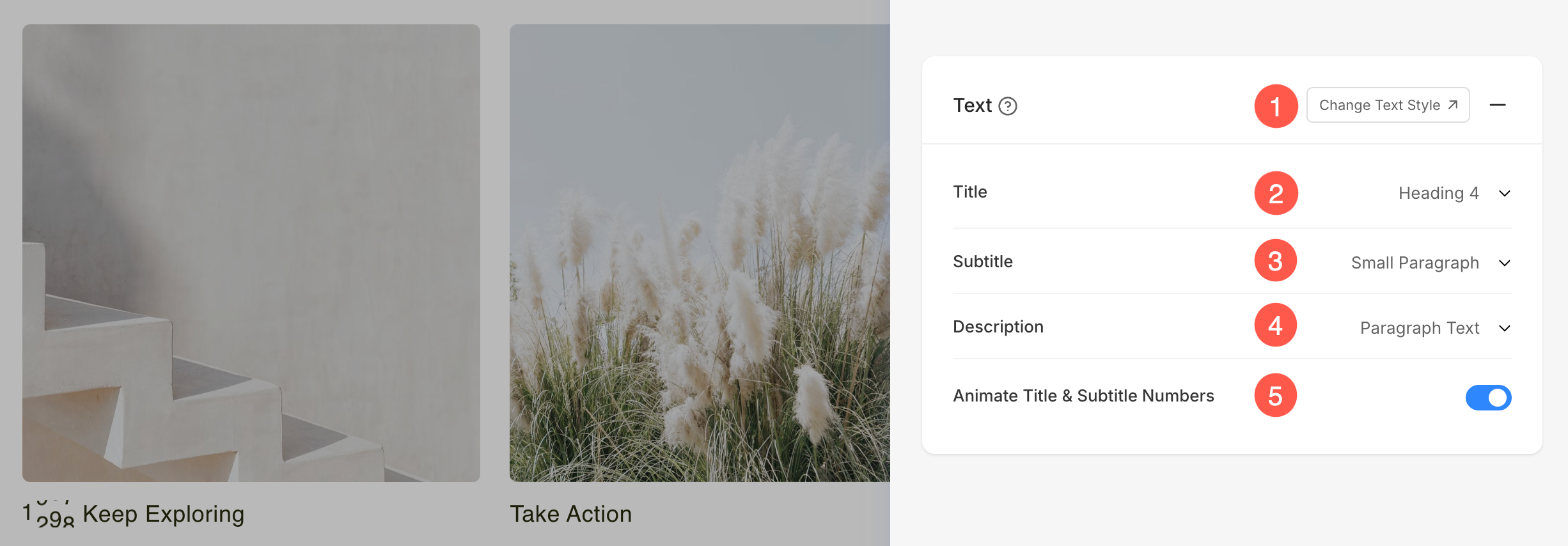
- Click on the Change Text Style button to visit the Design section and manage your font sizes and styles.
- Set the Title font style for the list items of the section.
- Set the Subtitle font style for the list items of the section.
- Set the default Description font style for the list items of the section.
- Enable this option to animate any numbers present in the Title and Subtitle fields. When turned on, numeric values will appear with a dynamic counting animation, making them more visually engaging.
Spacing
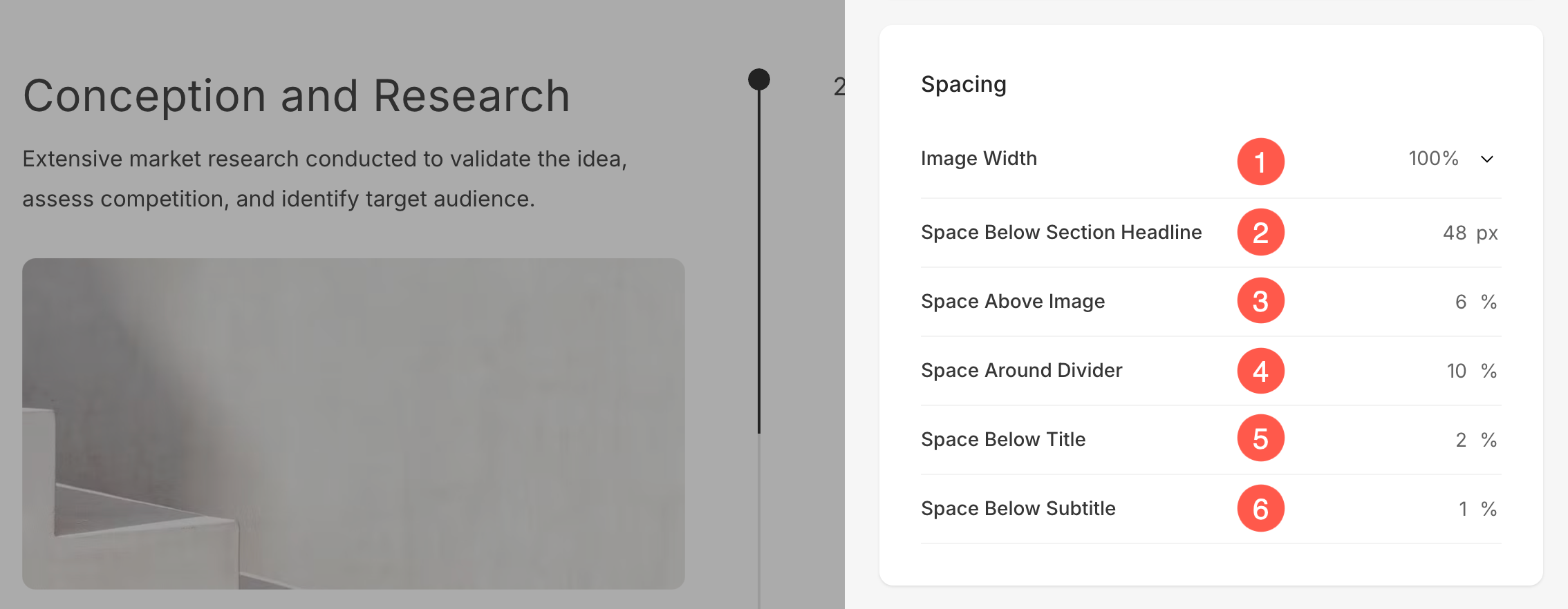
- Specify the Image Width for list items.
- Specify the Space below Section Headline in px.
- Specify the Space Above images of the list items (in %).
- Specify the Space Around the Divider horizontally of the list items (in %).
- Specify the Space below the titles of the list items (in %).
- Specify the Space below the Subtitles of the list items (in %).
Section Headline
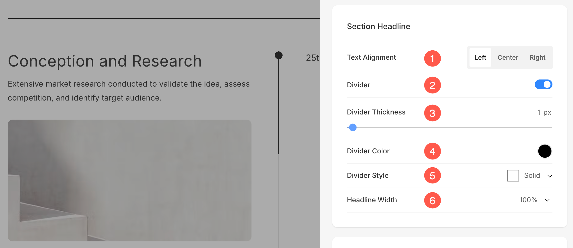
- Horizontally Align the section headline text. You can set it to Left, Center, and Right.
- Enable/Disable the Divider between the section headline and the section content.
- Set the thickness of divider (in px).
- Specify the Divider Color from color picker.
- Choose a Divider Style from the dropdown.
- Set the Headline Width to define how wide the section title appears, starting from a minimum of 50%.
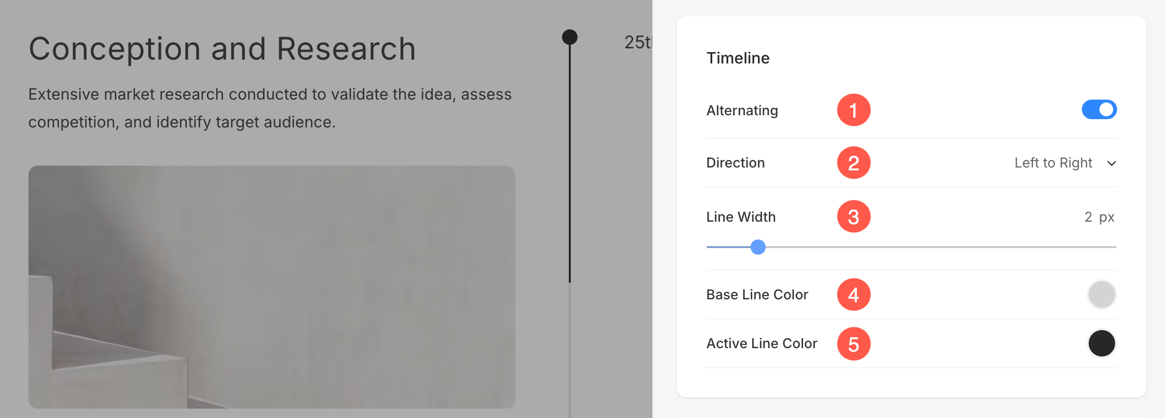
Timeline Style Options
- Enable this if you prefer every second item in the section to be on the Alternate (opposite) side.
- Select the Direction of the items.
- Specify the Divider Line Width for the section.
- Specify the Base Line (background) Color for the Divider.
- Specify the Active Line (highlighted) Color for the Divider.
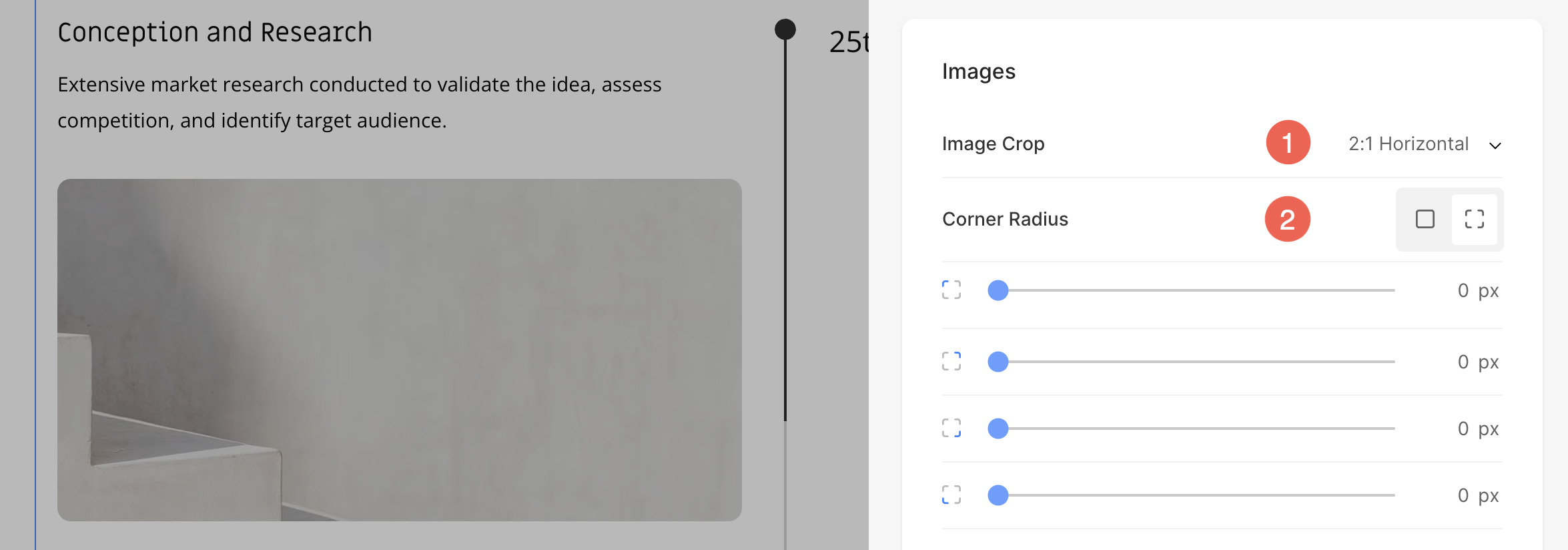
Images
- Choose the Image Crop for the list items. You can set the images as Square, Circle, Horizontal, Portrait, and Original.
- Choose to have a common corner radius or different corner radius for each side of the list items and set a number (in px) for the Corner Radius of the list item images. Know more.
Shape Mask
- Shape Mask: Enable this toggle to apply a shape mask to the image in the Timeline section. Once enabled, the selected shape will visually clip the image into that form.
- Select Shape: Choose from various predefined shapes to apply to your image. This allows you to creatively stylize your content by displaying image in a unique form like rounded, diamond, drop, etc.
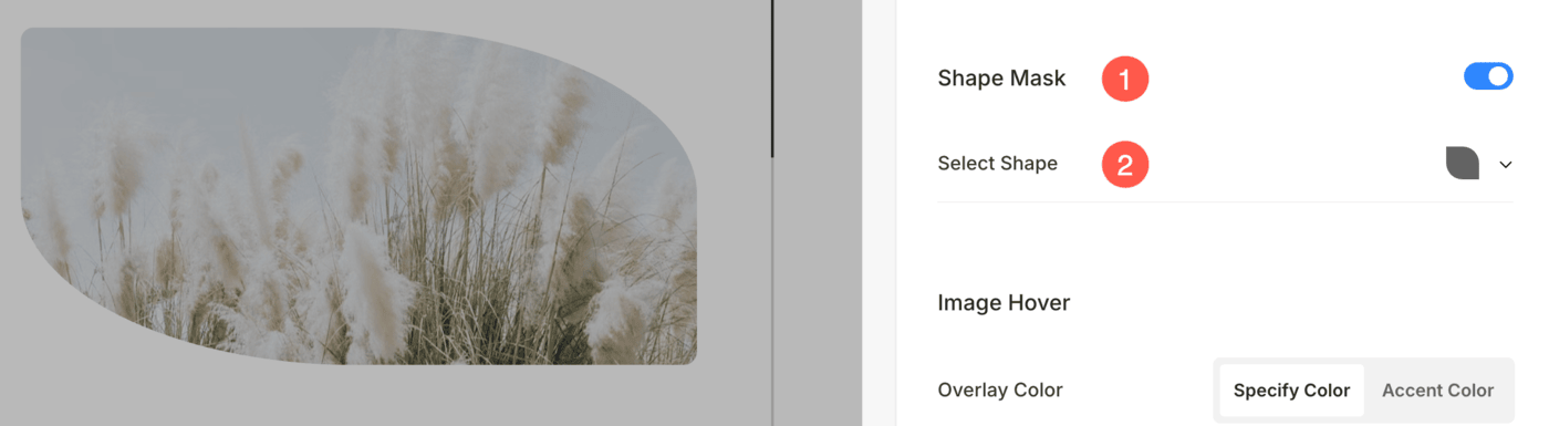
Image Hover
- Choose the Image Hover Color to be the accent color or to be specified. If you have chosen the accent color, then specify the opacity. You can specify the accent color for each item from Edit Item panel.
- If you have chosen the specify color option then set the Overlay color and opacity.
- Choose to Animate the list item images on hover by clicking on Yes. Check this feature on a live page.
- Choose an Animation Style for images when the cursor hovers over them.
- Choose if you want to allow the transitioning of images on hover or not.
- Select a Transition Style for hover transition. Available options are Fade and Flip.
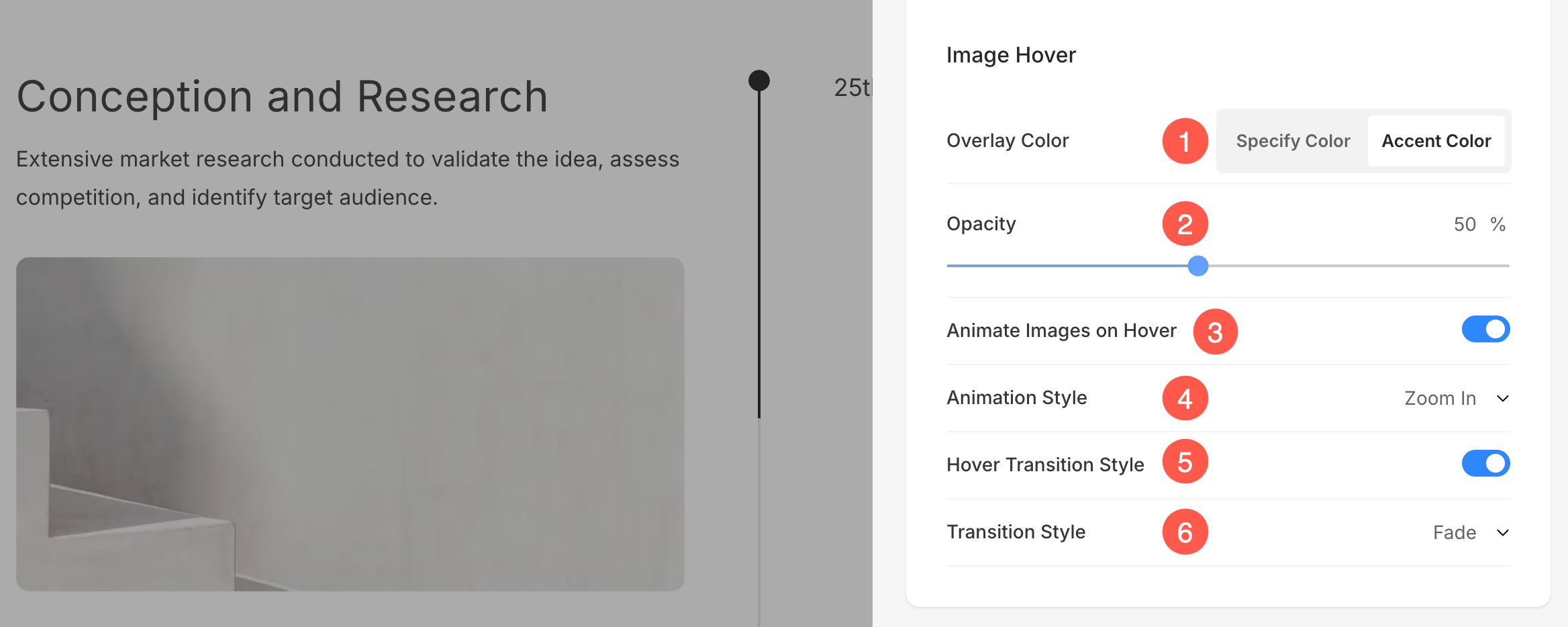
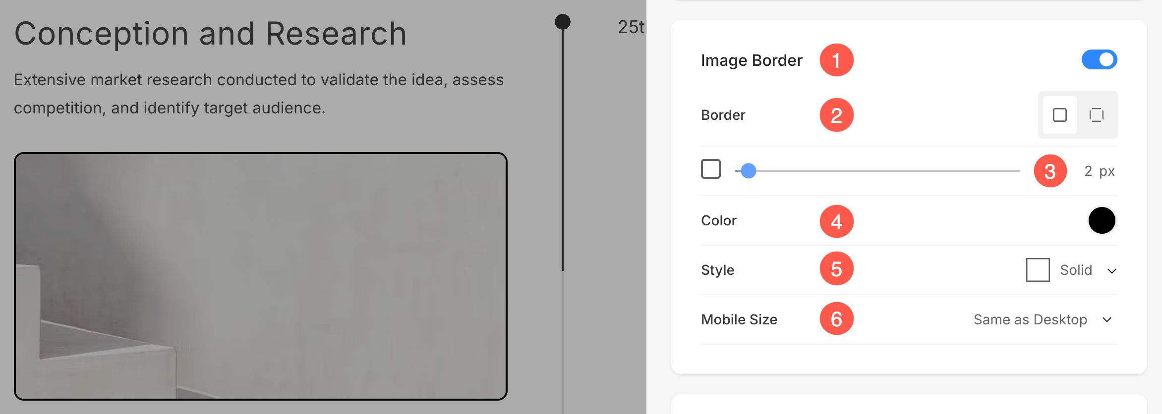
Image Border
- Enable / Disable border around the images by switching the toggle.
- Choose to have a common border on all sides of images or you can specify the borders separately for each side.
- Specify the width of the border. If it is set to 0, then the border will not appear. You also have the option to set the border width individually for each side of the image.
- Select the Border Color from color picker.
- Select a preferred Border Style from the dropdown.
- Determine the border width for mobile devices, aligning it with the width chosen for desktop.
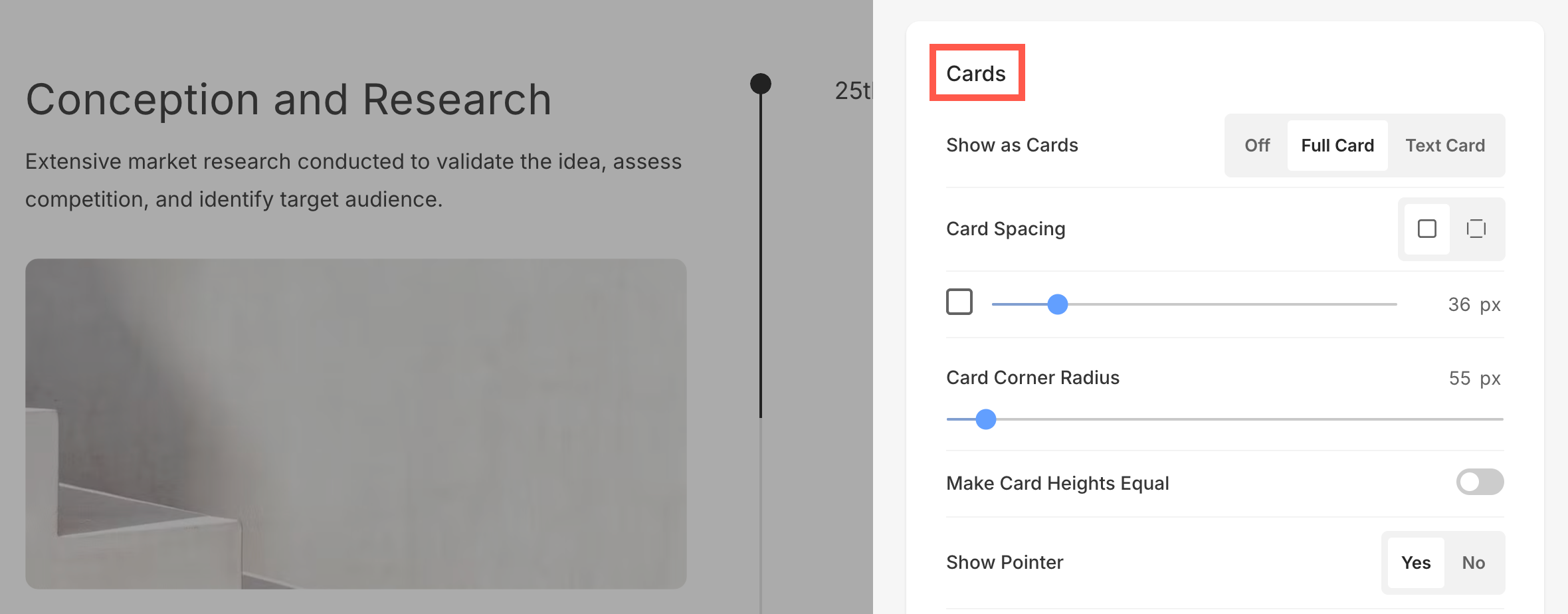
Cards
- See how to manage cards.
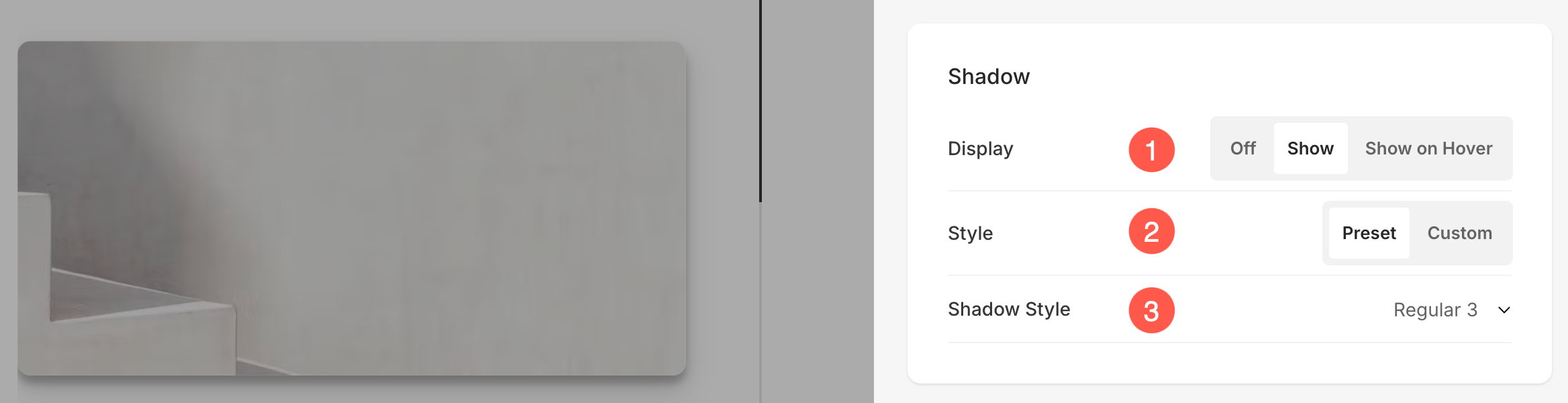
Shadow
- Display – Choose to show the shadow behind the list items always or on hover only.
- Style – Choose from existing presets or create a custom shadow.
In case you have chosen the Custom option, then visit this Box Shadow Generator to create a custom shadow. Finally, copy and paste the box shadow CSS. - In case you have chosen the presets option, then Choose Shadow Styles from the dropdown.
Buttons & Links
- See how to manage the styling of Buttons & Links.