Buttons and links on a website play a crucial role by providing users with clear and intuitive pathways to navigate, interact, and access desired information or services.
In this article:
You can manage the Buttons & Links styling from the Design (1) section.

Once you are inside the Design section, click on Buttons & Links (2) tab.

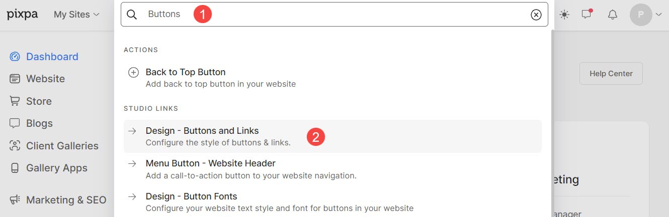
Alternatively, you can also use the studio’s search option.
- Enter Buttons (1) in the Search Bar.
- From the related results, click on the Buttons & Links option (2).
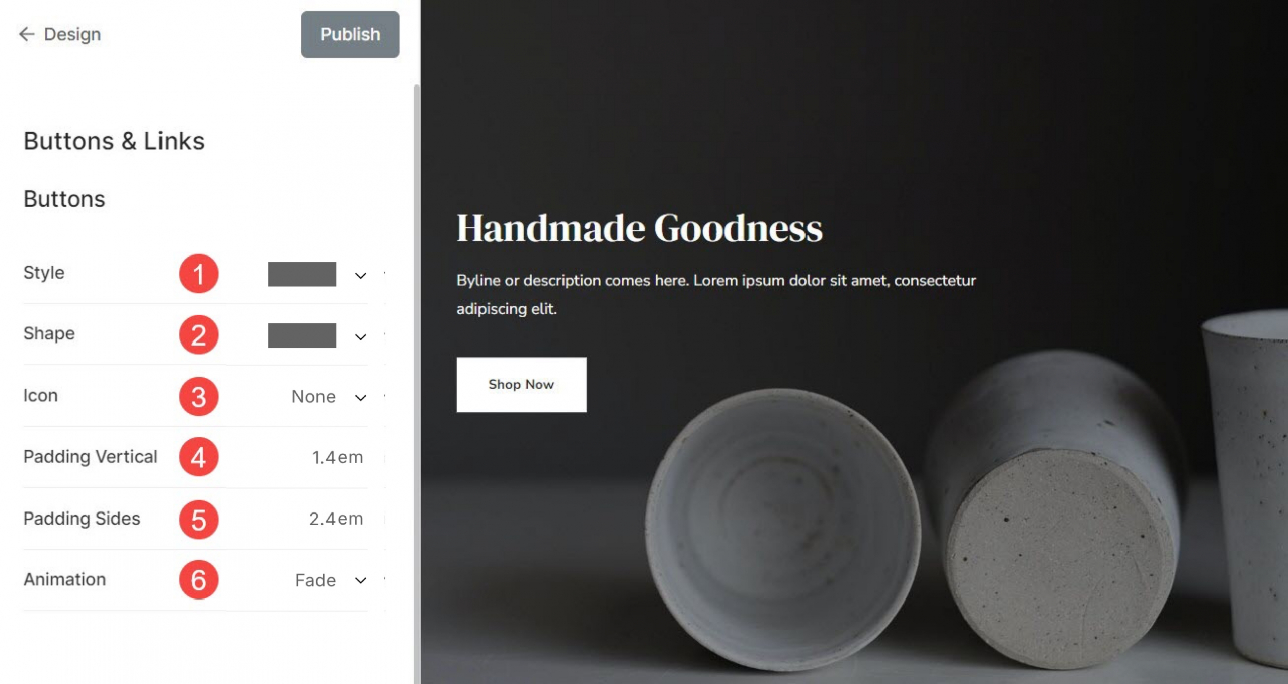
Buttons
Buttons are interactive elements designed to promt user actions. They are visually more prominent and shapes to stand out.
Buttons are commonly used for actions like submitting forms, trigerring specific functions, etc. From here, you can:
- Style: Set the style for the buttons to be solid or outline or a text link.
- Shape: Choose the shape of the buttons on your website from here. The available shapes are square, rounded, and pill.
- Icon: Set the icon that will appear over the button.
- Padding Vertical: Set the spacing between button text and the edges of button vertically.
- Padding Sides: Set the spacing between button text and the edges of button horizontally.
- Animation: Choose the animation when cursor hovers over the button.
Different shapes of buttons:

List of animation options that you can choose for buttons.
- Fade: The button will fade from opaque to translucent.
- Grow: Size of the button will grow while hovering cursor over it.
- Shrink: Size of the button will reduce while hovering cursor over it.
- Swipe to Right: Animation will occur horizontally covering the whole button from left to right.
- Swipe to Top: Animation will occur vertically covering the whole button from bottom to top.
- Underline Reveal: A line will gradually appear at the bottom edge of the button.
- Underline from Left: A line will gradually appear at the bottom edge of the button from left to right.
- Overline Reveal: A line will gradually appear at the top edge of the button.
- Overline from Left: A line will gradually appear at the top edge of the button from left to right.
Links
Links are elements that users can click to navigate to another page or section.
They are typically underlined or displayed in a different color to indicate their clickable nature.
- Underline: Choose if you want to display the underline permanently / on hovering the cursor or disable it at all.
