Grid image spacing is something that helps you control the space between your images in grids. You can increase or decrease the image spacing based on your requirements.
Grid image spacing control can be accessed from the Design section, and the individual gallery design page too.
Global Settings:
To access style options for all your galleries, follow these steps:
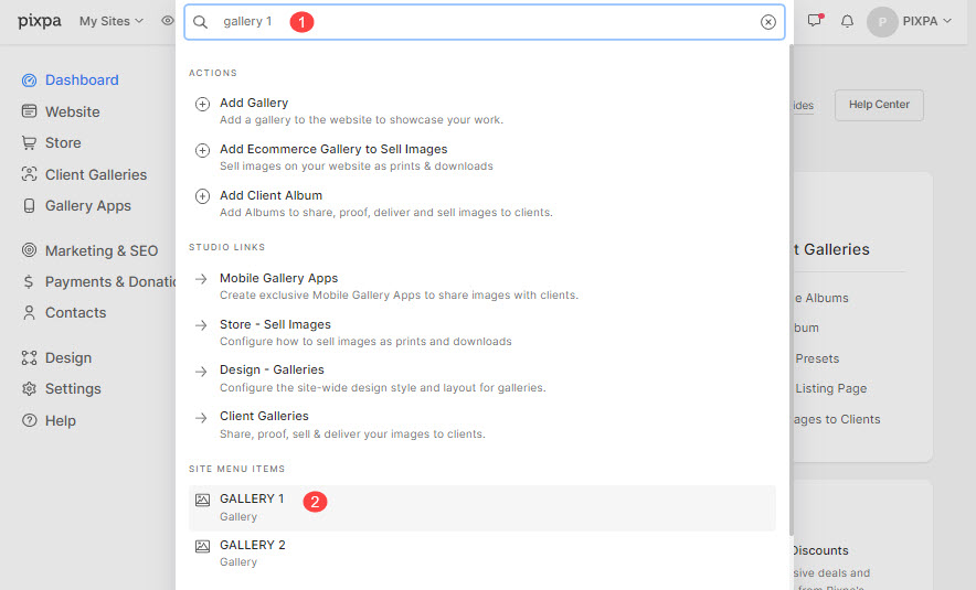
- Enter galleries (1) in the Search Bar.
- From the related results, click on the Design – Galleries option (2).
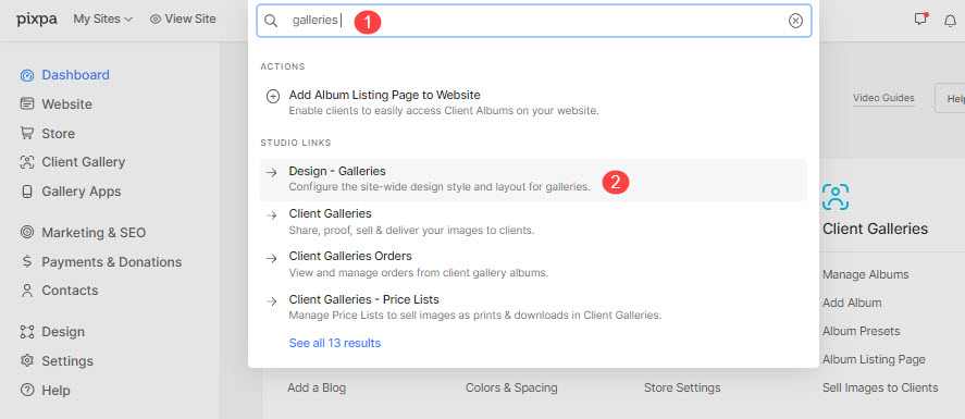
- You will now reach the Galleries styling page.
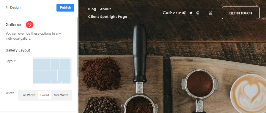
- You can specify the sitewide gallery design options here (3).
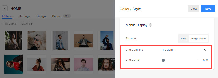
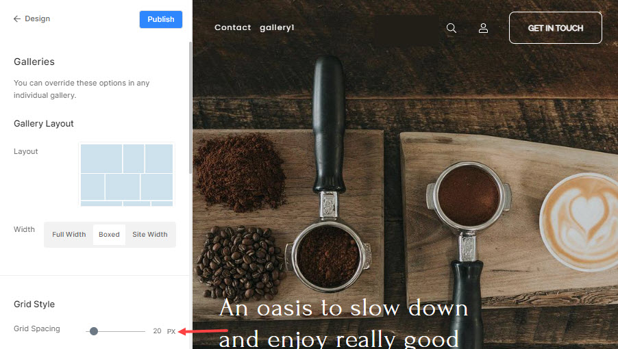
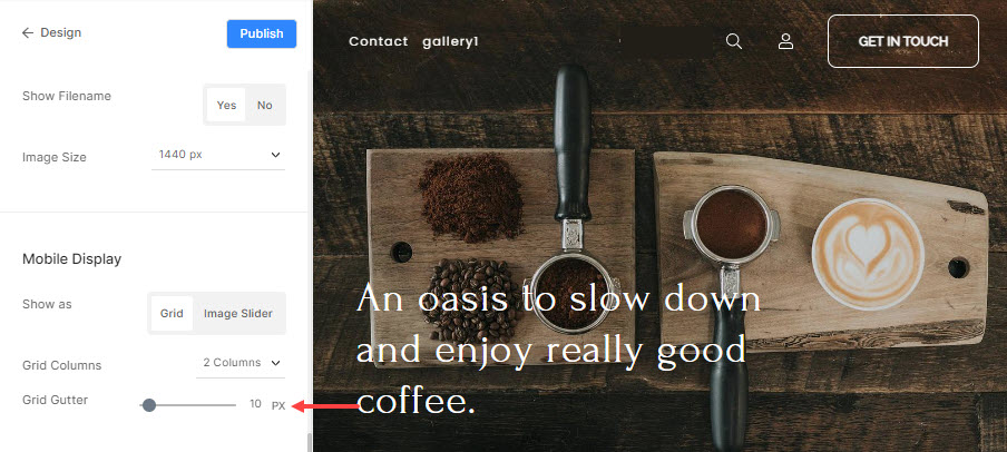
- In the Gallery option, you will have the option to set the grid spacing for desktop view.
- For changing the grid spacing in the mobile view, scroll down to the mobile display section where you can set the mobile grid gutter.
- Save the changes using the Publish button on the top right corner to apply this spacing to all your galleries where global styling is turned on.
From gallery individual settings:
You can override the global gallery options in any individual gallery.
For overriding, follow these steps:
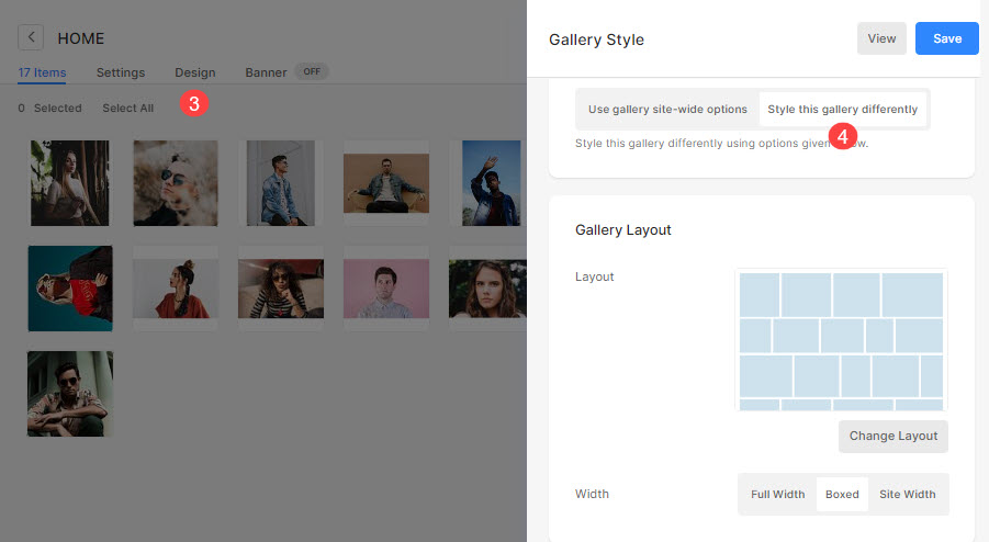
- Enter the gallery title (1) in the Search Bar.
- From the results, find the gallery (under Site Menu Items) that you want to work on and click on it (2).
- Next up, click on the Design tab (3). You would see the visual style of the particular gallery on the right side.
- Disable the gallery-wide settings by selecting the Style this gallery differently (4) tab.
To manage grid spacing in a gallery, follow these steps:
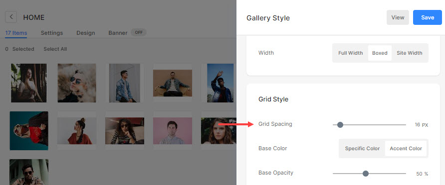
- Under gallery style options, you would see the Grid Spacing option to manage the image spacing in desktop view.
- Under the Mobile display, you will find Grid Columns from where you can choose 1 column or 2 columns view on mobile, and Grid Gutter from where you can manage the image spacing in the mobile view.
- Click on the Save button to publish your changes to the live site.