The Header contains the first set of visible elements when your website loads. You can arrange the elements such as logo, navigation menu, and social icons in the way you like them to appear in the Header.
In this article:
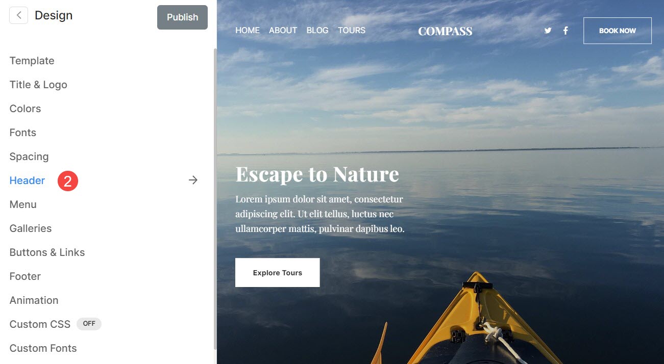
You can manage the Header styling (for both desktop and mobile) from the Design (1) section.

Once you are inside the Design section, click on Header (2) tab.
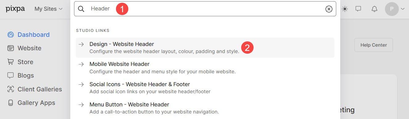
Alternatively, you can also use the studio’s search option.
- Enter Header (1) in the Search Bar.
- From the related results, click on the Design- Website Header option (2).
Header for Desktop
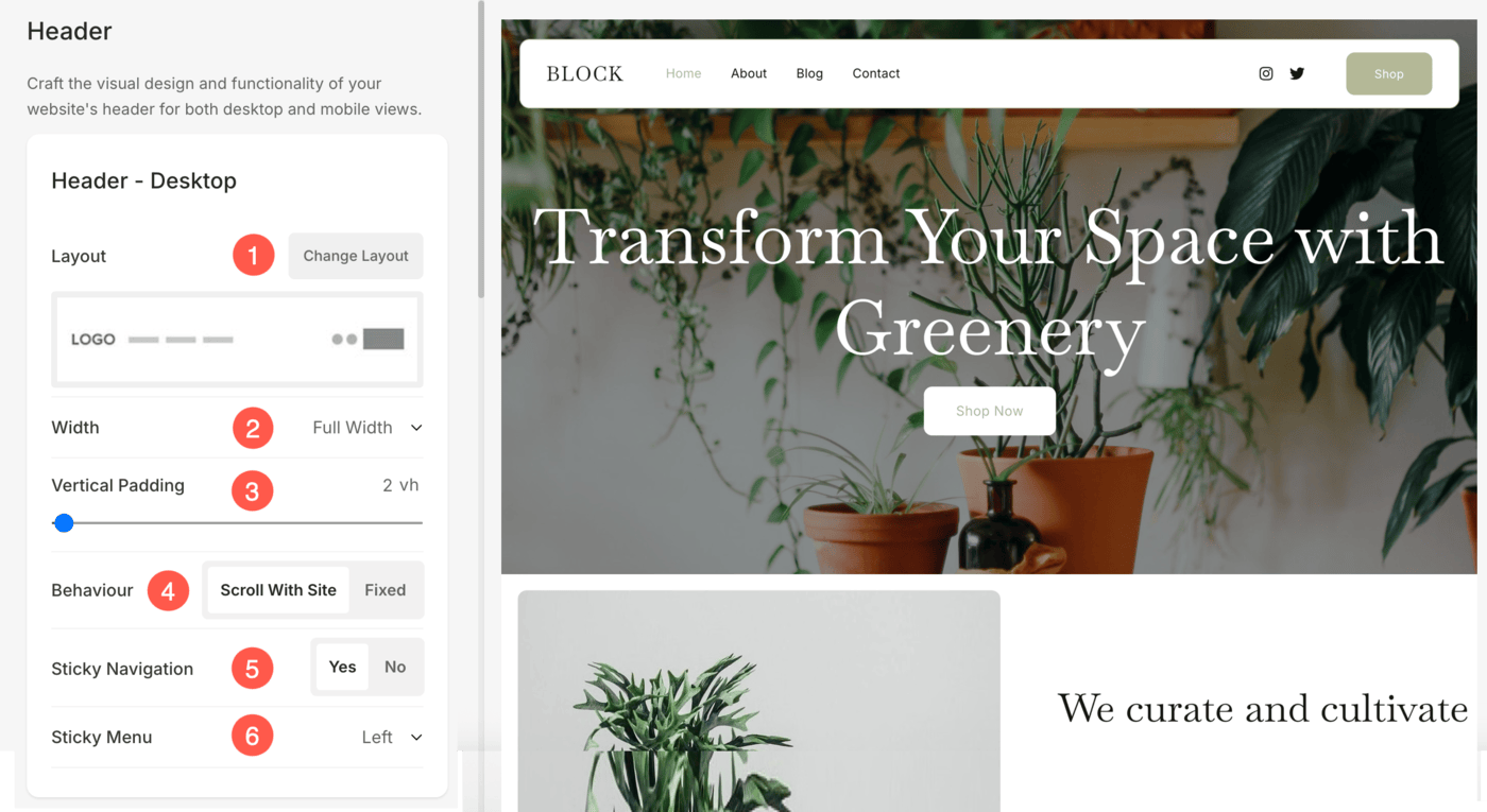
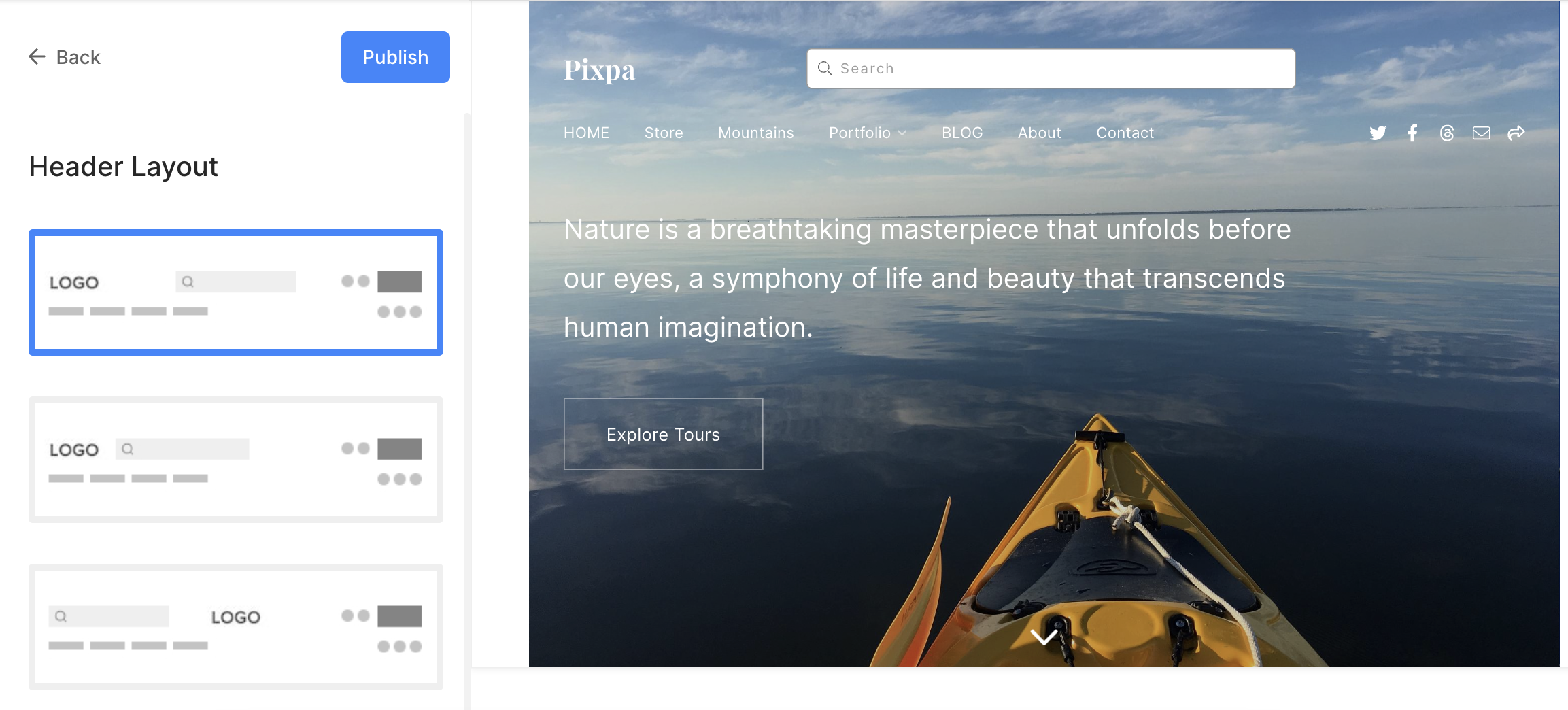
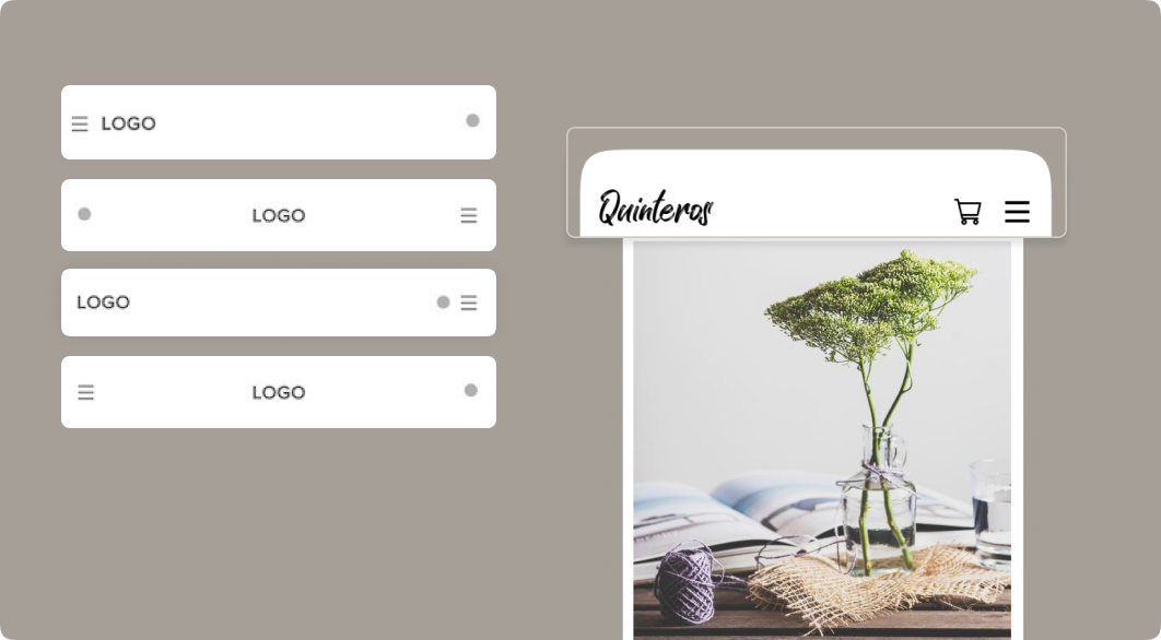
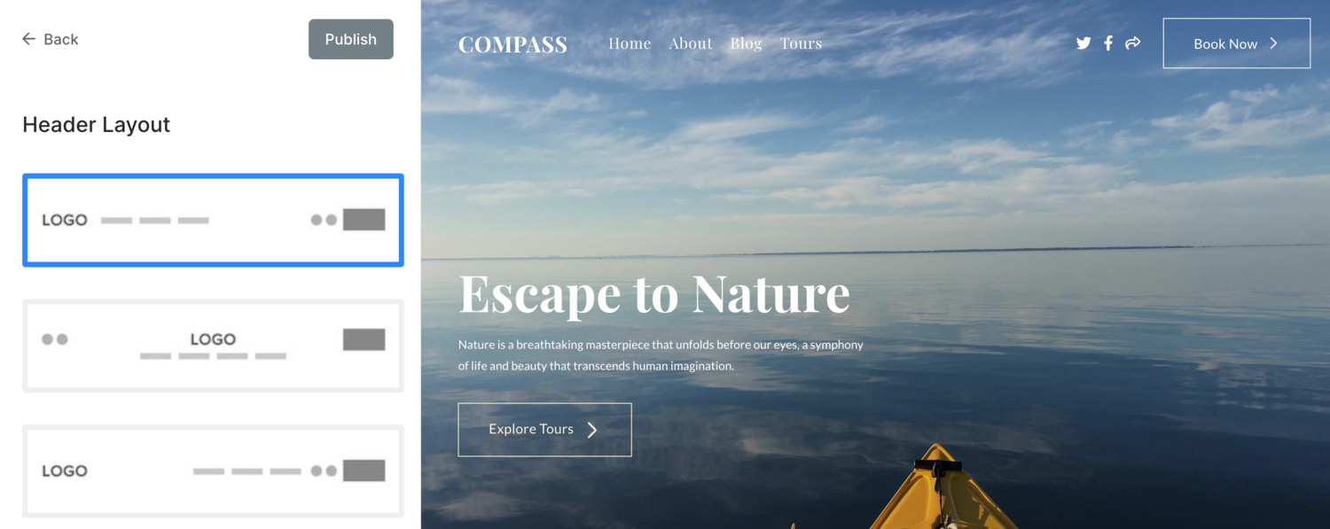
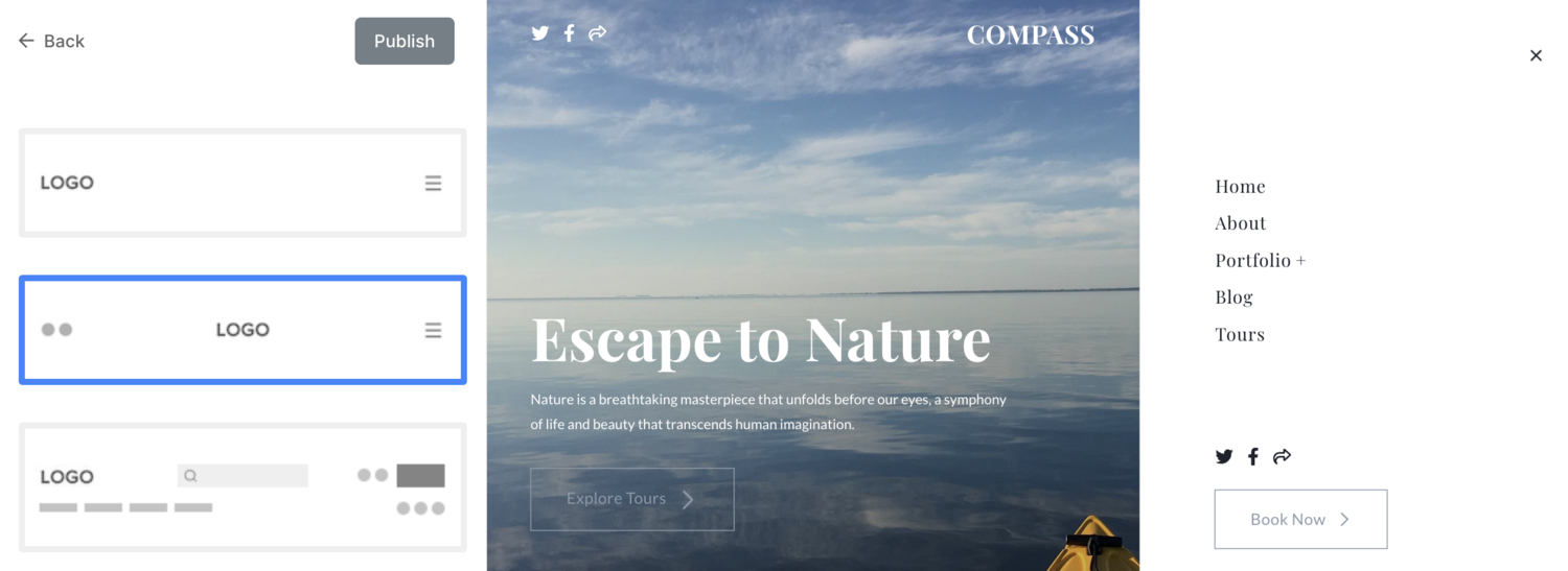
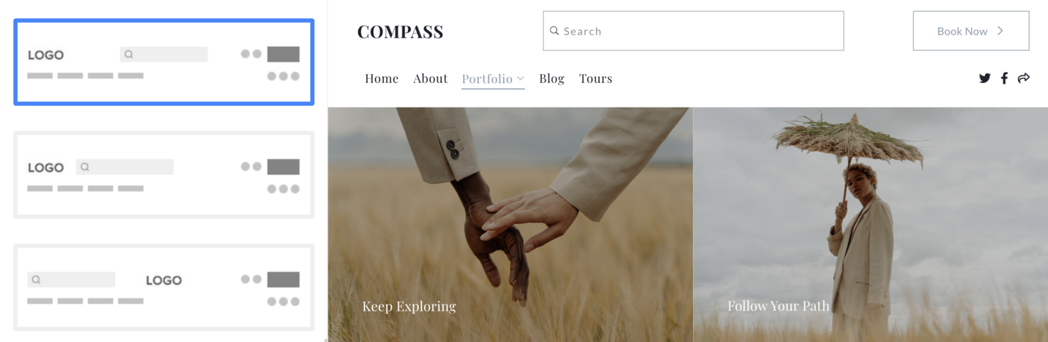
- Header Layout – Check the currently applied header layout for the desktop version. Click on the Change Layout button to choose from the available header layout options, and apply to your website.
We provide two types of header layouts – top header layouts, and two-column header layouts. The two-column header layouts exist in themes like Burst, and Isle. - Width – Specify the header width as Full Width or Site Width.
‘Full width‘ will display the header while covering the entire width without leaving any margin.
‘Site width‘ can be specified in the Design section. You can specify a fixed-width here.
It will display the header by adhering to the fixed-width specified. Know more. - Vertical Padding – Add space (top and bottom) to your website header (specified in vh). Know more.
- Behaviour – The position of your desktop header can be set to Fixed (here the header will be fixed on the top, i.e, even if the page scrolls, the header would be visible) or Scroll With Site (here the header will scroll along with the page).
- Sticky Navigation – Enable or Disable the sticky navigation in case of the Scroll With Site header position.
- Sticky Menu – Set the position of the sticky menu when the page is scrolled to Left or Center of the screen.
Check out header padding in action:
Have a look at a Header on a live site.
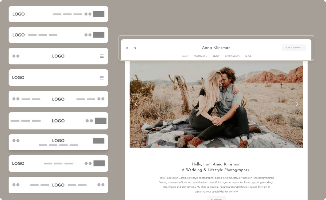
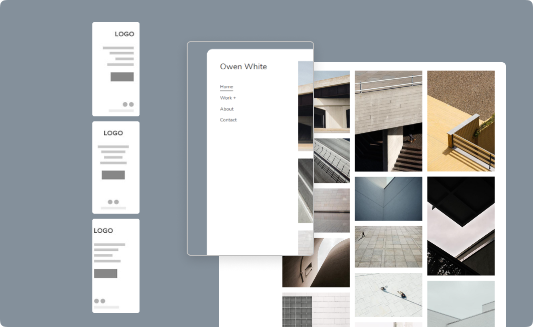
See different desktop header layouts
See different 2-column desktop header layouts
Search based Header layouts which focuses on Website Search
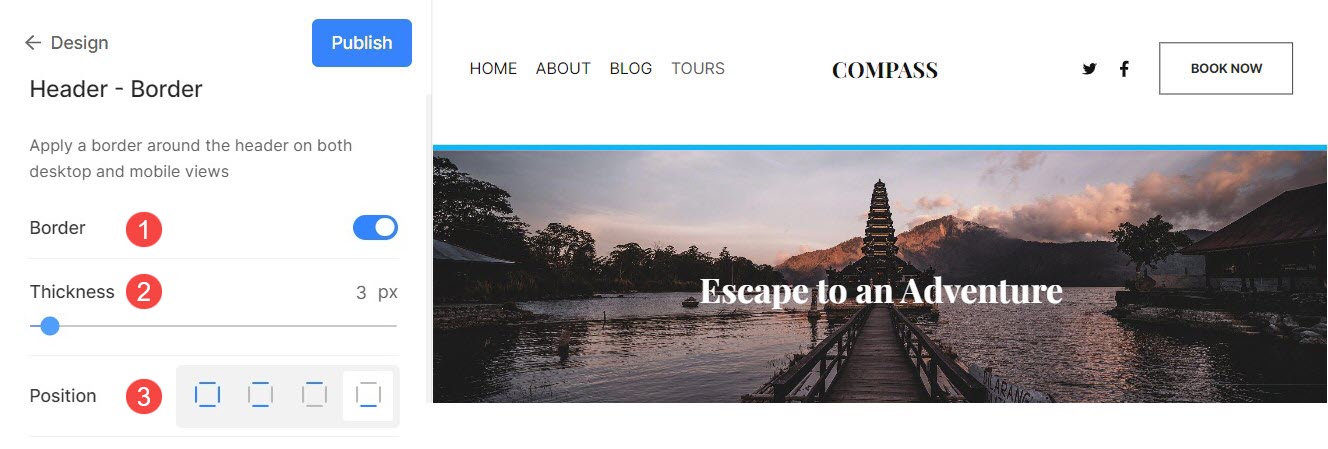
Header – Border
- Border: Enable or disable the border for header.
- Thickness: Specify the width of border lines for the header.
- Position: Set the position of header border. You have four options – All sides, Top & Bottom, Top only, and Bottom only.
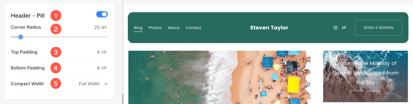
Header – Pill
The Pill-Shaped Header in Pixpa adds a sleek, modern look to your website header with rounded corners and spacing flexibility. This design is ideal for creatives and professionals who want to make their header visually distinct and stylish.
You can apply this style to any header layout, giving you full design freedom across different header types.
- Header – Pill: Turn on the Header – Pill toggle to activate pill styling for your header.
- Corner Radius: Adjust the roundness of the header corners using the Corner Radius slider or field. Higher values will make the corners more rounded.
- Top Padding: Specify the space above the content in the pill header to control vertical spacing.
- Bottom Padding: Define the space below the content to ensure a balanced appearance.
- Compact Width: This allows you to choose how wide your pill header appears:
- Full Width: Stretches the header across the entire screen width.
- Site Width: Aligns the header with your overall site content width.
- Compact: Shrinks the header to a tighter, centered block – ideal for minimalist designs.
Header for Mobile
These settings allow you to control how your site’s header appears on mobile devices. This ensures a clean and optimized layout for smaller screens.
- Layout – Check the currently applied header layout for the mobile version. Click on the Change Layout button to choose from the available header layout options, and apply to your website.
- Vertical Padding – Add Vertical Space (top and bottom) to your website header on mobile devices (specified in vh).
- Mobile Header – Specify whether you want the mobile header to appear only on mobile devices (up to 768px) or extend it to tablet devices as well (up to 1199px).

Be sure to click the Publish button after making changes to ensure they are live on your website.
See different mobile header layouts
Types of Header
You can choose from four different types of headers:
Normal Header
The normal header layout features a clean and straightforward design with a logo, navigation links, social icons, and menu button displayed horizontally. It’s ideal for providing a classic and user-friendly browsing experience.
Two-Column Header
The two-column header layout divides the header into two distinct sections, allowing for a logo and social icons on the left or center and the navigation menu and other items of the header on the right as a clickable sidebar.
This layout is perfect for websites that need to emphasize both their brand and important actions simultaneously.
Search-based Header
The search-based header layout prominently includes a search bar, making it easy for users to find specific content quickly. This design is especially useful for content-heavy websites where search functionality is a primary focus.
Header Elements
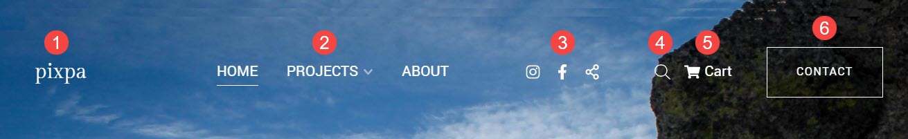
- Logo / Site Title – The very first element of the site header is the site logo/title. Set the site title/upload the site logo for your site.
Note: If you have not uploaded the site logo, the site title would appear on your site header. Also, if you have provided both, then the site logo will be visible on your site header. - Menu – Another element of the site header is the menu (menu links). You can sequence the site navigation links, or delete/hide any menu item from your site.
- Social icons – You can add the Social icons that are connected to your social media profiles to your site header. You can upload a social sharing image that will be used as a thumbnail when the website or any of the website pages are shared on social media. Also, choose where the social media icons would show up on your website. The available positions are header, footer, both, or none.
- Search box – Add a search box that lets your site visitors search for any content in Products (if you have a Store enabled on your website), Images, Blog Posts, and Pages (Galleries, Folders, and other pages) to your site header.
- Cart icon – Add a floating cart icon that’s easy to reach and always visible without interfering with your website to your site header.
- Menu button – Add a menu button to your site header i.e., a call-to-action button that redirects to a specified URL. You can specify the Label and the URL for the Menu Button. Also, choose the Button size to be Small, Medium, or Large.