Add a call to action button to your website header using a Menu button, increasing the probability of visitors clicking the button.
This button shows up on your header across your website. The position of this button depends on the header layout you choose, whereas on mobile it always displays inside the menu icon below the menu items.
Pixpa gives you the option to show any page that you want to highlight in the header as a Menu Button. You can always choose to show or hide it from your website header.
In this article:
Add a Menu button

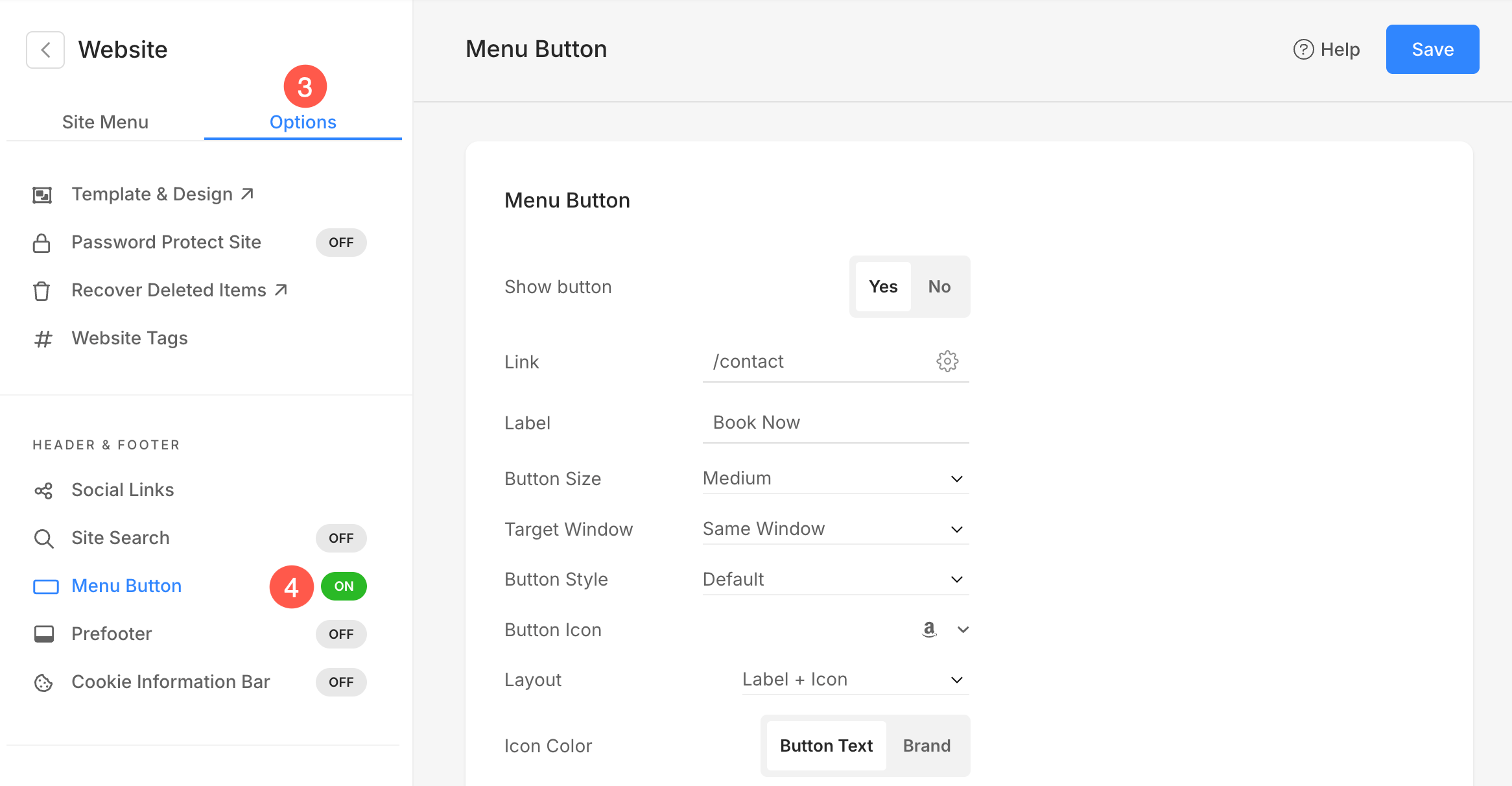
- Click on the Options (3) tab where you will see the option to customize the Menu Button (4).
Alternatively, you can use Pixpa’s search option to navigate to the Menu button section.
- Enter menu button (1) in the Search Bar.
- You will see the related results.
- Click on the Menu Button – Website Header option (2) under Studio Links.

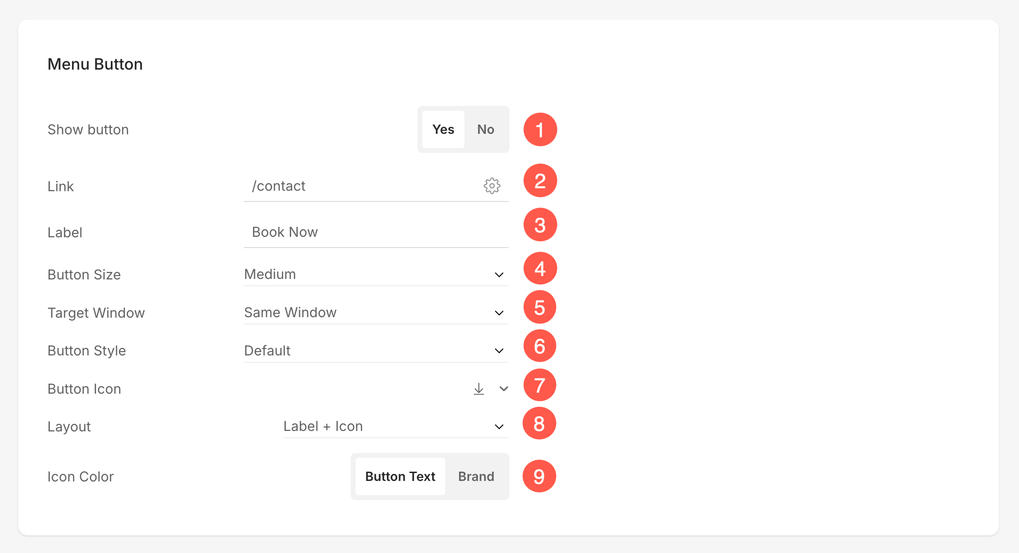
On clicking on it, you would see a page where you would be able to manage the Menu Button. You can choose to show/hide the menu button, link it with a page, and more.
Menu Button Options
- Show Button – Enable/Disable Menu Button on the website.
- Link – Click on the Link Builder icon to choose the page or link you want to connect with the Menu Button.
- Label – Specify the Label for the Menu Button.
- Button Size – Choose your Button size from Small, Medium, or Large.
- Target Window – Set the target window for the menu button to open in the Same Window or a New Window.
- Button Style – Choose the button style to be the default (set in the Buttons and Links tab of the Design section), Solid, Outline, or a Text Link.
- Default: Follows your site’s theme settings.
- Solid: A bold, filled button.
- Outline: Transparent background with a border.
- Text Link: Simple, clean text-only style (no button box).
- Button Icon – Add an icon next to your button label. You can choose from various icon options.
- Layout – Control the placement of the icon in relation to the label. Available layout options are:
- Label + Icon: Text appears first, followed by the icon.
- Icon + Label: Icon appears first, then text.
- Label + Icon (Wide): Text and icon arranged with more padding, suited for wider buttons.
- Icon + Label (Wide): Icon first, wider padding layout.
- Icon Color – Choose the color of button icon. You can either set it to the Button Text color or the Brand color.
Menu Button Colors
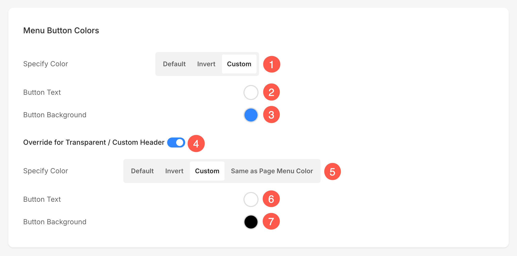
Use the Menu Button Colors panel to customize how the button in your site navigation appears. These settings allow full control over text color and background color, both for regular headers and transparent or custom headers.
- Specify Color – Choose how the menu button inherits its colors.
- Default: Inherits theme settings.
- Invert: Reverses the button text/background colors.
- Custom: Enables you to choose specific text and background colors.
- Button Text – If using Custom button color, you can set the text (label) color from here.
- Button Background – Also available under Custom, this sets the button’s background color. Pair this with text color for maximum readability and style.
- Override for Transparent / Custom Header – If your website uses a transparent or custom header design, you can activate this option to apply a separate set of colors specifically for that header style. You can customize the menu button color for each page also.
- Specify Color – Choose how the button should appear on transparent or custom headers.
- Default: Inherits theme settings.
- Invert: Reverses the button text/background colors.
- Custom: Enables you to choose specific text and background colors.
-
Page Menu Color: Applies the Element Color set for the specific page as the button color, ensuring the menu button automatically matches that page’s styling.
- Button Text – If using Custom button color, you can set the text (label) color from here.
- Button Background – Also available under Custom, this sets the button’s background color. Pair this with text color for maximum readability and style.