The Contact form serves as a crucial tool for facilitating communication between individuals or businesses. It provides a convenient and organized way for users to reach out and express their queries. You can also take applications, contact queries, and opinion polls using it.
You can easily create a Contact page on your website using the Contact section.
In this article:
- Adding Contact Section to a page
- Content of Contact Form
- Manage Layout
- Managing Form Fields and Form Type
- Types of Fields
- Inline Form and Popup Form
- Button Style Settings
- Style Contact Form
- Contact Form Settings
- Redirect Form to another page
- Export Form Data
- Submitted Form Data
- Email Notifications
- Live Example
Adding Contact Section to a page
- On your page, click on the blue + icon to add a new section to your page.

- You will now see the Section Categories on the left side.
- Choose the Forms (1) category and click on the Contact tab (2) where you can choose from different layouts of the Contact (3) section.
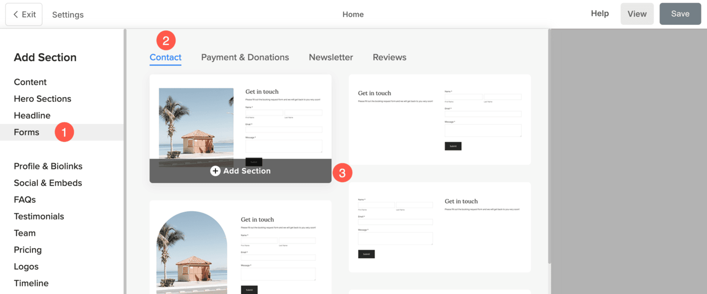
- Choose any section layout and click on it to add it to your page.
Content of Contact Form
This is an important part of the form since you upload or change the image, give title and description here so that users get an idea regarding the purpose of the form itself. By carefully crafting concise, descriptive title and informative, compelling description, you can enhance communication and establish strong connections with your website’s visitors.
- You can Upload or Delete (1) the image that will be displayed in the form.
- Edit the Title (2) of the form.
- Edit the Description (3) of the form.

- Define the Section Headline (4) that will be displayed on top of the form.

Manage Layout
- While adding the form on the page, a layout must be selected. You can Change the Layout after adding the form also.

Managing Form Fields and Form Type
Under Manage Form Fields, you can specify the fields that you want your visitors to fill in.
- Click on the + Add Field (1) button to add more fields to your form.
- Edit, Duplicate or Delete (2) an already added field.
- Drag and drop (3) the field to change the sequence in the form.

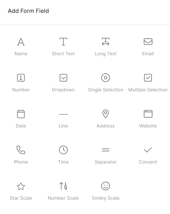
On clicking on the + Add Field button, a pop-up will open from where you can choose the elements that you want to display in the form.
Types of Fields
There are several field types that you can use on your website’s contact form to gather more and useful data from users in a categorized and professional way. These fields can be very easily added, duplicated or can be deleted.
Here is a brief description of the form fields.
- Name: Capture the name of your client using this.
- Short Text: Use this box to capture brief text data from the website visitors.
- Long Text: Use this box to capture long text data from the website visitors.
- Email: Capture the email of your client.
- Number: Use this to capture numbers (digits).
- Dropdown: You can add options to choose from in a dropdown way.
- Single Selection: Add this where users can select only one option from the list.
- Multiple selection: Add this where users can select multiple options from the list.
- Date: Add a date picker so that your clients can choose a date for any event.
- Line: Add lines to your form. This can be used to differentiate the fields.
- Address: Use this to capture the address of the users.
- Website: You can use this to capture the website of the user.
- Phone: Capture phone number using this field.
- Time: This will give an option to users to select a time.
- Separator: This can be used to categorize the form fields with an option to add Title and Subtitle.
- Consent: Obtain consent from the users using this on the form.
- Star Scale: Allow users to give star rating using this. It can display either 3 or 5 stars.
- Number Scale: Allow users to give number rating using this. You can choose to display from 0 to 10 and customize the left and right caption.
- Smiley Scale: Allow users to give smiley rating using this option.
Inline Form and Popup Form
You can choose to show the form on the page or as a pop-up linked to a call to action button.
Inline Form
Selecting Inline Form will place the contact form directly on the page where it is added. The form will be immediately visible to visitors without requiring any additional action. This is ideal for situations where you want to keep the form prominent and encourage direct engagement, such as on a contact or inquiry page.
Popup form
Choosing Popup Form will display only a button on the page. When a visitor clicks the button, the contact form will open in a popup window. This keeps the page design cleaner and works well when you want to offer the form without taking up much space. It’s commonly used for quick inquiries, lead capture, or when you want to minimize distractions on the page.

Button Stye Settings
- Button Label – Specify the visible text on your button. This is what users will see and click on.
- Button Size – Choose the size of the button (e.g., Small, Medium, Large). This adjusts the padding and font size to suit your design.
- Button Style – Choose the button style to be the default (set in the Buttons and Links tab of the Design section), Solid, Outline, or a Text Link.
- Default: Follows your site’s theme settings.
- Solid: A bold, filled button.
- Outline: Transparent background with a border.
- Text Link: Simple, clean text-only style (no button box).
- Button Color – Customize the color scheme of the button:
- Default: Inherits theme settings.
- Invert: Reverses the button text/background colors.
- Custom: Enables you to choose specific text and background colors.
- Button Text – If using Custom button color, you can set the text (label) color from here.
- Button Background – Also available under Custom, this sets the button’s background color. Pair this with text color for maximum readability and style.
- Button Alignment – Choose the Alignment of button in the form from Left, Center or Right option.
- Button Width – Choose how wide the button should appear:
- Default: Standard width based on button content
- Large / X-Large: Wider buttons for more emphasis
- Full Width: Button stretches across the entire container width

Style Contact Form
Styling a contact form is an important aspect of creating a visually appealing and user-friendly experience.
You will have multiple style options for the section:
- Form Fields
- Alignment
- Text
- Spacing
- Headline
- Images
- Image Border
- Popup Button
- Form Button
- Headline Buttons
- Headline Social Icons
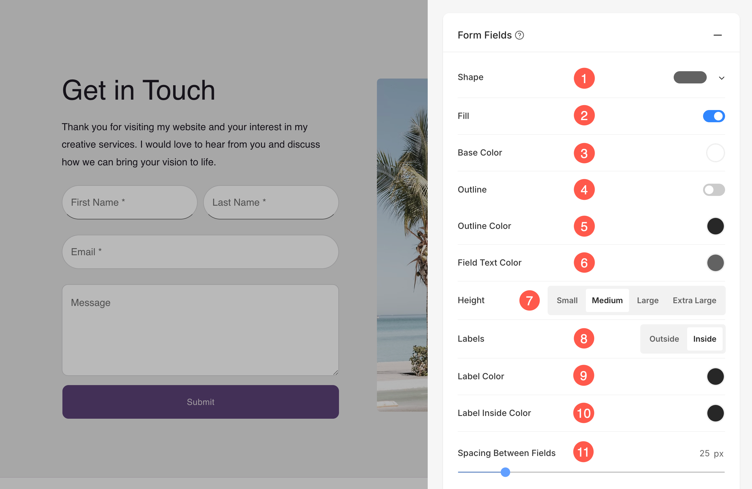
Form Fields
Pixpa allows you to fully customize the appearance of your form fields. These styling options apply to all input fields in your Contact Form and give you greater control over how your form looks and feels on your website.
- Shape: Choose the shape of your input fields — such as rectangle, rounded, pill, or text — to match your website’s aesthetic.
- Fill: Enable this toggle to apply a background fill color to your form fields.
- Base Color: Set the background color of the fields when the fill option is enabled.
- Outline: Toggle the border (outline) on or off for each field.
- Outline Color: Choose the color of the field’s border when the outline is enabled.
- Field Text Color: Set the color of the text typed by users inside the form fields.
- Height: Adjust the height of your fields by choosing from: Small, Medium, Large, or Extra Large.
- Labels: Choose whether form field labels appear Inside or Outside the field.
- Label Color: Define the color of labels when placed outside the field.
- Label Inside Color: Set the color for labels placed inside the field (helpful for placeholder-style labels).
- Spacing Between Fields: Use the slider to set the vertical spacing (in pixels) between each form field.
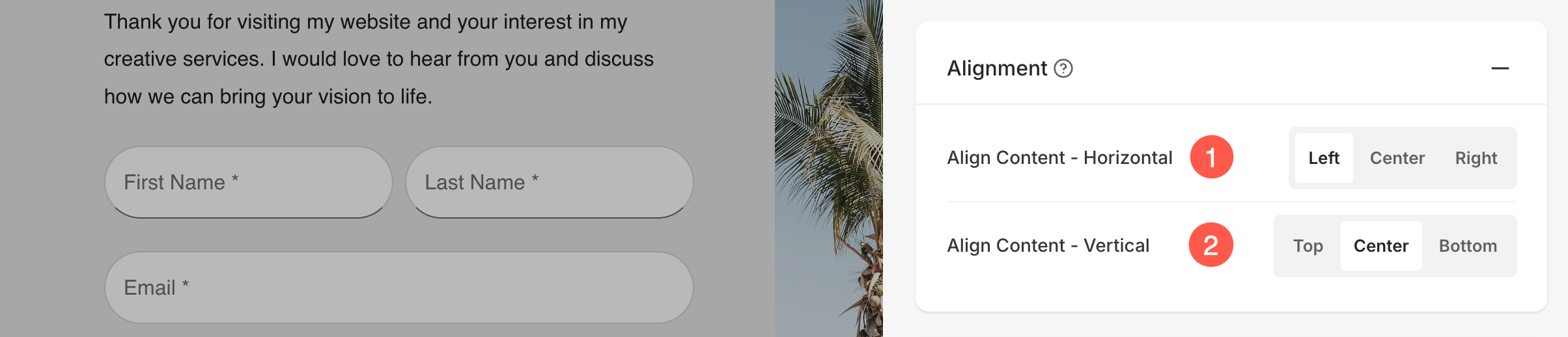
Alignment
- Manage the alignment of the form content horizontally from Horizontal Alignment (1).
- Manage the alignment of the form content vertically from Vertical Alignment (2).
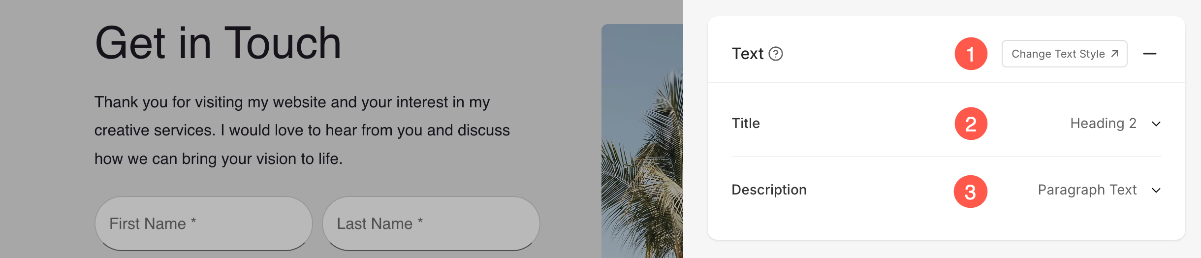
Text
- Click on the Change Text Style (1) button to visit the Design section and manage your font sizes and styles.
- Specify the Title (2) font style of the form.
- Specify the Description (3) font style of the form.
Spacing
- Specify the Image Width (1) of the image in the form in Percent.
- Specify the Space Between Image and Text (3) in Percent.
- Specify the Space Below Title (4) in Percent.

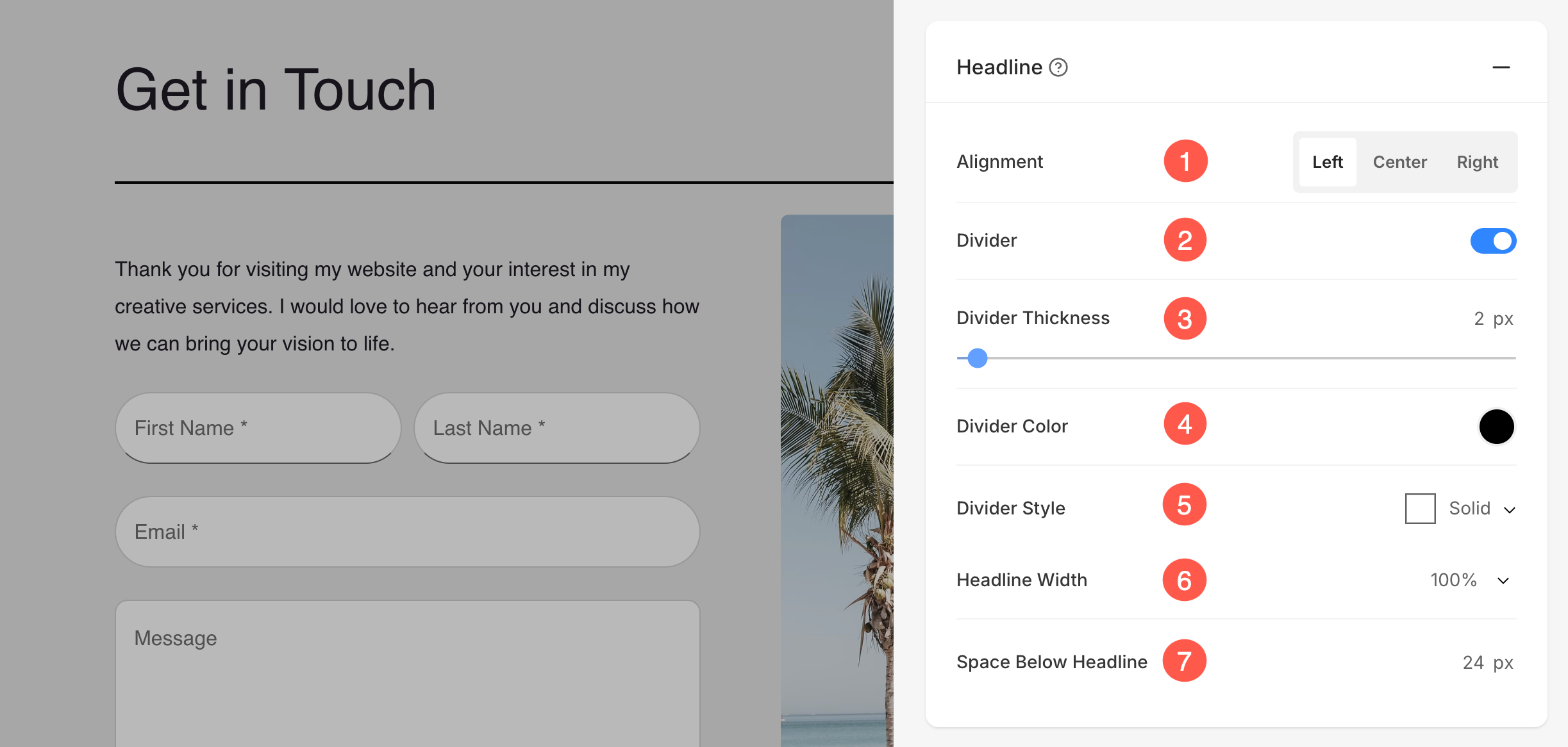
Headline
- Horizontally Align the section headline text. You can set it to Left, Center, and Right.
- Enable/Disable the Divider between the section headline and the section content.
- Set the thickness of divider (in px).
- Specify the Divider Color from color picker.
- Choose a Divider Style from the dropdown.
- Set the Headline Width to define how wide the section title appears, starting from a minimum of 50%.
- Specify the Space Below Headline within the section (in px).
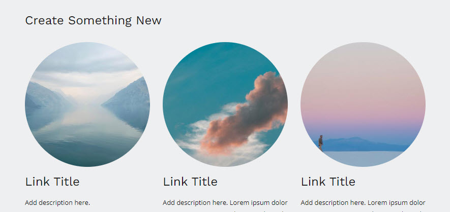
Images
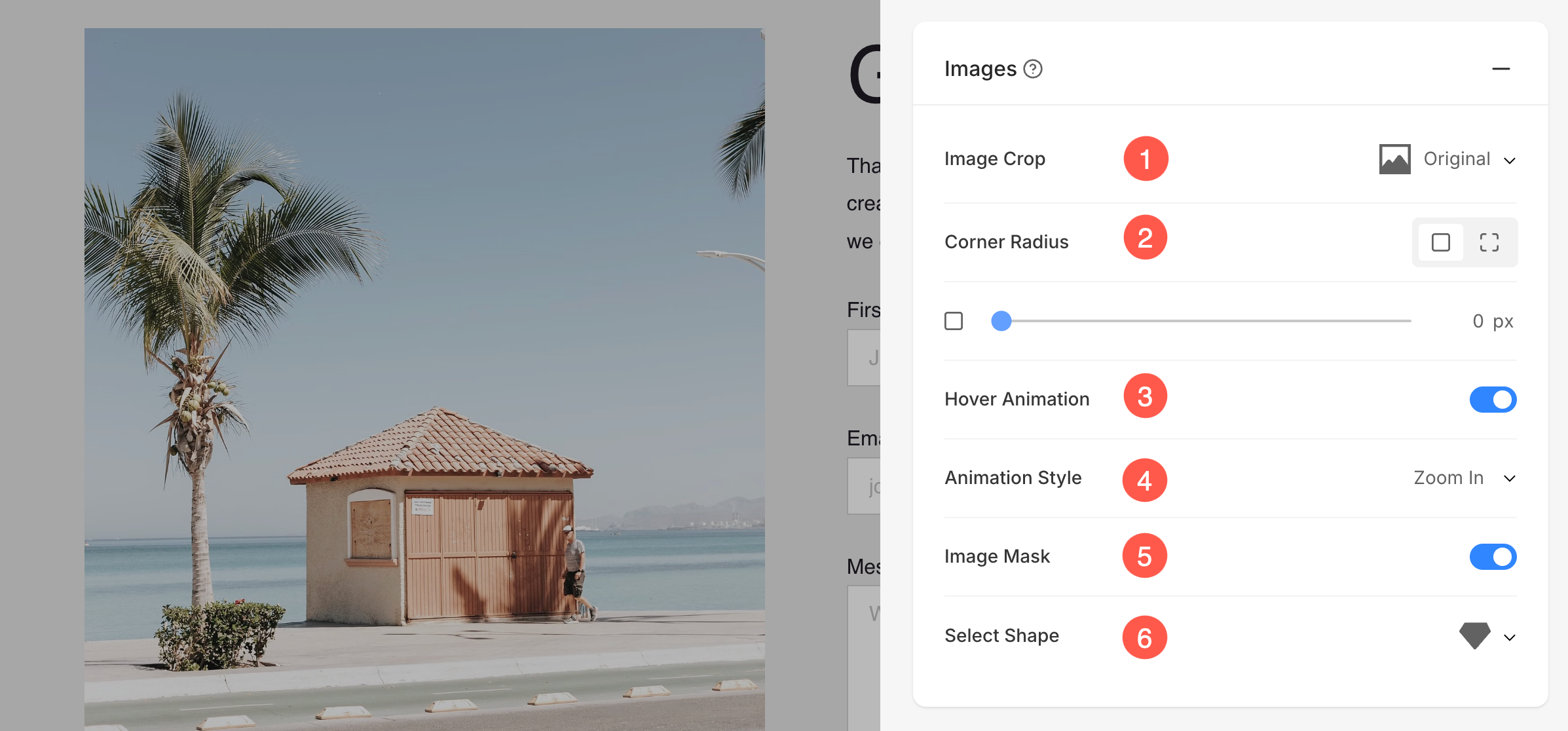
- Image Crop: Choose the Image Crop for the list items. You can set the images as Square, Circle, Horizontal, Portrait, and Original.
- Corner Radius: Choose to have a common corner radius or different corner radius for each side of the list items and set a number (in px) for the Corner Radius of the list item images. Know more.
- Hover Animation: Choose to Animate the section’s image on hover by enabling the toggle. Check this feature on a live page.
- Animation Style: Choose an Animation Style for image when the cursor hovers over them.
- Shape Mask: Enable this toggle to apply a shape mask to the images in the Image List section. Once enabled, the selected shape will visually clip the image into that form.
- Select Shape: Choose from various predefined shapes to apply to your images. This allows you to creatively stylize your content by displaying images in unique forms like rounded, diamond, drop, etc.
- In case you have chosen split corners, you can set different corner radius for each corner.

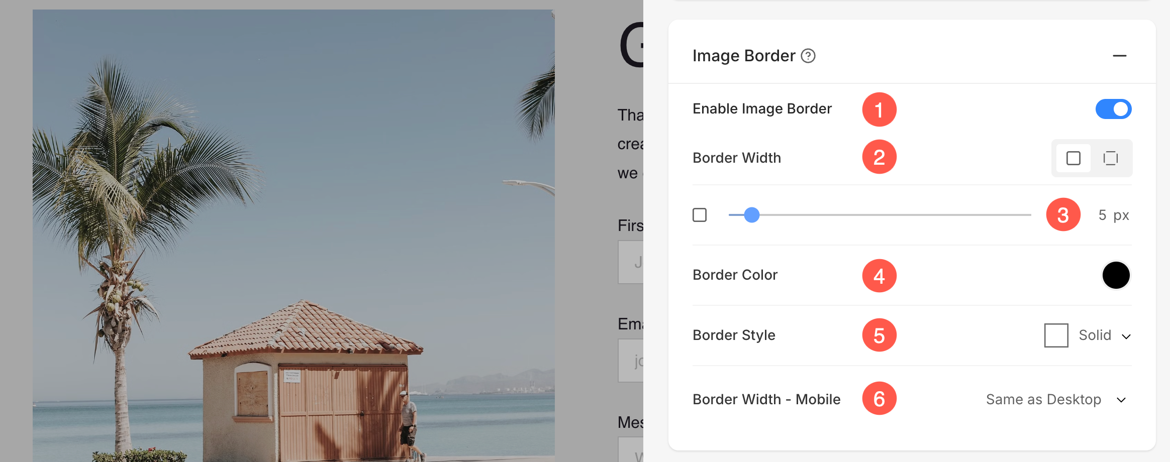
Image Border
- Enable / Disable border around the image by switching the toggle.
- Choose to have a common border on all sides of image or you can specify the borders separately for each side.
- Specify the width of the border. If it is set to 0, then the border will not appear. You also have the option to set the border width individually for each side of the image.
- Select the Border Color from color picker.
- Select a preferred Border Style from the dropdown.
- Determine the border width for mobile devices, aligning it with the width chosen for desktop.
Popup Button
These style options are for the popup button, where the contact form will open when the button is clicked.
- Button Size – Select the size of the button from options like small, medium, or large.
- Space Above Button – Adjust the vertical spacing above the button (in percentage).
- Button Style – Choose the style of the button, such as default or custom.
- Button Color – Select the color style for the button. Options include Default, Invert, or Custom.
- Button Text – Customize the text color for the button.
- Button Background – Select the background color for the button.

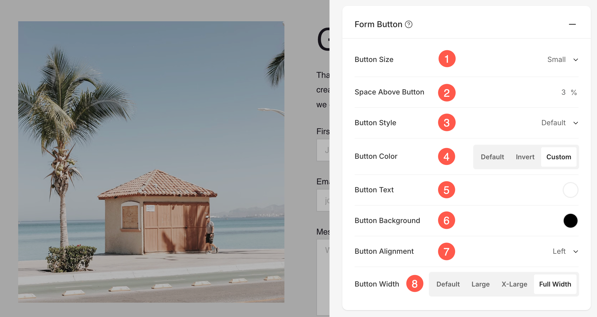
Form Button
These settings allow customization of the form submission button to match the design and layout of the page.
- Button Size – Select the size of the button (Small, Medium, or Large).
- Space Above Button – Adjust the vertical spacing above the button (specified in percentage).
- Button Style – Choose the overall style of the button, such as Default or Custom.
- Button Color – Set the button color style. Options include Default, Invert, or Custom.
- Button Text – Customize the text color displayed on the button.
- Button Background – Select a background color for the button.
- Button Alignment – Choose the alignment of the button (Left, Center, or Right).
- Button Width – Adjust how wide the button appears. Options include Default, Large, X-Large, or Full Width.
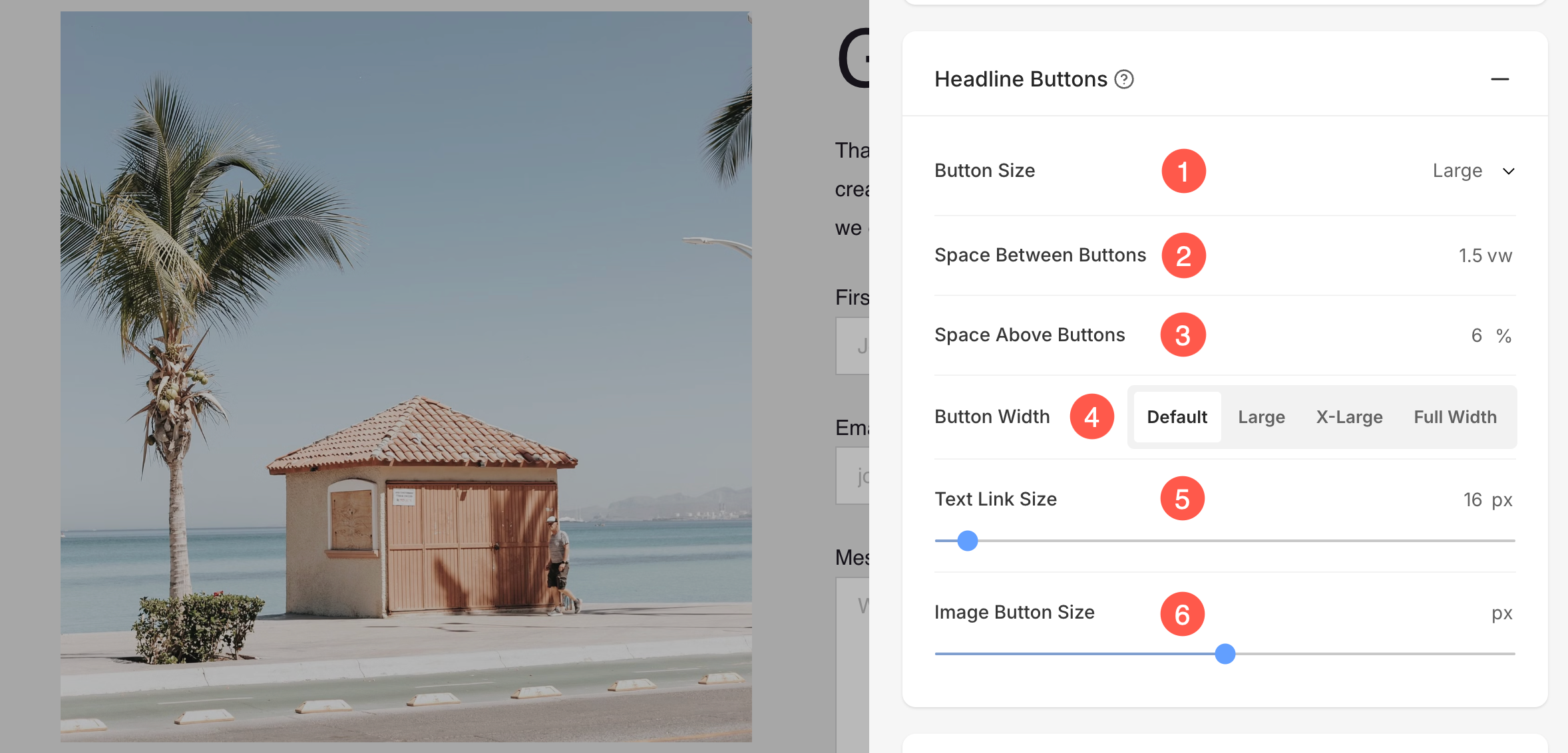
Headline Buttons
These settings control the appearance and spacing of buttons placed with the headline of the section.
- Button Size – Select the overall size of the buttons (Small, Medium, or Large).
- Space Between Buttons – Adjust the spacing between multiple buttons (measured in vw).
- Space Above Buttons – Set the vertical spacing above the buttons (measured in percentage).
- Button Width – Choose how wide the buttons should appear. Options include Default, Large, X-Large, and Full Width.
- Text Link Size – Specify the font size of text links associated with buttons (measured in px).
- Image Button Size – Adjust the size of image-based buttons (measured in px).
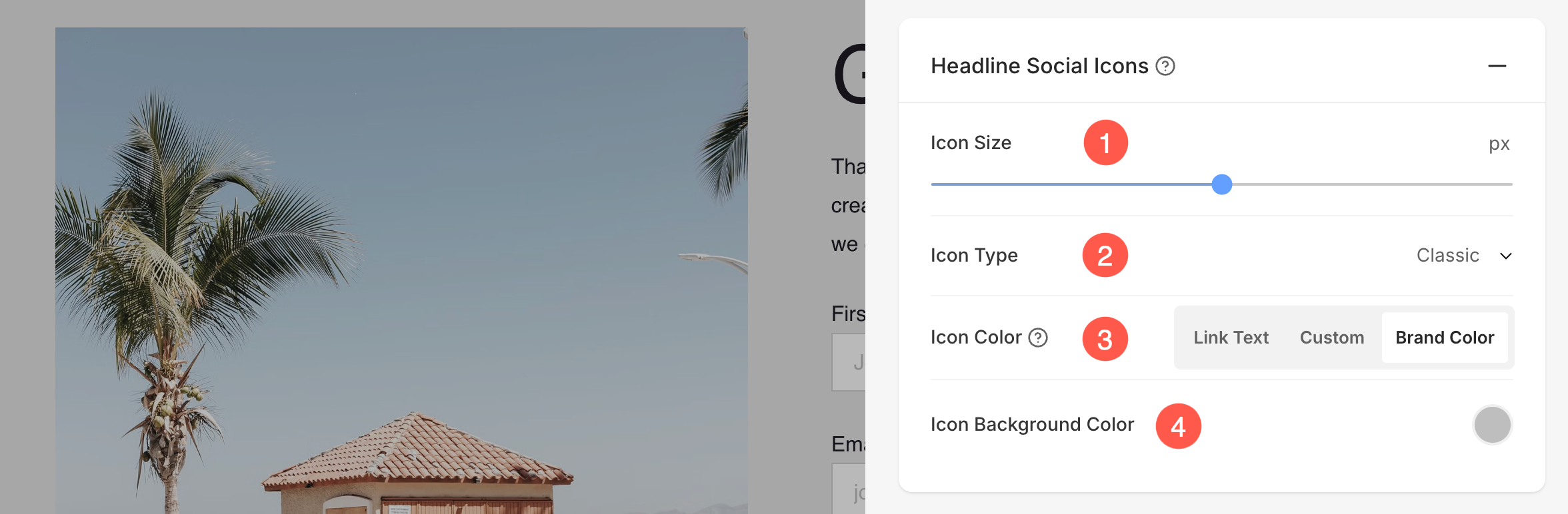
Headline Social Icons
Display and customize social sharing icons in the form.
- Icon Size – Adjust the size of the social icons (measured in px).
- Icon Type – Choose the style of the icons, such as Classic, Solid, or Outline options.
- Icon Color – Select the color for the icons. Options include Link Text, Custom, or Brand Color (original color of the social platform).
- Icon Background Color – Set a custom background color for the icons to enhance visibility and style.
Contact Form Settings
- Specify an internal name for the form to help identify it within Pixpa Studio. This name is not visible to website visitors.

Post Submission Action
- You can define Post Submission Action (1) either by displaying a Success Message (2) or Redirecting the user to a specified URL.
- You can also add any script in the Post Submit Success HTML (3) box.

Redirect Form to another page
Redirecting users to a specific page after they submit a form can enhance the overall user experience and serves various purposes like avoiding duplicate submissions, analytics and tracking, retaining users on the website for a longer period of time, etc.
Redirection can be easily created using the Post Submission Action option under the Setting tab.
- You can create a redirect within your website from Website Content (1) option. It can be a page, gallery, blog, e-commerce gallery, folder, etc. You have to enter the element’s name in the field as shown in the screenshot below and you’ll get suggestions relating to it.
- Use External Link (2) option to create redirection outside your website. You will have to enter the URL in the field where you want the users to get redirected after the form submission.

Learn more on how to use Linkbuilder.
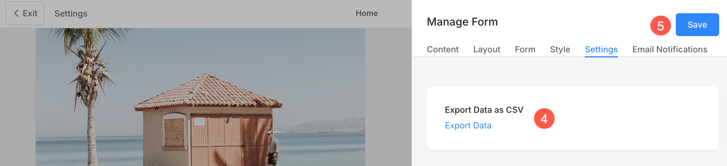
Export Form data
- Export form data (4) as a CSV file. Learn more.
- Save (5) the changes.
Submitted Form Data
Submitted form data in a contact form includes the information that a user enters into the form fields when they submit it.
- All form data is stored and accessible from the Form Submissions page of the studio. Learn more.
- All submitted data via the contact form will also be forwarded to the email ID specified in contact form settings. Your account email address is taken as the default.
Also Check: Change account email address.
Email Notifications
From here, you can customize the email subject for the notifications you receive as a website owner upon a successful form submission. Additionally, you can personalize the success email sent to users or customers after they submit the form. This feature can be leveraged for branding, marketing, and running campaigns effectively.
- Email to Website Owner: Enable or disable email notifications for form submissions. When enabled, notifications will be sent to the specified email addresses.
- Subject: Customize the email subject line. Use the {WEBSITE} variable to dynamically include the website name in the subject. This is useful when you have multiple websites.
- Email: Specify up to 5 email addresses to receive notifications when the form is submitted.

- Specify the Subject of the contact form submission email. You can also include {WEBSITE} variable to include the name of the website.
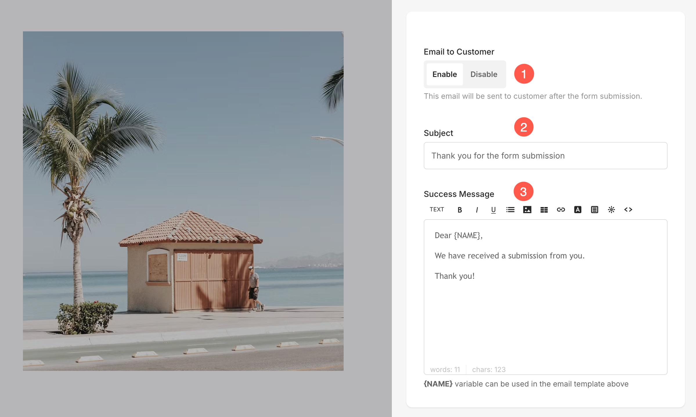
Email to Customer
- You can enable Email to Customer (1) to send a mail regarding the Form submission success.
- Specify the Subject (2) of the mail.
- Specify the content inside the mail from Success Message (3).
Live Example
Here’s a live Pop-up Contact Form:

Here’s a live Inline Contact Form:
