Pixpa allows you to change the layout of the category listing page.
Apart from the layout, you can manage the grid spacing, Category Title Font, and many other options.
Manage the Category Listing page design:
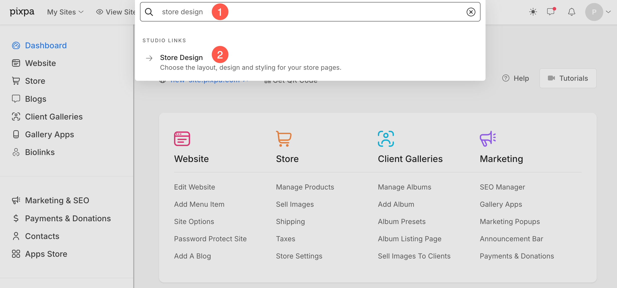
- Enter store design (1) in the Search Bar.
- From the related results, click on the Store Design option (2) under Studio Links.

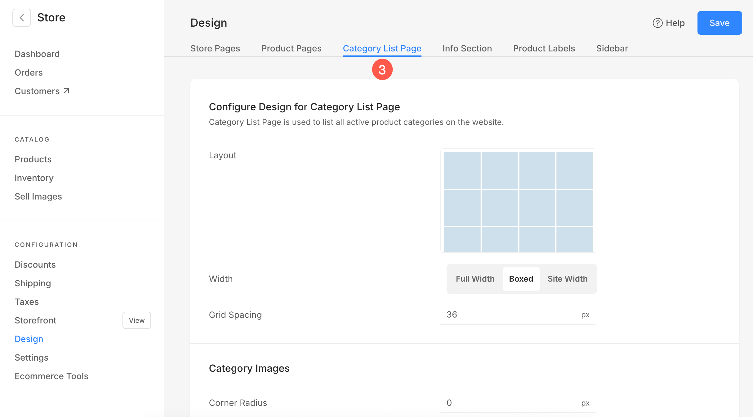
- Now, from the Category List Page (3) tab, you would see the design options.

The available options here can be categorized as:
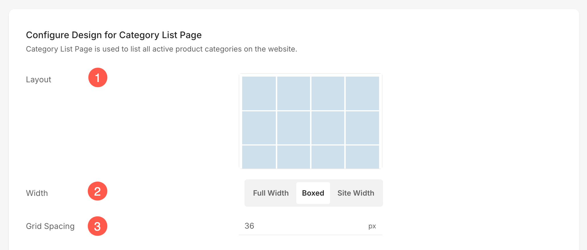
Configure Design for Category List Page
- Layout – Choose the layout for the category list page.
- Width – Select the width for the category list page.
- Full width‘ will display the page while covering the entire width without leaving any margin.
- ‘Boxed‘ will display the page while leaving some amount of padding on right and left of the screen.
- ‘Site width‘ can be specified in the Design section. You can specify a fixed width there.
It will display the page by adhering to the fixed-width specified.
- Grid Spacing – Manage the spacing between the grids on the category list page.

Category Images
- Corner Radius – Specify a value to make the category images rounded at corners.

Text
- Change Text Style – Click on this button to customize the fonts used on your website.
- Category Title Font – Choose the font (H1, H2, H3, H4, P, P (large), & P (small)) for the category title.
- Text Alignment – Choose the alignment (left, center, & right) for the text.

Mobile Options
- Grid Gutter – Specify the grid gutter/spacing for the mobile view.

