Cards in dynamic sections enhance the visual appeal of your content by adding a background color to the items under the section.
This helps create clean and organized sections, making your website more visually engaging and easier to navigate.
In this article
The Full card / Text card
- When you turn on the Full / Text Card over your Dynamic sections, the list items will have an outline and background with the card color.
Also See: Website colors and spacing.
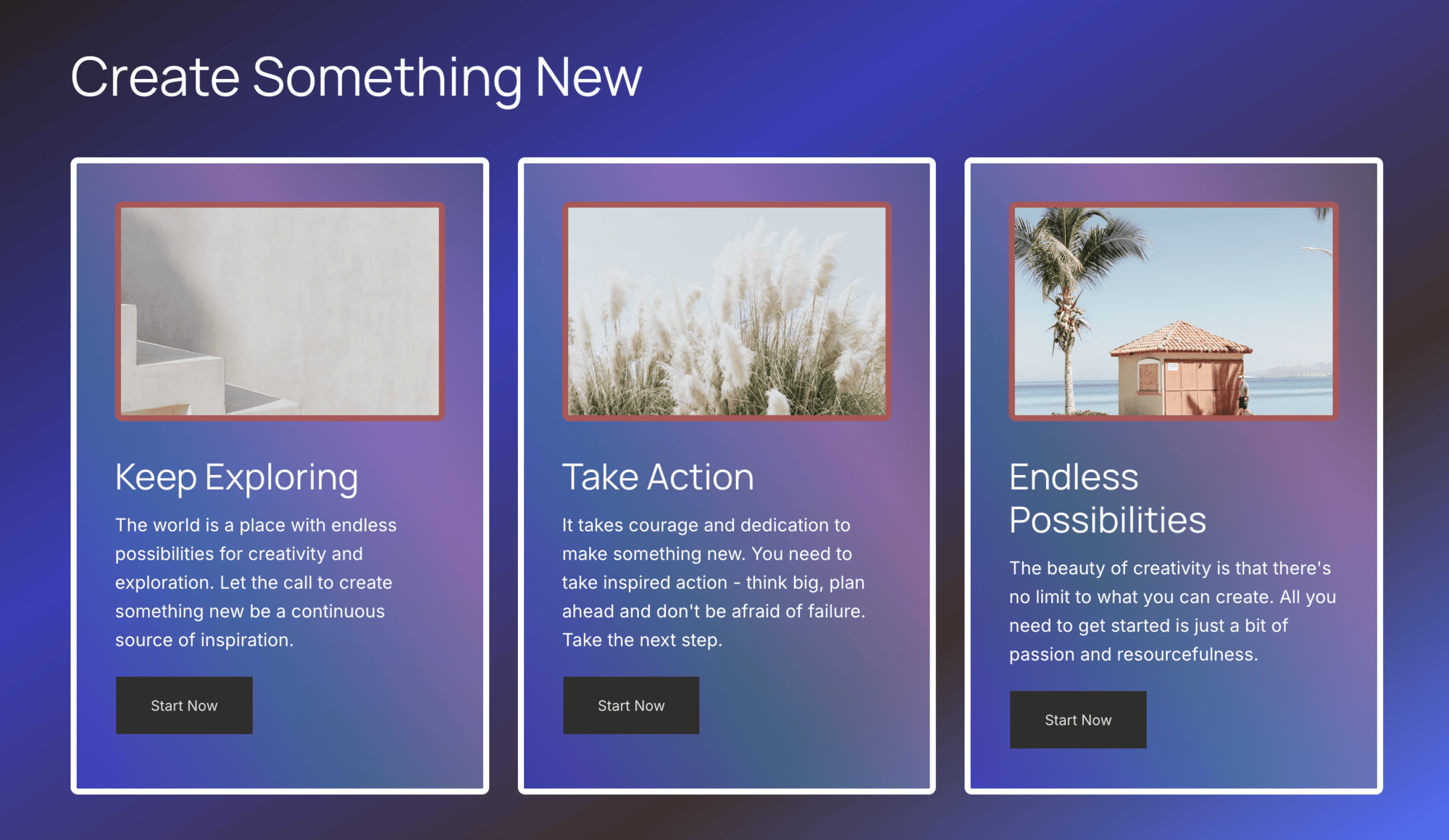
Full Card
- When the full card option is selected, the card color and other properties you specified are applied to the whole card i.e., the image and the text below it.
Have a look:
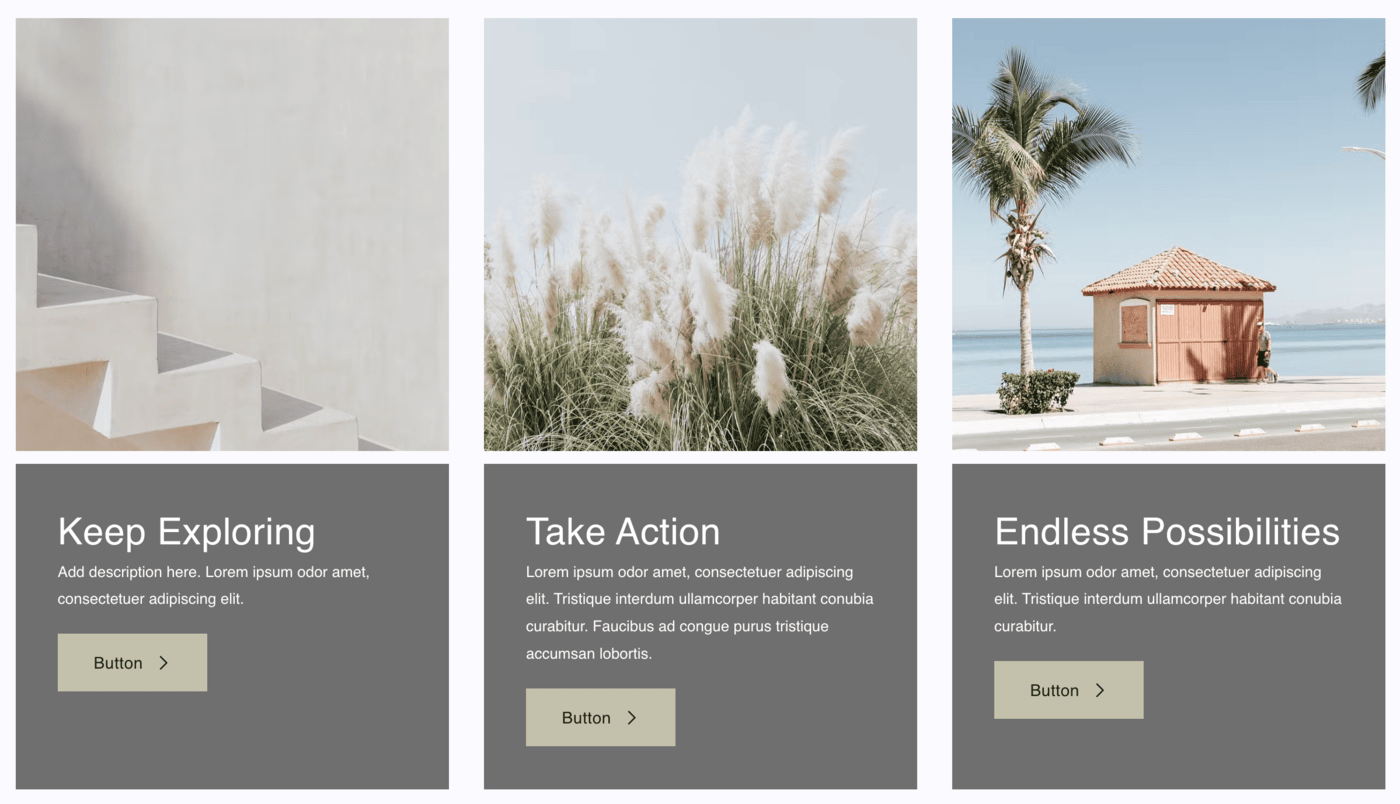
Text Card
- When the text card option is selected, the card color and other properties you specified are applied only to the text (below the image).
Have a look:
Style Cards
The card styling options are available in the Style tab of the section (right drawer). The styling options are as follows:
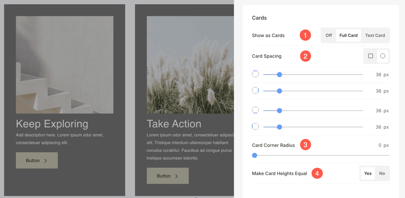
Cards
- Show as Cards: Choose to show the list items as Full/Text Cards. This option may vary based on the layout selected for the section. Learn more.
- Card Spacing: Choose to have a common or different card spacing for each side of the list items and set a number (in px) for the card spacing of the list item images.
In case you have chosen split corners, you can set different card spacing for each side of the card. - Card Corner Radius: Specify the card corner radius for the list item’s card in px.
- Make Card Heights Equal: Choose whether the height of the cards should be uniform across all items or adjust based on the content of each item.
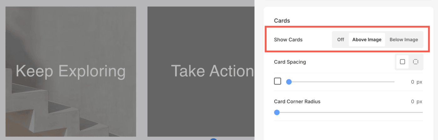
If you have selected a layout wherein, the text is displayed over the image, then the following option will appear:
- Show Cards: This toggle determines whether or not the card is displayed. The following options are available:
- Off: Turns off the card entirely, leaving only the image and text visible in the section.
- Above Image: Displays the card above the image. This layout works well for designs where you want the text to be the focus before the image.
- Below Image: Displays the card below the image. This is ideal for designs where the image is the primary focus, followed by the descriptive content. If no image is uploaded for an item, the card will be displayed for that item by default.
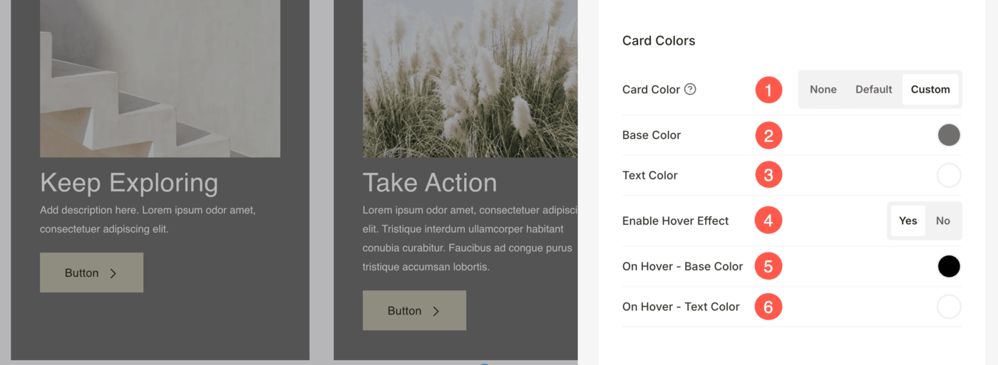
Card Colors
- Choose the card color to be none or default or custom. If the default option is chosen, then the card color set in the Design section is used here.
- If you have chosen the custom option, then specify the base color and
- Text color of the card.
- Choose to enable Hover Effect for the card.
- Specify the base color for the card hover view.
- Specify the text color for the card hover view.
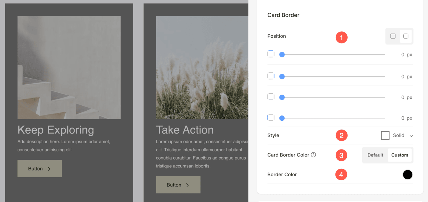
Card Border
- Position – Choose to have a common or different card border for each side of the list items and set a number (in px) for the card border.
In case you have chosen split corners, you can set different card borders for each side of the card. - Choose the Style of the card border.
- Choose Default card border color or Custom color.
- If Custom option is selected, specify the color.