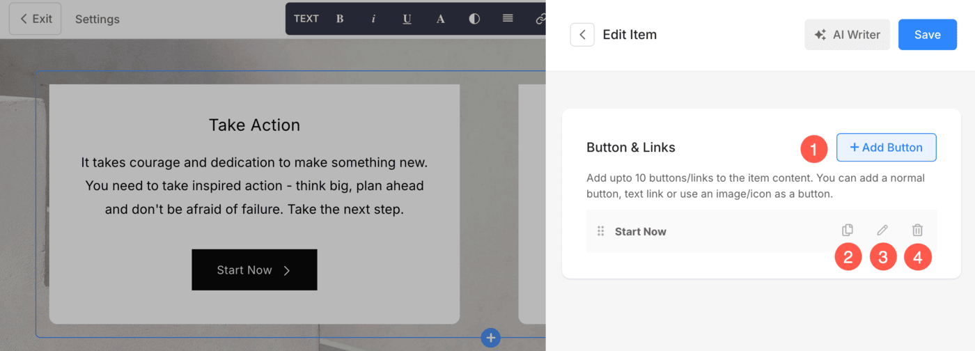
Using Button & Links, you can add any type of Link (1) to the section. You can add a Button/Text Link/Image link/Icon/Separator.
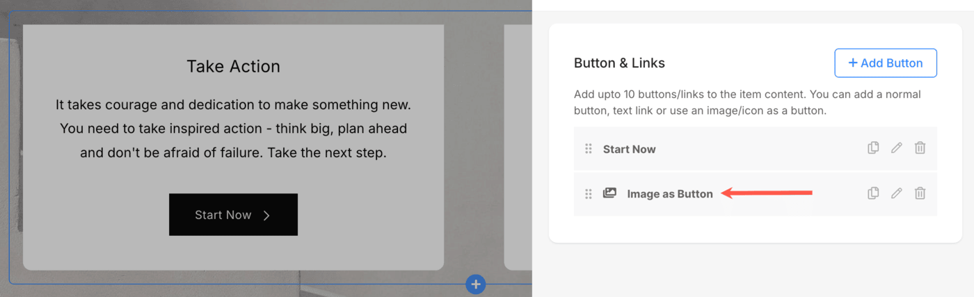
You can Duplicate (2), Edit (3), or Delete (4) the existing button/link.
In this article:
Add Buttons/Links
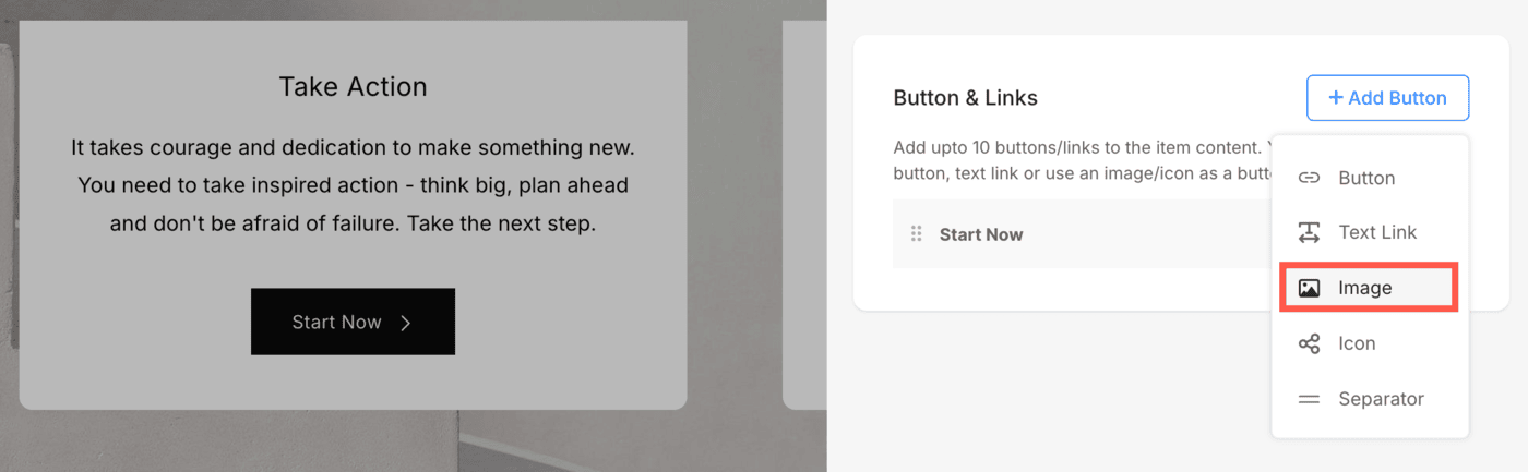
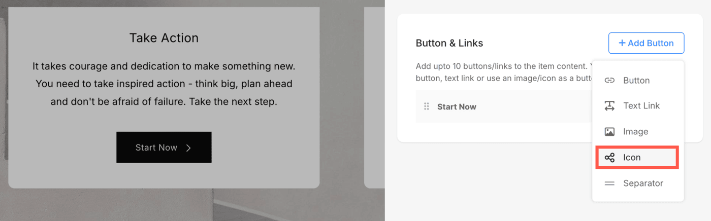
- To add any type of link to the section, click on the + Add Button option.
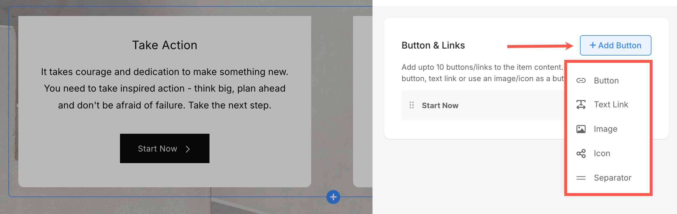
The + Add Button option provides four ways to add a link. Apart from this, you can also add Separators to add space between buttons/links. Following are the options:
Button
Add a button to the list item.

You will be able to update:
- Button Label – Specify the visible text on your button. This is what users will see and click on.
- Button Link – Specify the URL or action the button should trigger when clicked.
- Target Window – Choose whether the link opens in the same tab or a new tab.
- Button Style – Choose the button style to be the default (set in the Buttons and Links tab of the Design section), Solid, Outline, or a Text Link.
-
- Default: Follows your site’s theme settings.
- Solid: A bold, filled button.
- Outline: Transparent background with a border.
- Text Link: Simple, clean text-only style (no button box).
- Button Shape – Set a custom shape for each individual button within the section. This allows you to override the global button shape defined under the Design settings, giving you more control over how each button appears. The available shapes are Square, Rounded, and Pill.
- Button Color – Customize the color scheme of the button:
-
- Default: Inherits theme settings.
- Invert: Reverses the button text/background colors.
- Custom: Enables you to choose specific text and background colors.
- Button Text – If using Custom button color, you can set the text (label) color from here.
- Button Background – Also available under Custom, this sets the button’s background color. Pair this with text color for maximum readability and style.
- Button Icon – Add an icon next to your button label. You can choose from various icon options.
- Layout – Control the placement of the icon in relation to the label. Available layout options are:
-
- Label + Icon: Text appears first, followed by the icon.
- Icon + Label: Icon appears first, then text.
- Label + Icon (Wide): Text and icon arranged with more padding, suited for wider buttons.
- Icon + Label (Wide): Icon first, wider padding layout.
- Icon Color – Choose the color of button icon. You can either set it to the Button Text color or the Brand color.

Button Style Settings
You will find these settings under the Style tab of sections. These settings allow you to fine-tune the appearance, spacing, and layout of buttons on your Pixpa site for better design control and responsiveness:
- Button Size – Choose the size of the button (e.g., Small, Medium, Large). This adjusts the padding and font size to suit your design.
- Space Between Buttons – Controls the horizontal spacing between multiple buttons. You can use vw (viewport width) units for responsive spacing.
- Space Above Buttons – Adds vertical spacing above the button(s). This helps separate them from the content above, measured in %.
- Text Link – Adjusts the font size for button text links (especially useful when using a “Text Link” style instead of a traditional button).
- Image as Button (Size) – If you’re using an image instead of a traditional button, this setting defines the image’s display size (in pixels).
- Button Width – Choose how wide the button should appear:
-
- Default: Standard width based on button content
- Large / X-Large: Wider buttons for more emphasis
- Full Width: Button stretches across the entire container width

Text Link
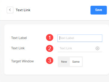
Add a text link to the list item.
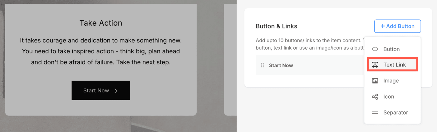
You will be able to update:
- Set the text label.
- Specify the text link.
- Target Window – Choose to open the page in the same or a new window.
Image
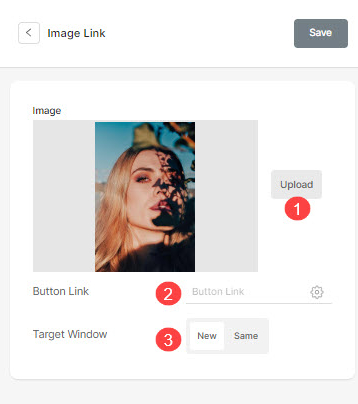
Add an image and link it to any page.
- Once you have uploaded the image, it shows up this way. Click on the link to edit it.
- From here, you can:
- Upload/Change the image.
- Button Link – Specify the link.
- Target Window – Choose to open the page in the same or a new window.
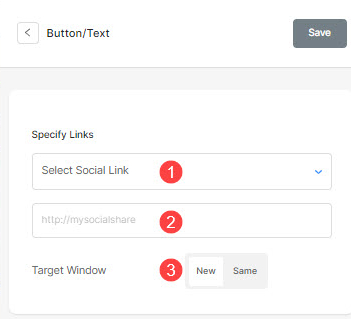
Social Icon
- Add a social icon to the list item.
You can manage:
- The social icon to be linked.
- Specify your relevant social profile path.
- Target Window – Choose to open the page in the same or a new window.
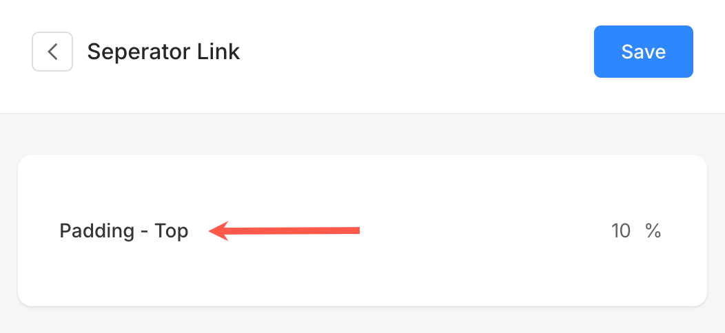
Separator
The Separator option lets you insert spacing between buttons or links.
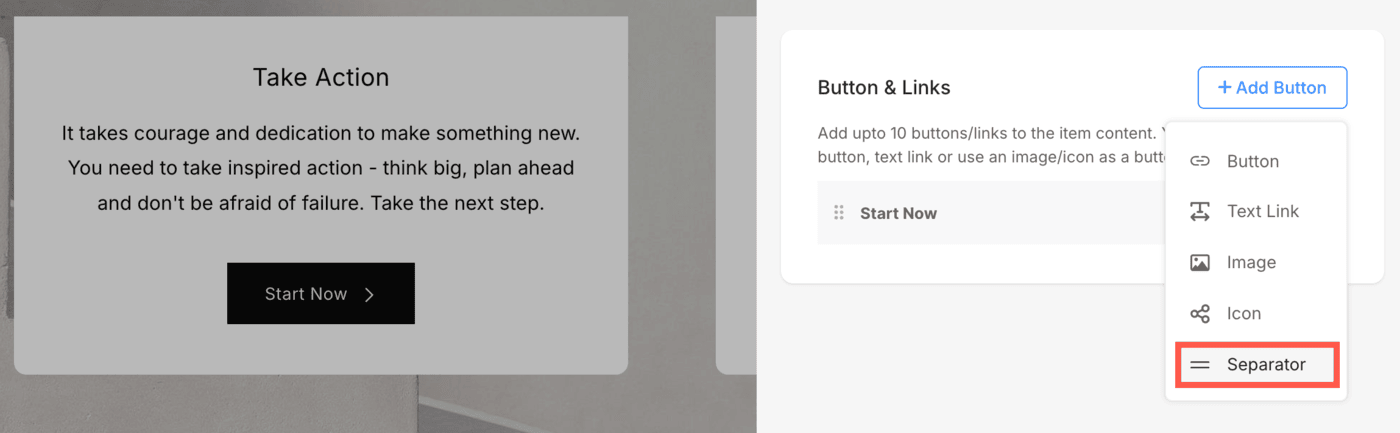
This is useful for creating visual separation between buttons placed in close proximity. You can add a separator from the Button & Links panel just like you add other buttons.
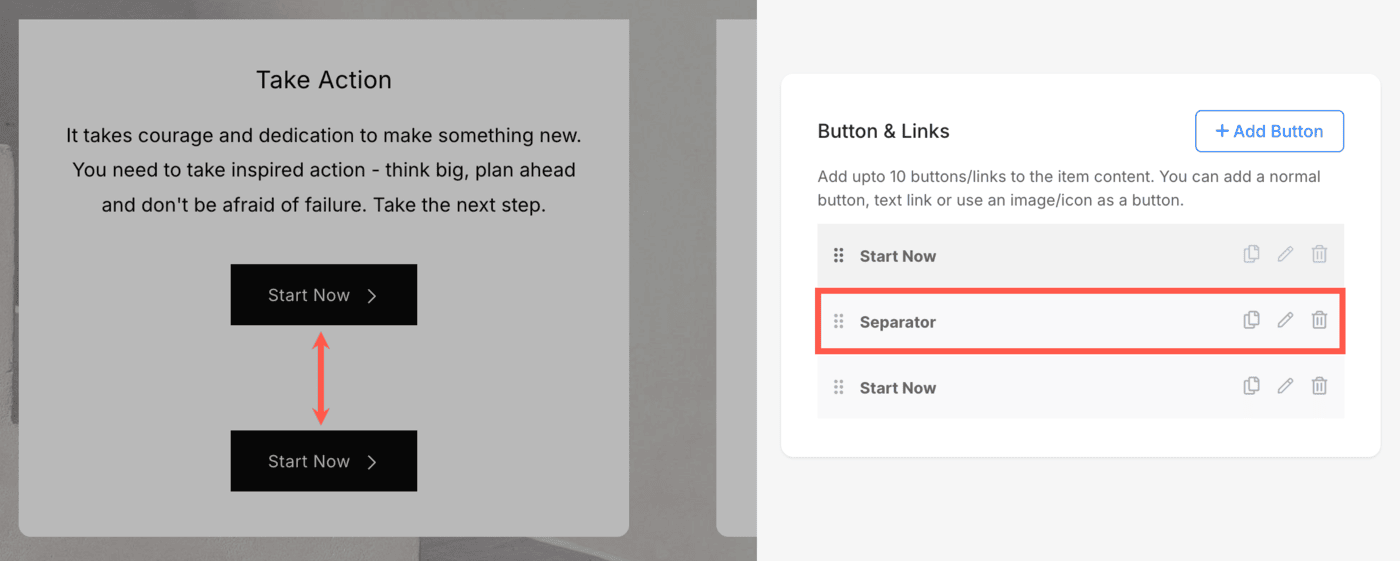
- The space between buttons is controlled by the Padding – Top setting within the Separator. Adjusting this value increases or decreases the vertical spacing between buttons placed closely together.
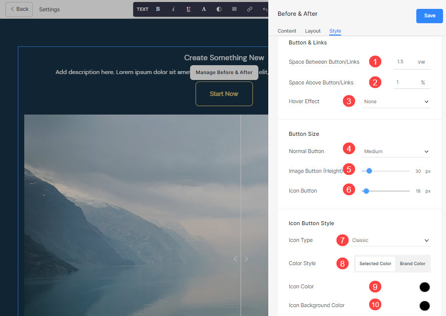
Style Options for Button & Links
The style options will be present under the Style tab while managing the section.
You will have multiple style options for the Button & Links as follow:
Button & Links
- Specify the Space Between Button/Links that have been added.
- Specify the Space Above Button/Links.
- Choose the Hover Effect for the Button/links.
- Choose the size of the Normal Button that you have added in the Button/Links.
- Specify the height of the Image Button if you have added an image link in the Button/Links.
- Specify the size of the Icon Button if you have added a social icon in the Button/Links.
If you have added a social icon in the Button/Links above, then:
- Choose the Social Icon Type/Shape.
- Choose the Social Icon Color Style. If you have chosen the Brand Color, then the icon’s brand color will be inherited.
If you have chosen the Selected Color option above then:
-
- Specify the Social Icon Color.
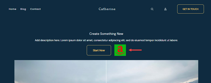
- Specify the Social Icon Background Color.
Example
For suppose, you have added an Amazon social link in the Button/Links, and specified the icon color as Red and the icon background color as Green, then the icon will show up as below: