Pixpa client galleries now come with advanced global design settings, allowing you to personalize the appearance of all galleries within an album (except video galleries) from a single place.
This eliminates the need to individually style each gallery, streamlining the customization process for a consistent and professional look. With these enhanced options, you can easily customize cover designs, layouts, and visual styles to provide a seamless and engaging user experience.
In this article:
To manage the design settings of any album, follow the steps mentioned below:
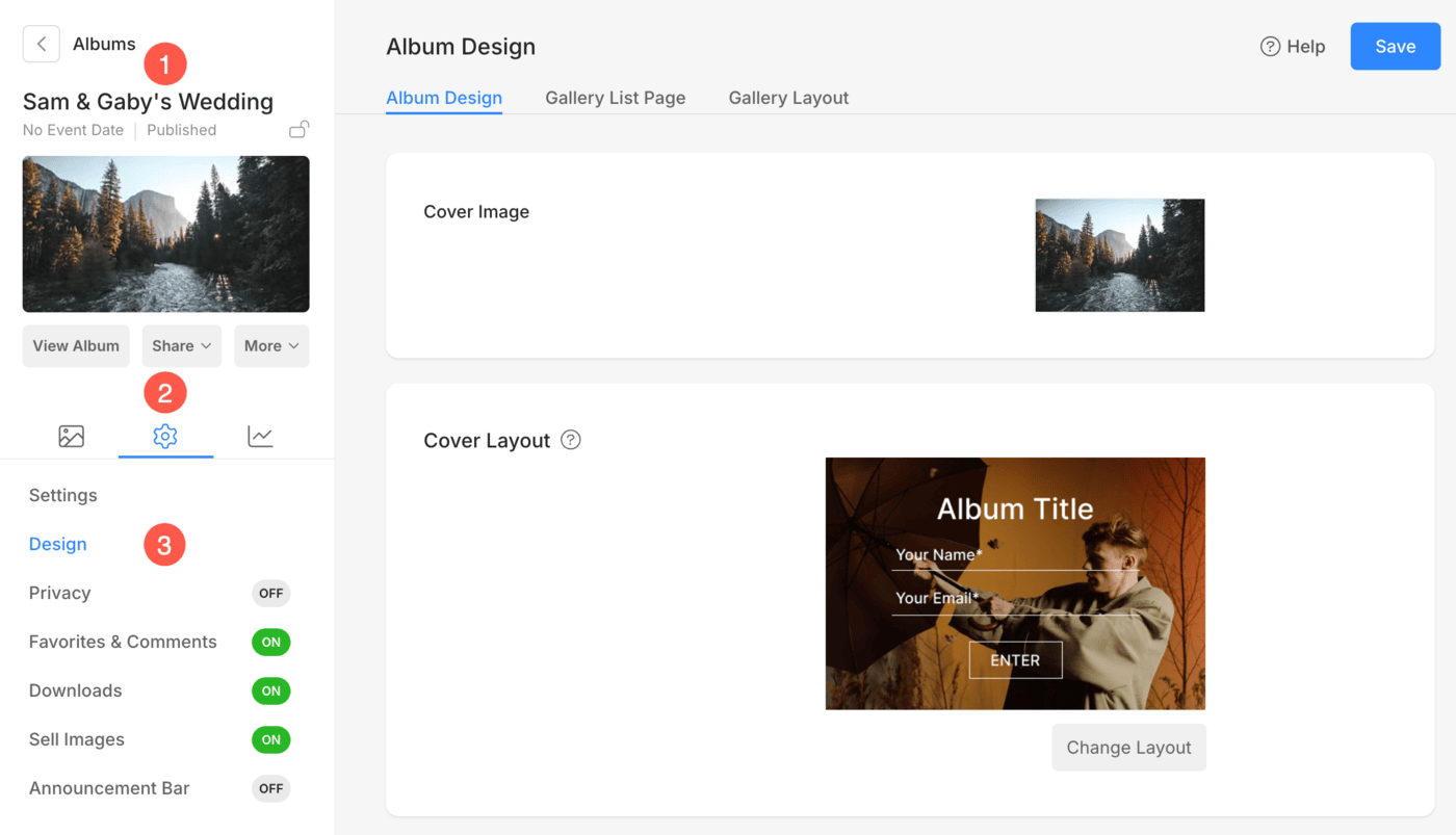
- Open the album (1) which you want to edit.
- Click on the Settings (2) icon and select Design (3) option.
Album Design
The Album Design tab allows you to customize the cover design and text elements for your album. Here are the features:
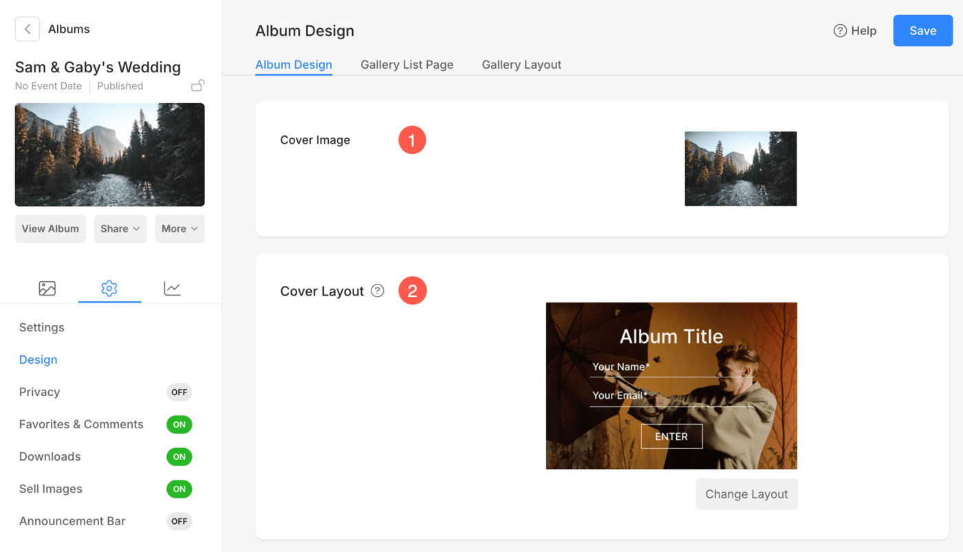
- Cover Image: Upload or update the cover image for the album. You can also select the focal point for Cover image, select the Accent color and specify Alt Tag.
- Cover Layout: Choose from various layout styles to define how the cover image and album details are displayed. Click Change Layout to select your preferred layout.
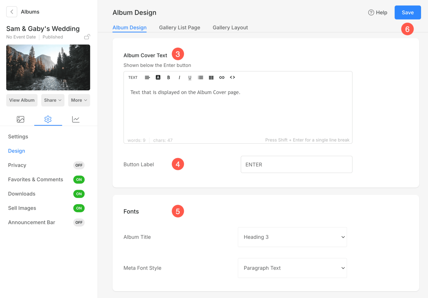
- Album Cover Text: Customize the album cover text, such as adding descriptive information or notes.
- Button Label: Edit the text displayed on the album entry button (e.g., “Enter”).
- Fonts: Customize font styles for:
- Album Title
- Meta Font Style: It is used to display the event date of the album on Album Cover page.
- Save: After making the customizations, save the changes.
Gallery List Page
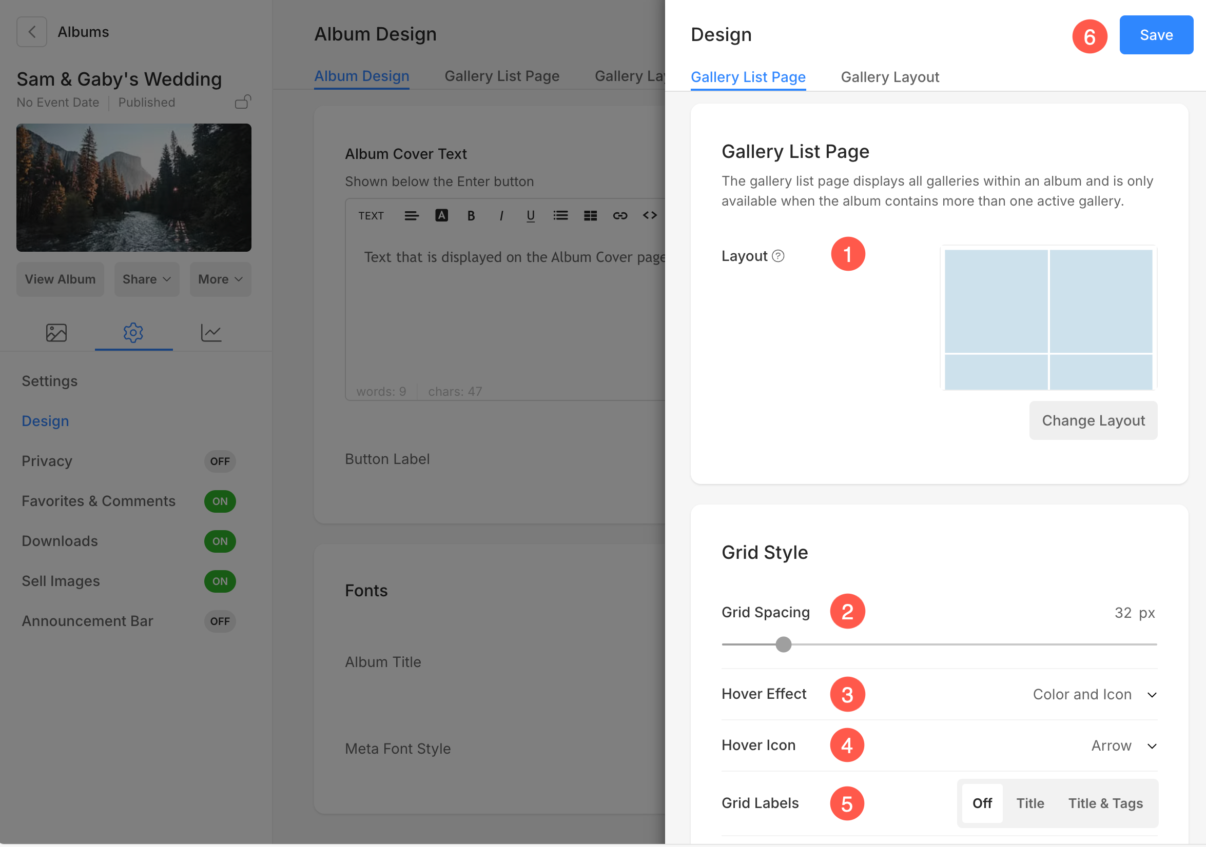
The Gallery List Page tab allows you to manage how different galleries under this album are displayed on the gallery list page.
- Layout: Select the layout for how galleries are displayed on the list page.
- Grid Spacing: Specify the spacing between the gallery grids on gallery list page (0- 250 pixels).
- Hover Effect: The hover effect will be used only in a Grid layout. Select an effect when cursor hovers over the gallery grids. Following are the different options to choose from:
- No Effect – There will be no effect on hover.
- Color – The hover color gets displayed on hover.
- Color and Title – The hover color and title get displayed on hover. You can set the overlay color and sub-item title text color/font/size/weight from the Design section.
- Color and Icon – The hover color and icon get displayed on hover.
- Color, Title, and Icon – The hover color, title, and icon get displayed on hover. You can choose any icon like plus, arrow, cross, and eye from the below option.
- Hover Icon: You can add a hover icon to your galleries.The available options are – plus, arrow, cross, and eye. Only applicable if an icon is selected in point 3.
- Grid Labels: You can show gallery titles under the grid images with titles/titles and tags.
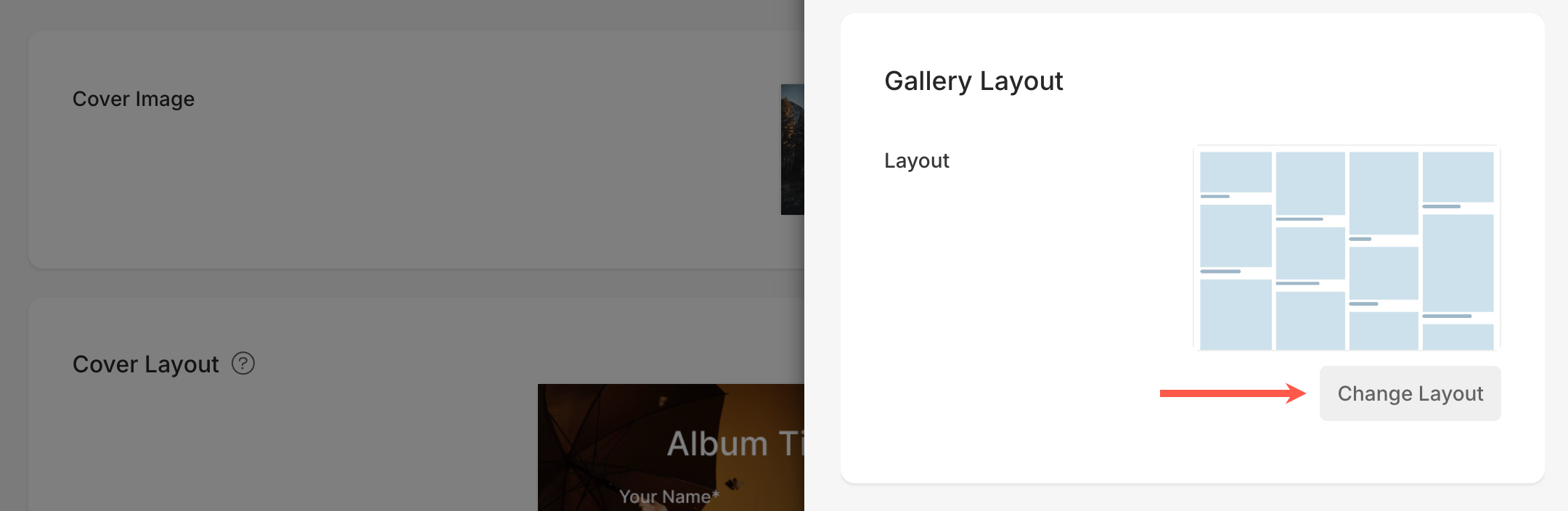
Gallery Layout
The Gallery Layout tab provides extensive options to manage the appearance and functionality of different galleries within the album (except the Video galleries).
- Layout: Choose how the gallery images are arranged on the page. Use the Change Layout option to switch between available layouts.
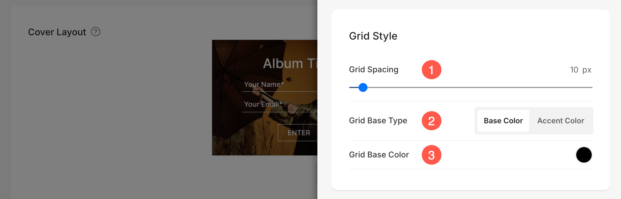
Grid Style
- Grid Spacing: Specify the gutter space between the images in grid layouts. (0 – 250 pixels)
- Grid Base Type: Set the Grid Base Type to customize the base color or accent color. Accent color will give a multi-colored grid using the accent colors of each image.
- Grid Base Color: If Base color is selected in the previous step, specify a color.
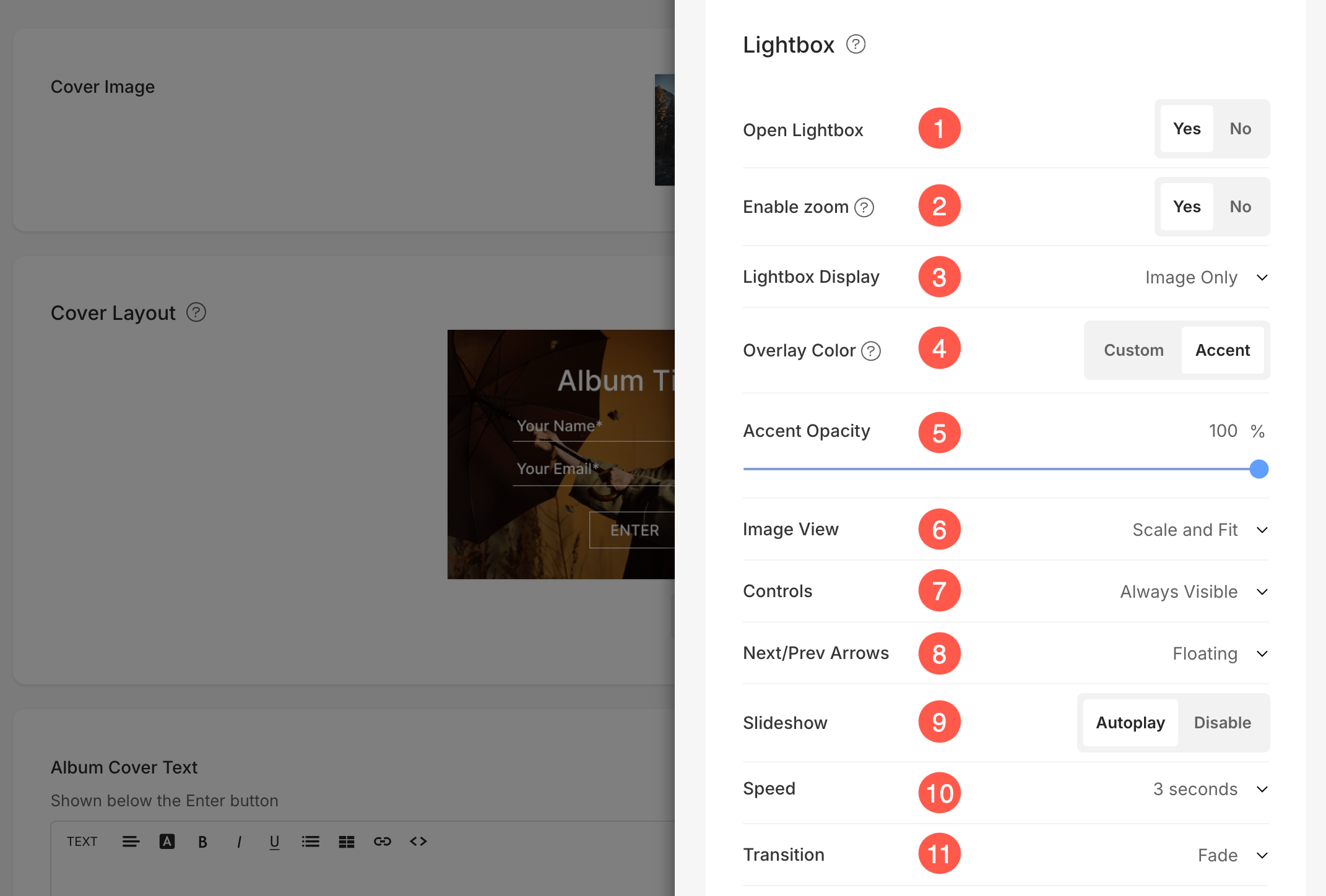
Lightbox
- Open Lightbox: Enable or disable the Lightbox option to allow image enlargement in a pop-up view.
- Enable Zoom: This lets viewers zoom into the image by double clicking for finer details.
- Lightbox Display: Choose how you want to display your images in full image display. You can select from show only images, image with thumbnails, image with captions on bottom, and image with captions on right.
- Overlay Color: This is the background color that appears when images are viewed in lightbox mode.
- Choose the Custom Color option to set a specific background color for all images viewed in lightbox mode. You can define your preferred color in the Overlay Color setting. Learn more.
- Choose Accent Color to apply a unique color from each image’s accent tones. You can customize this individually for each image as desired. Learn more.
- Accent Opacity: If you select the Accent color option, you can adjust the Opacity (transparency) of the background color.
- Image View: Specify the display mode for the Lightbox –
- Scale and fit – Images would be scaled to fit into the available browser area so that the full image is visible.
- Full-bleed – Images would be sized to fill the entire available browser area – some portions of the image may get cut off in achieving this full-screen display.
- Controls: Choose how you want to show navigation controls like image info icon, gallery info icon, cross icon, browser fit icon, etc.
- Next / Prev Arrows: Choose how you want to show your navigational arrows. You have these options to choose from: Floating, Chevron, Arrows, Show Arrow in Circle, and Hidden.
- Slideshow : Click on autoplay to start the slideshow automatically in full image viewer. You can also disable the slideshow.
- Speed : Select the speed of transition. You can choose from 1 to 10 seconds.
- Transition : Choose the transition style of the slideshow.
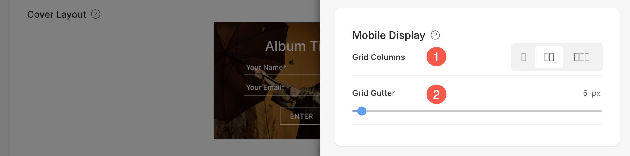
Mobile Display
- Grid Columns: Choose from 1, 2, or 3 column view for grid display in mobile view.
- Grid Spacing : Set the gutter between images in mobile view.
Related articles: