Styling a website effectively is very important as it directly influences user experience and engagement.
Consistent and appealing design choices not only convey professionalism and brand identity but also improves readability and navigation, making content more accessible to users.
Let’s explore the important points that must be taken into consideration while designing a website.
In this article:
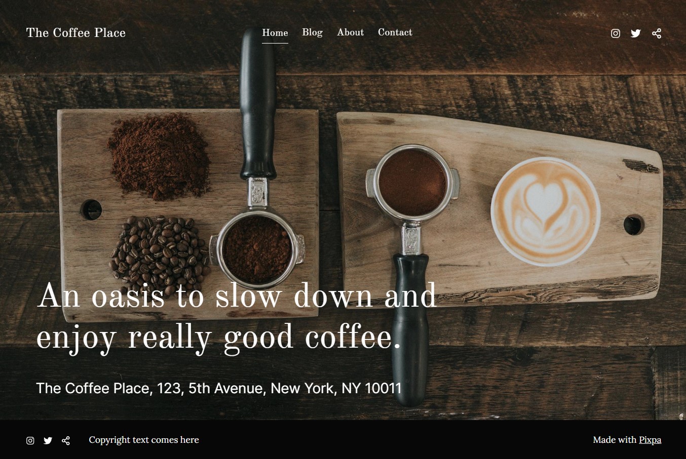
Prerequisites for Styling a Website
Before you begin styling your website, there are several factors to take into account.
Structure of your Website
It is necessary to pre-plan the structure of your website. This may include:
- The position and style of your website’s header
- Layout of pages, galleries, and folders
- Pre-footer and Footer design
These are some of the key elements of any website and considering them in advance will save a lot of time and effort while actually building or styling your website.
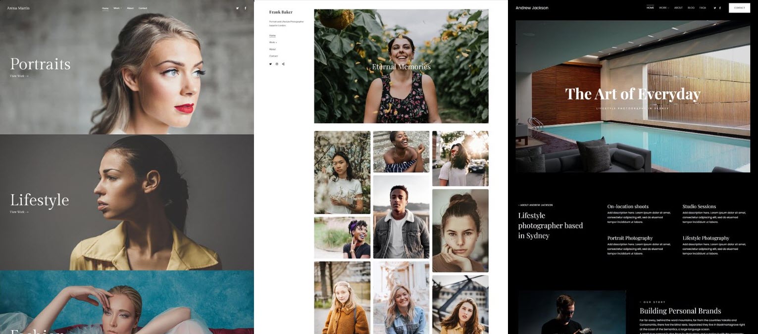
Choosing your template
Previous step will help you in choosing the appropriate template. Make sure to choose the right template that suits best according to your business as it sets the foundation of your website’s design and layout.
Know more about templates.
Decide the Color Scheme
Visually appealing colors on a website creates first impression, increases brand recognition and improves design aesthetics. You can decide whether your website will have a light, airy feel, a darker feel, or something in between through colors.
Select Fonts
Choosing the right font is crucial as it significantly impacts user experience and improves readability. Consistency in font usage ensures a cohesive look, while responsive fonts adapt to various screen sizes.
Designing your Website
The next step in website styling involves meticulously refining every design element to achieve your desired look. During this phase, you will make adjustments and enhancements to various aspects of your website’s aesthetics.
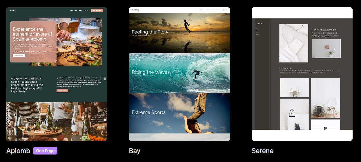
Templates
Whether you are creating a website from scratch or redesigning your website, the first thing that you should consider is to choose an appropriate template. Pixpa provides you with two types of templates:
- Single Column Templates: With these templates, you get the header and navigation menu at the top followed by the main body (content) of your website and finally comes the Footer at the bottom.
Templates like Color, Titan and Nirvana are classified as Single Column templates.
- Two Column Templates: These templates are structured in a way that the Logo, Navigation Menu, Social Icons and Footer remains on the one side like a sidebar and the main content of your website is positioned on the other side covering a wider section of the screen.
Some examples are Burst, Beyond, Isle, etc.
You can check out all the templates here.
Click here to know more about website templates.
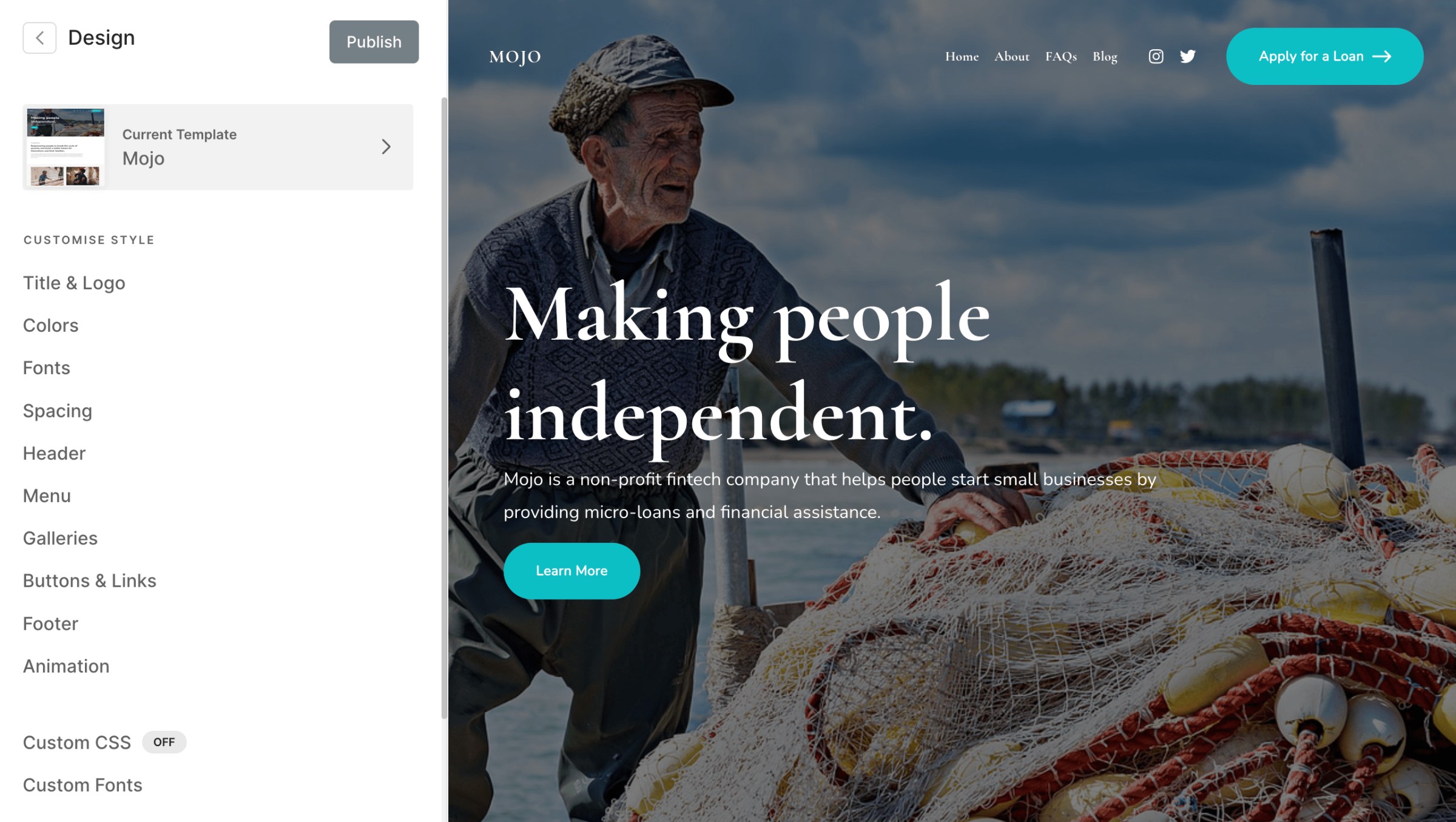
Colors
Website colors play a pivotal role in enhancing your website’s visual appeal and creating a cohesive design that effectively communicates your brand’s message.
They also contribute significantly to improving the overall user experience.
Pixpa offers a variety of predefined color palette presets, each thoughtfully curated to offer you a simple and efficient way to customize the appearance of your website with a distinct style. You can change the colors of your overall website with just a single click.
Within each preset, you have five palette options that you can customize individually also. Moreover, you can modify the color of every element using the Advanced Edit option.
Click here to know more about website colors.
Website Fonts
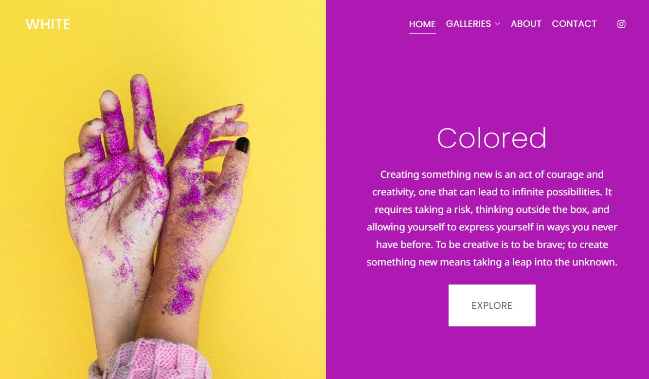
Fonts have a significant impact on websites, influencing readability, conveying brand’s identity, and improving the overall user experience.
Fonts must be easier to read and shall add a professional and polished touch to your website as it helps in building trust with visitors.
Pixpa provides you multiple font presets that are predefined combinations of font type, font sizes, letter spacing, and other typographic settings that can be applied to the text on the overall website with just a single click.
You can also customize the Heading and Paragraph font with each palette or you can specify font styling for individual elements using the Advanced Edit option.
Click here to know more about website fonts.
Title and Logo
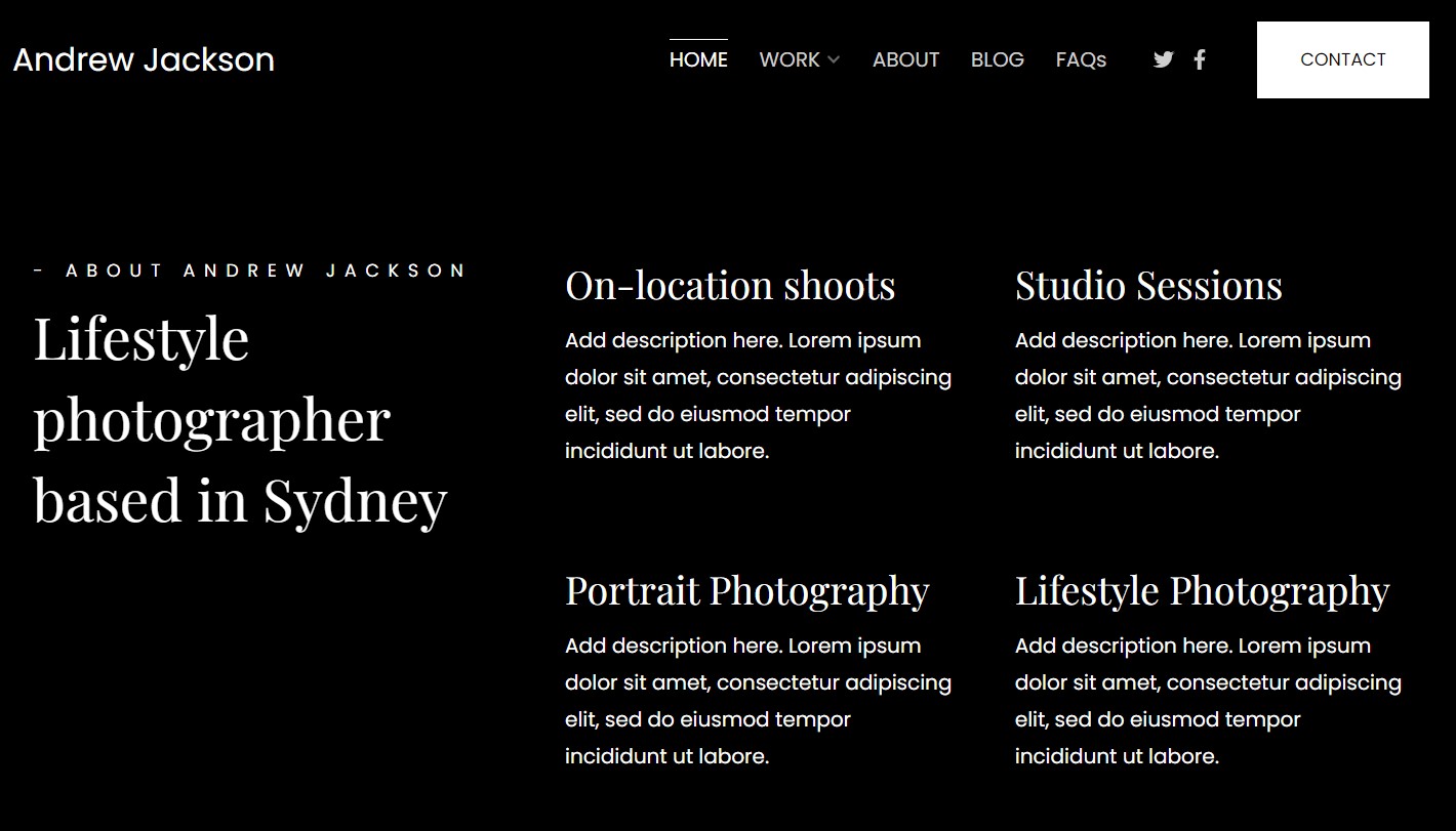
The Site title or logo is typically the initial element visible on any website. It either showcases your brand name directly or symbolically represents your brand, quickly capturing the attention of visitors.
You can specify the Site title or upload different logos for your website from Title & Logo section. These logos include Primary Logo, Alternate Logo, Favicon and System Logo.
Learn more about Title and Logo.
Website Spacing
A website that incorporates adequate spacing and maintains proper balance among its elements tends to be not only more visually appealing but also significantly easier to read and navigate.
From the spacing section, you can specify the maximum width of your website along with margin and padding options. This will be applied to the overall website.
Also, you can upload a Background image and customize the Scrollbar color from here.
Know more about website spacing.
Website Header
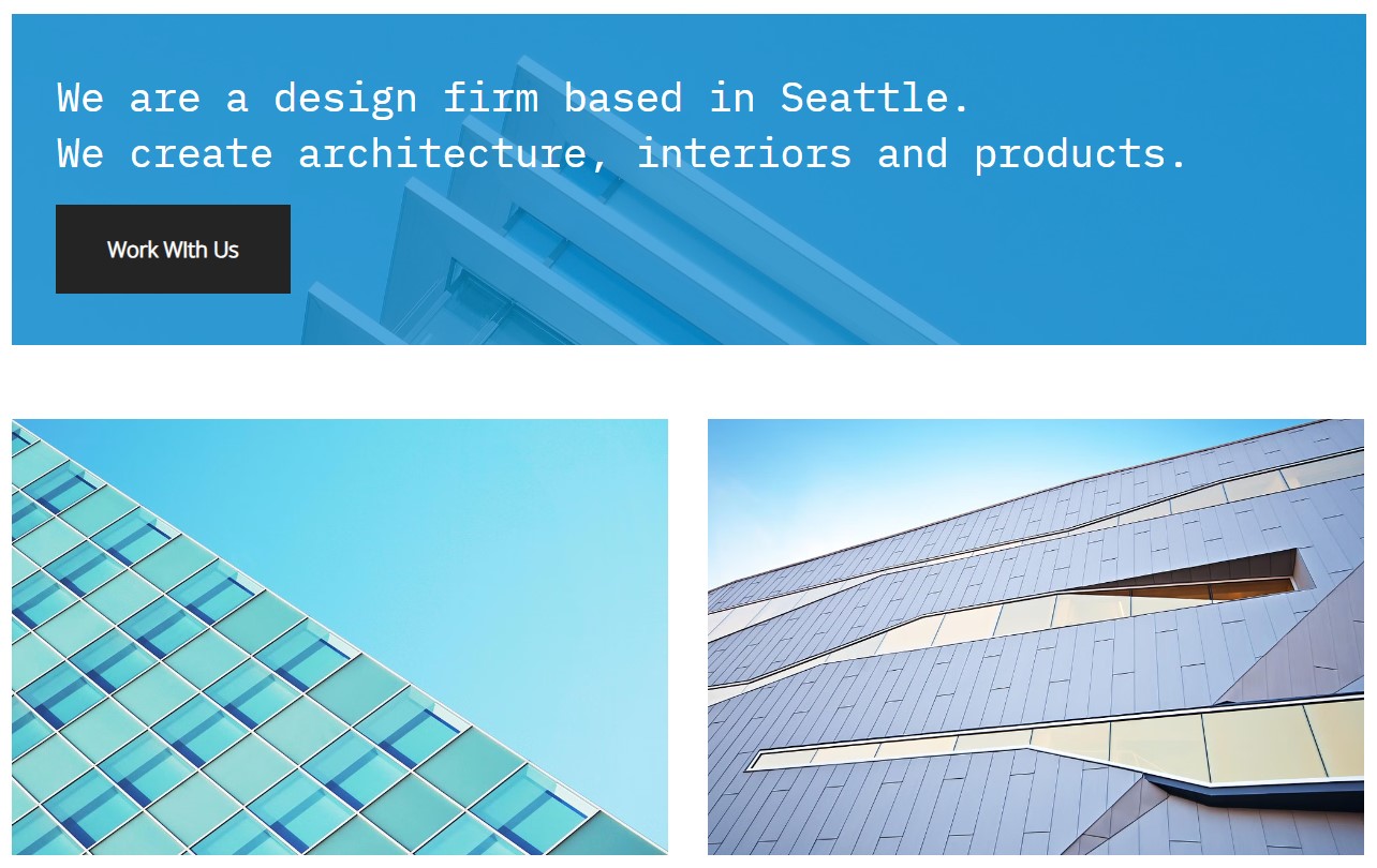
This is the top section of your website that typically contains essential elements like the site title or logo, navigation menu, social media links, and contact information.
It serves as a crucial component guiding users to navigate through your website.
You can customize the layout, width, behavior of header, header border, etc. Also, you can choose the layout of header for mobile devices from here.
Click here to know more about website header.
Website Menu
The website’s navigation menu plays a vital role in improving site usability and enhancing the overall user experience by providing a convenient means for users to access various sections and pages of the site.
From the menu section, you can specify the spacing between menu items, its different blocks, menu icons and text options for mobile devices and customize the option regarding Social Icons.
Click here to learn more about website menu options.

Website Gallery
Galleries offer a practical way to display numerous images and videos simultaneously, allowing you to showcase your media content and captivate your website visitors.
You have the flexibility to personalize them to achieve your desired aesthetic.
From here, you can customize the layout, grid spacing, grid colors, lightbox options, etc.
Options for the appearance of galleries on mobile devices are also available.
Click here to learn more about website gallery design options.
Buttons & Links
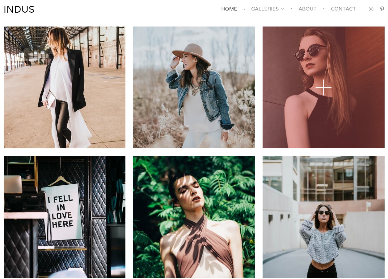
Buttons and links are essential elements on a website, as they serve a vital role in guiding users, facilitating interactions, and granting easy access to the information and services they seek.
This ensures a seamless experience on the overall website.
From here, you can customize the style and shape of buttons, button icons, spacing and animation styles.
Also, styling related to links can be customized from buttons & links section.
Click here to know more.
Website Footer
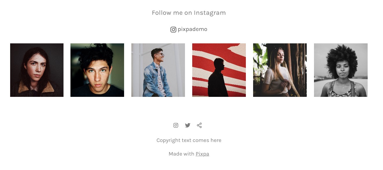
Footer is the bottom section of a website that typically contains important information and links, such as social icons, copyright information, contact details, etc.
It serves as a convenient way for visitors to find additional information and navigate the site effectively.
Pixpa provides you with two different footer styles that you can choose for your website.
Apart from this, you can customize width, footer text, footer border and back to top button from here.
Learn more about styling your website’s footer.
Animation
Animations make your website dynamic and add visual effects to the elements and different sections.
These animations enhance user engagement and can make a website more visually appealing, improving the overall user experience.
From here, you can choose the animation effect that you want to apply on your website and customize the speed of it.
Click here to know more about website animations.
Custom Fonts
While Pixpa offers access to over 300 fonts from Google Fonts repository, you also have the option to incorporate and utilize your own custom fonts allowing your website to stand out and align with brand identity.
You can select fonts for elements like headings, paragraphs, buttons, titles, footer, etc.
Learn more about custom fonts.
Custom CSS
Apart from all the design related options mentioned above, you have the power to style each and every element of your website using Custom CSS option. Pixpa offers this on every plan that it offers to its customers.
Using this, you can override the default styling and customize the looks of your website exactly according to your choice and preferences.
Click here to know more about Custom CSS.
Style Checklist
When it comes to building a website, design is very crucial. To ensure that your website is visually stunning and user-friendly, you need to pay attention to styling elements.
In this final checklist, we’ll guide you through the essential steps to perfecting your website’s style.

Responsive Design
All Pixpa templates are responsive. However, make sure that your overall website and each section are responsive. It should adapt seamlessly to various screen sizes and devices.
Test your website on different devices, including smartphones, tablets, and desktops, to make sure it looks great everywhere.
Consistent Design
Consistency is key to professional look. Ensure that elements like logos, color schemes, and fonts are consistent all across the website.
Consistency builds trust and makes your website more memorable.
Typography
Choose proper fonts for headings, paragraphs, and other elements. Ensure that proper hierarchy is maintained with appropriate font sizes and line spacing.
Avoid using too many different fonts.
Navigation
Navigation menu should be intuitive and easy to use. Ensure that visitors can easily find their way around your website. Use clear labels and organize your menu logically.
For websites having large amount of content, consider adding Search functionality.
