Pages consist of fully editable sections seamlessly connected from top to bottom. With a variety of sections at your disposal, customization becomes effortless to tailor pages to your preferences.
Each section allows for the specification of unique colors for both the section itself and its underlying elements. Additionally, the option to designate background colors and background images further enhances the visual appeal and personalization of individual sections.
In this article
You can customize the colors and background image of a section by following the steps mentioned below:
- Hover the cursor over the section that you want to work on.
- This will enable the editing toolbar in the top right corner.
- Click on the Edit Section icon to open the Color Style box.

Section Colors
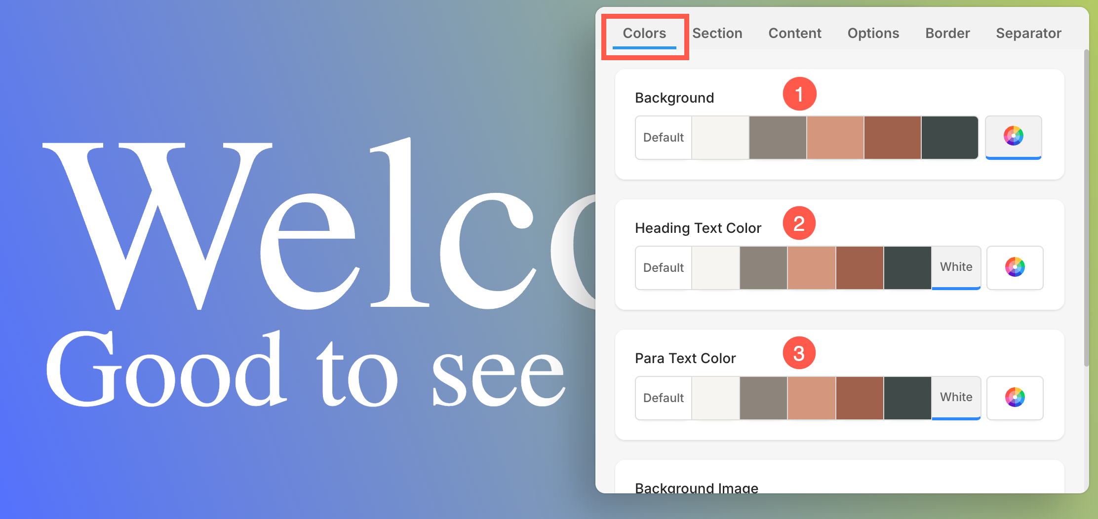
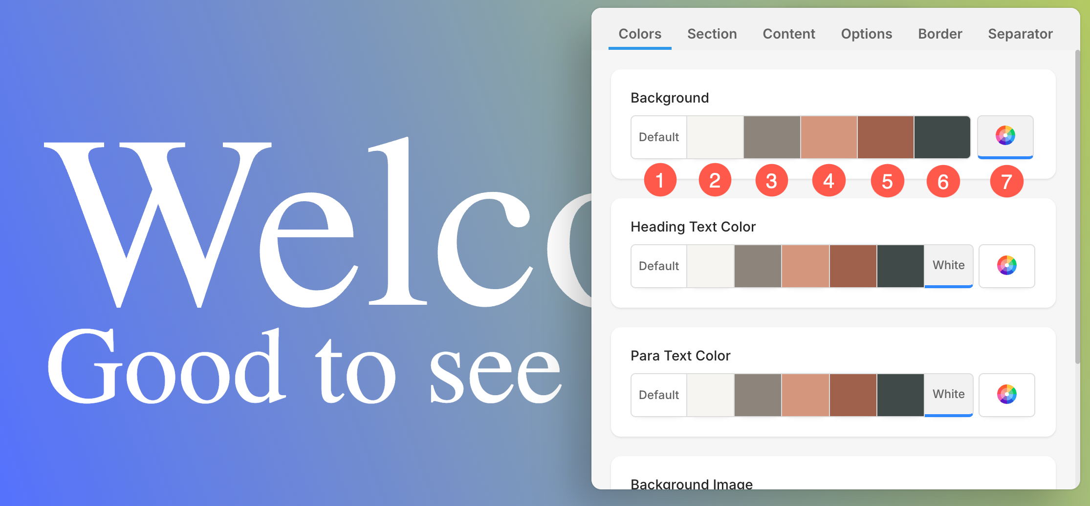
Under the Colors tab, you will find the following options:
- Background Color: The color that appears behind all the content within a section is known as background color. You can customize the background color of the section from here.
- Heading Text Color: Text designated with Heading fonts collectively forms the Heading Text. This includes Haeding 1, Heading 2, Heading 3, and Heading 4. Customize the color of heading text from here.
- Para Text Color: The text assigned as paragraph fonts collectively comprises the Para Text. This includes Paragraph, Small Paragraph, and Large Paragraph. Customize the Para Text Color from here.
Different color options for Background, Heading, and Para Text color:
- Set the background color as Default (1). The Background color will be the same as set for the website.
- Options 2, 3, 4, 5, and 6 are dynamic color options that directly depend upon the Color Palette Preset selected. If you select a light-shaded Background color, the Heading Text and Para Text color will automatically change to a dark shade and vice versa.
- Use the Custom Color (7) option to set a solid color or apply advanced gradients (linear or radial). You can manually pick a color, adjust transparency, or use the gradient builder to combine multiple colors and angles. Learn more.
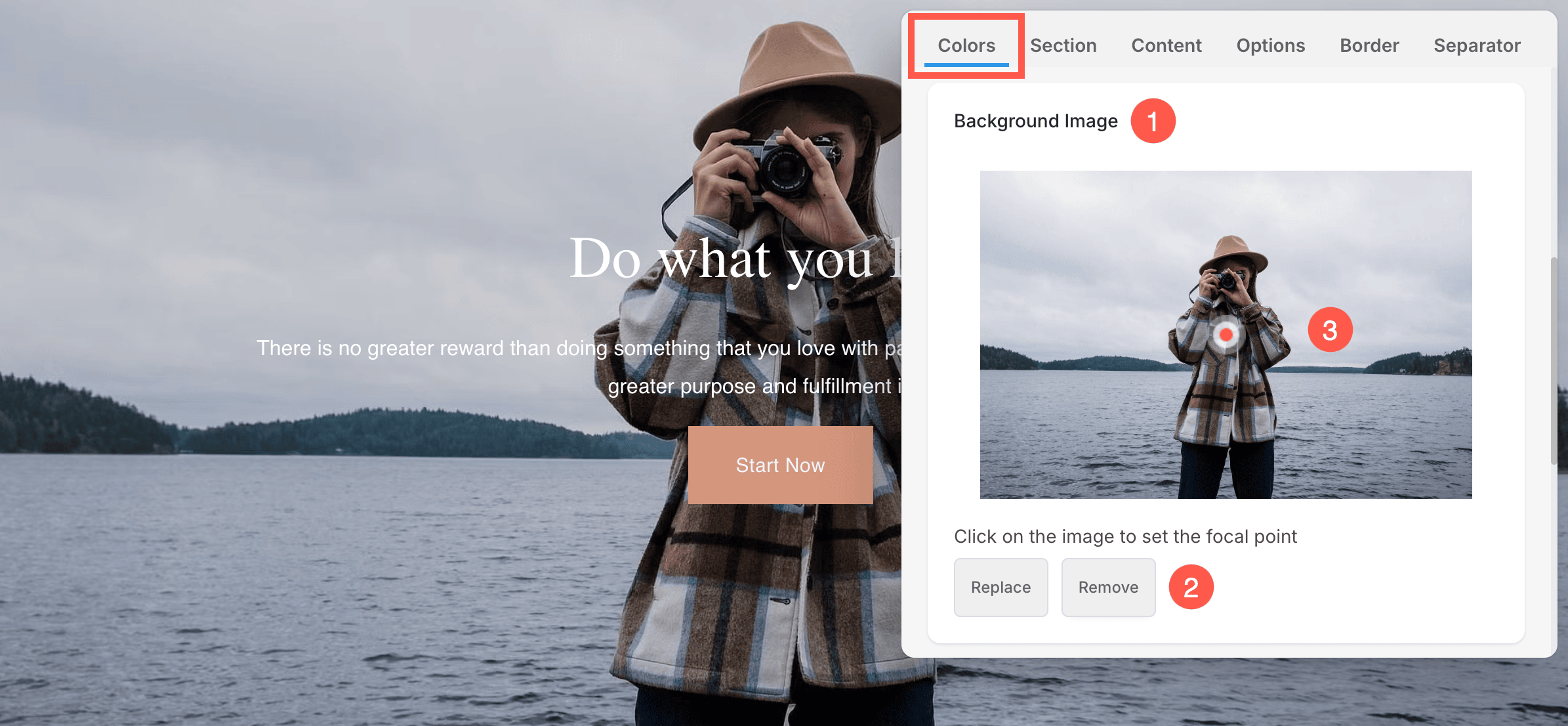
Background Image
- Under the Colors tab, scroll down to access the Background Image (1) section.
- From here, you can Replace or Remove (2) the existing background image, or Upload a new background image if one has not been added already.
- Set the Focal point (3) of the image. You can click on any point of the image and the focal point will be changed. Focal Point indicates the specific point or area of the image highlighted within the section.
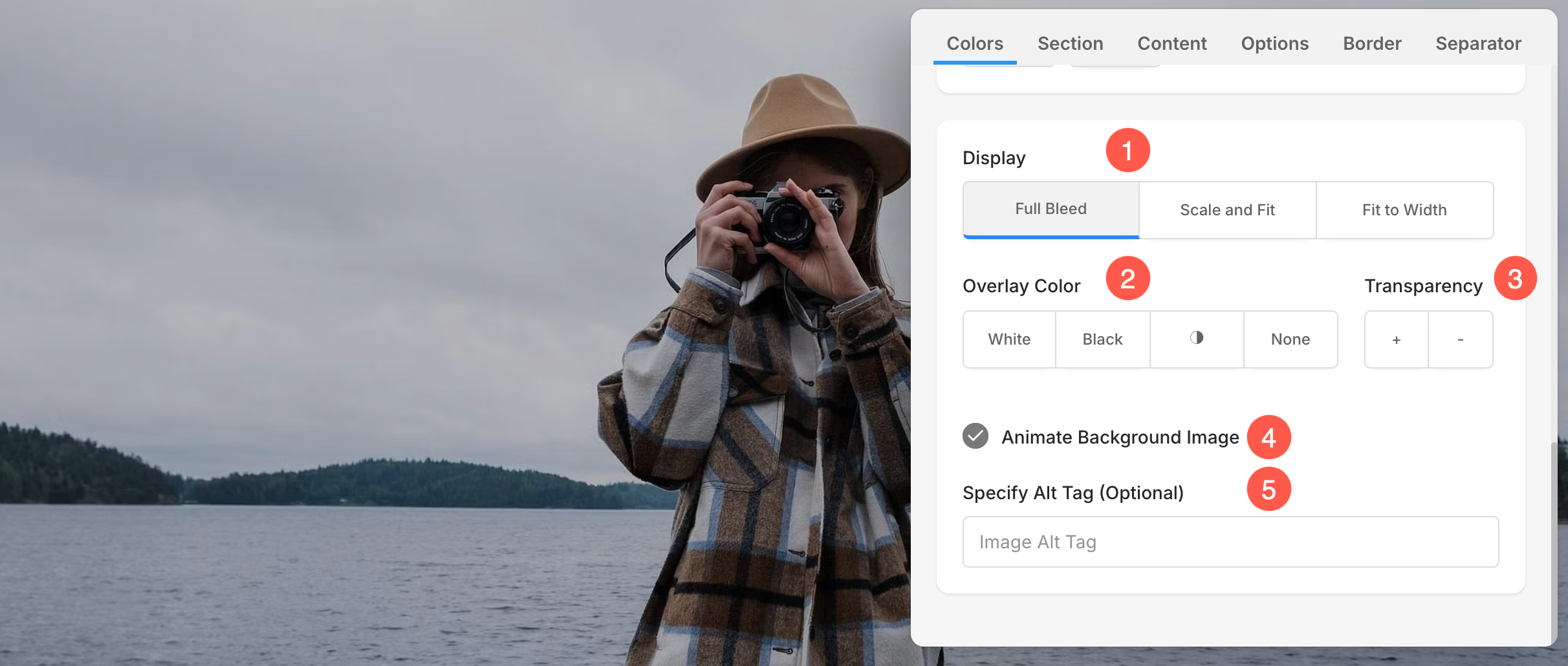
Display Options for Section Background
The Display options lets you control how your background image appears in the section. These options will show only when a background image is added
- Choose the Display width and height of the background image.
- Scale and Fit – The image will fit within the section width and height.
- Fit to Width – The image will be scaled to the section width. Section height will inherit the image height.
- Choose an Overlay Color.
- Set the Overlay Transparency (you can increase or decrease the color intensity).
- Enable Animation for the background image, creating a slow zoom effect for added visual appeal.
- Specify the Alt Tag for background image from here. It is a descriptive text attribute that provides alternative information for an image on a webpage, aiding accessibility and SEO.