The Folder lets you create a collection of your pages as a listing page or as a dropdown.
Think of a Folder as a container that holds multiple menu items and shows them in a visual layout (grids, slideshows, vertical or horizontal scrolls, and many more layouts).
Once you have created a folder, you can manage its design as shown below.
Manage folder style:
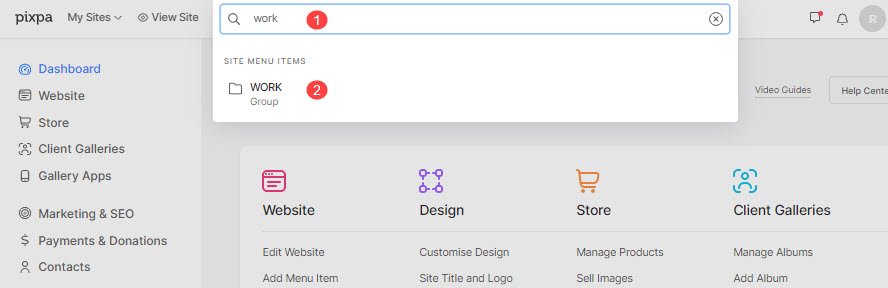
- Enter the folder title (1) in the Search Bar.
- Click on the folder (2) under Site Menu Items.
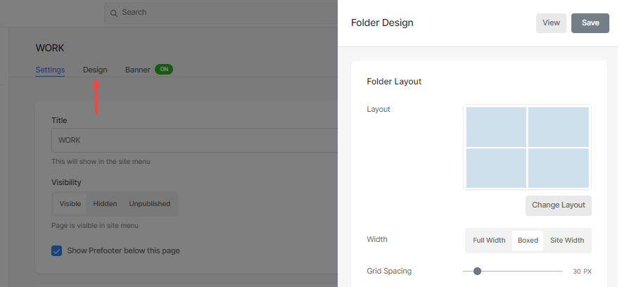
- This will take you to the folder settings page, click on the Design tab to open the Folder Design drawer.
You’ll see the following design options here:
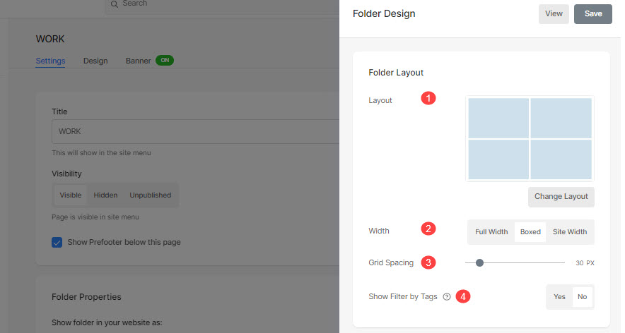
Folder Layout
- Layout – Choose a layout that will be applied to the folder. You can choose from 20+ layouts to show the sub-items of a folder on your site. Know more.
- Grid Spacing – Specify the space between sub-items in grid layouts. (0- 250 pixels)
- Width – Set the width of the Folder as Full Width, Boxed, or Site Width.
- ‘Full width‘ will display the folder while covering the entire width without leaving any margin.
- ‘Boxed‘ will display the folder while leaving some amount of padding on right and left of the screen.
- ‘Site width‘ can be specified in the Design section. You can specify a fixed-width there.
It will display the folder by adhering to the fixed-width specified.
- Filter by Tags – Check this to enable filter by tags on your folder sub-items.
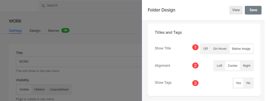
Titles and Tags
Show Title (1): You can enable sub-item titles under the grid images with titles and tags.
- Off: Select this to turn off grid titles and tags.
- On Hover: Select this to show the title on hover. You can choose the alignment for the title.
- Below Image: Select this to show the title as well as tags below the grid images. You can choose the alignment of titles and tags (2) and choose to show the tags (3).
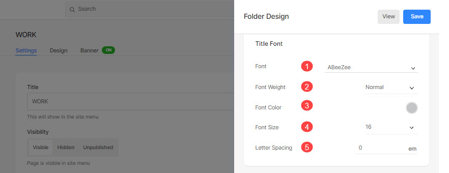
Title Font
- Font: Select a font for the folder title. Also Check: Manage the fonts of your website.
- Font Weight: Specify a font style for the title of the folder. Select between Normal, Light, and Bold.
- Font Color: Specify a color for the font of the title.
- Font Size: Specify a size for the font of the title (between 1 to 100 pixels).
- Letter Spacing: Specify the space between letters in the title.
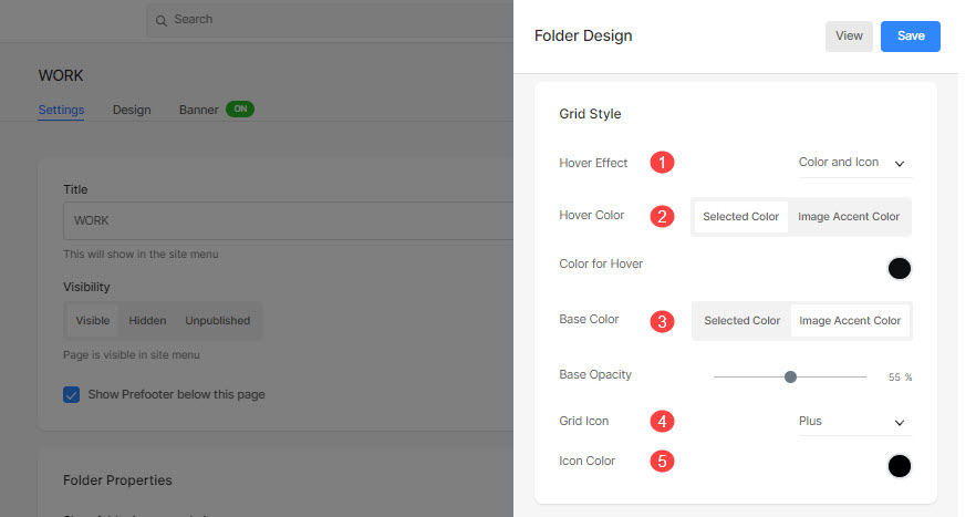
Grid Style
- Hover Effect: The hover effect can be used only in a grid layout. You can show the following options on hover in grid mode.
- No Effect: For no effect on subitems in grid mode.
- Color: For only overlay color on your sub-items in grid mode.
- Color and Icon: For the overlay color of sub-items with an icon.
- Hover Color: Specify color on hover.
- To specify a color, select Selected Color. If you select this, you’ll find an option below to specify the color.
- Select Image Accent Color so that the accent color of the image appears on hover. If you select this, you’ll find an option below to specify the opacity of the image accent color.
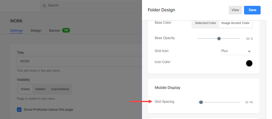
- Base Color: Specify the color of the grid base.
- To specify a color, select Selected Color. If you select this, you’ll find an option below to specify the color.
- Select Image Accent Color so that the accent color of the image becomes the base color. If you select this, you’ll find an option below to specify the opacity of the image accent color.
- Grid Icon: Select a Plus, Arrow, Cross, or Eye icon. This icon will appear on hovering the grid images.
- Icon Color: Specify the grid icon color.
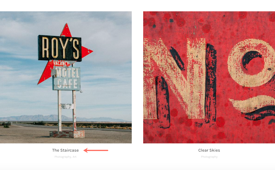
For example, do check out this folder where ‘Square large folder layout’ is selected with ‘Grid labels – Title & Tags’:
Mobile Display
- Specify the space between the sub-items in grid layouts for mobile. (between 0- 250 pixels)
Breadcrumb Navigation
Know about the breadcrumb navigation in detail.
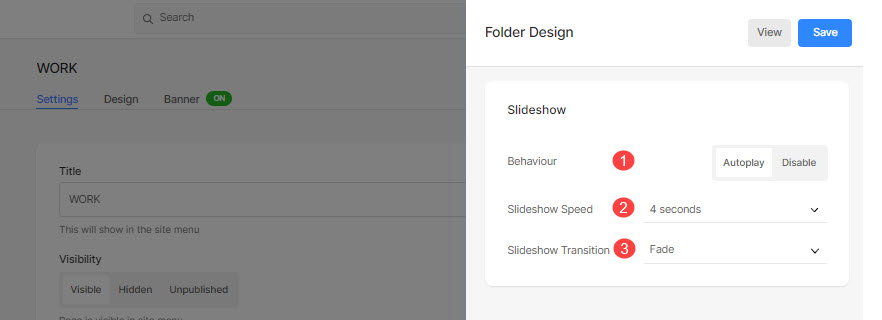
Slideshow (only for ‘Full-Image Slider’ layout)
- Behavior: Enable the slideshow from here.
- Slideshow Speed: Set the slideshow transition speed (between 1 to 10 seconds).
- Slideshow Transition: Specify the Slideshow transition type. You can apply the ‘Horizontal Swipe’ or ‘Fade’ option.